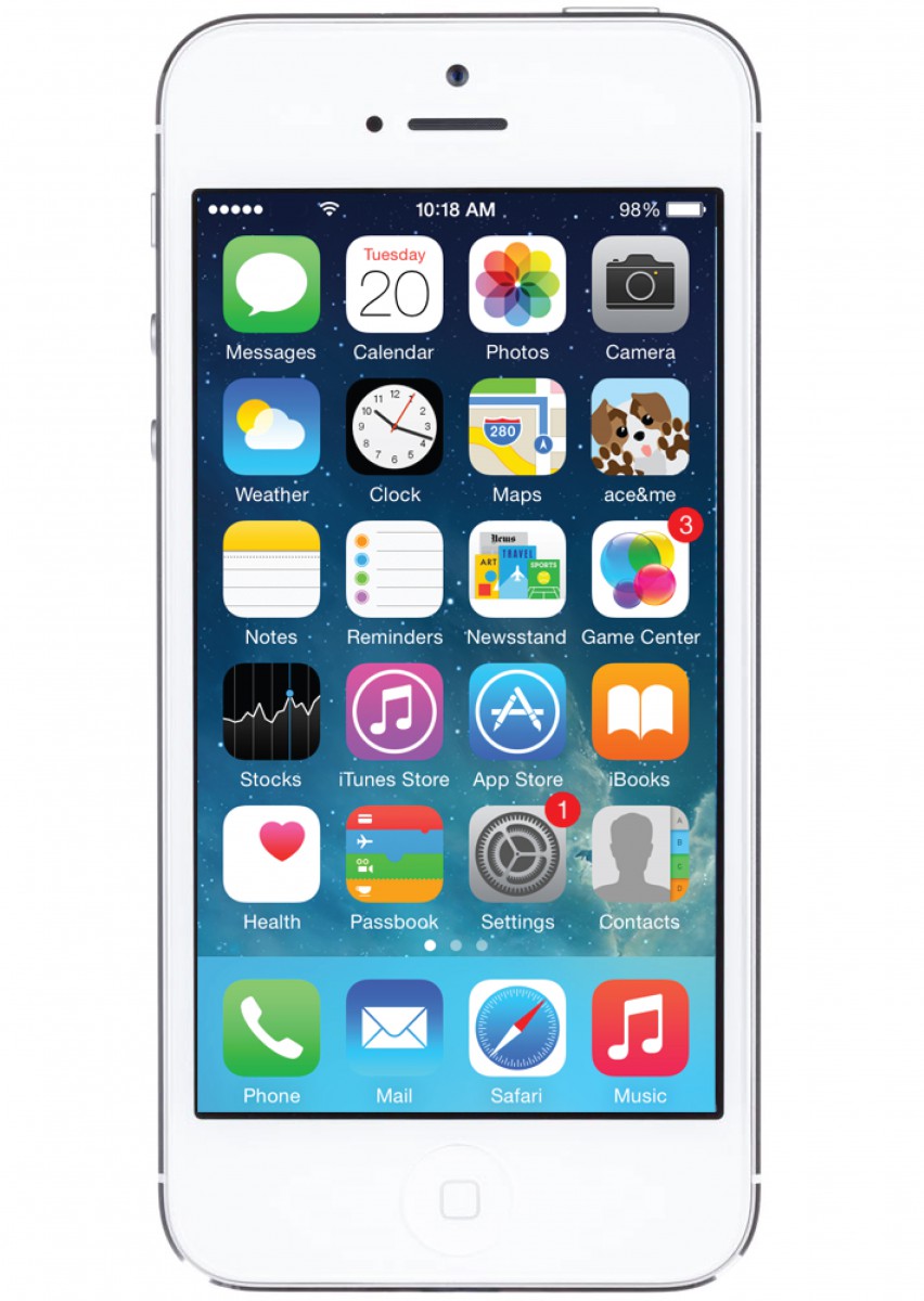
I started planning how the app would look and it actually took me about a week to complete. I originally explained how I wanted the app to have a blue sky theme and this required me to create new animations for certain features. I started with the logo for the app, we didn’t have a name for it so I just called it ace&me as a placeholder until we came up with something else but the name stuck.
I wanted the letters to be very round and to look almost like a cloud and I use the bauhaus font to accomplish this. The apps colors would consist of different shades of blue, and we needed the app have the user be able to figure it out without much help. The app needed a way to have the audience see where Ace would be going once they had settled on which animation was chosen.
I tried my best to have the apps layout be as simple as possible, and when shown to my boss was told it was much better than what we previously received and this is the model we started working off of and improving little by little the next step was to have this animated to fully show the user what the experience would be like.

