
This is the photo i took in class. I love how the light bounces from behind to capture the image. I really like how the flower is positioned and captures that dark but light look.
This is the photo i took in class. I love how the light bounces from behind to capture the image. I really like how the flower is positioned and captures that dark but light look.
Filed under Uncategorized

What i like about this picture is how you can see the water drop on the sunflower very clearly. It is a picture that has a very clear close up view. You can also see the texture and almost feel the sunflower.
Filed under Uncategorized
 i love how this picture came out. i love how you can see the texture and how you can feel it from the picture. i also love how the lighting was angled for the picture. this is the best picture of a flower i have ever seen yet!~
Filed under Uncategorized

I chose this image because I like close up images, this was one of our extreme close up shots for texture.
Filed under Uncategorized

This photo I took was a close up of the sun flower with the water droplets showing on it. The cropping of it focuses only on one flower and the details. The lighting is soft so you can still see the details, but not too much.
Filed under Uncategorized
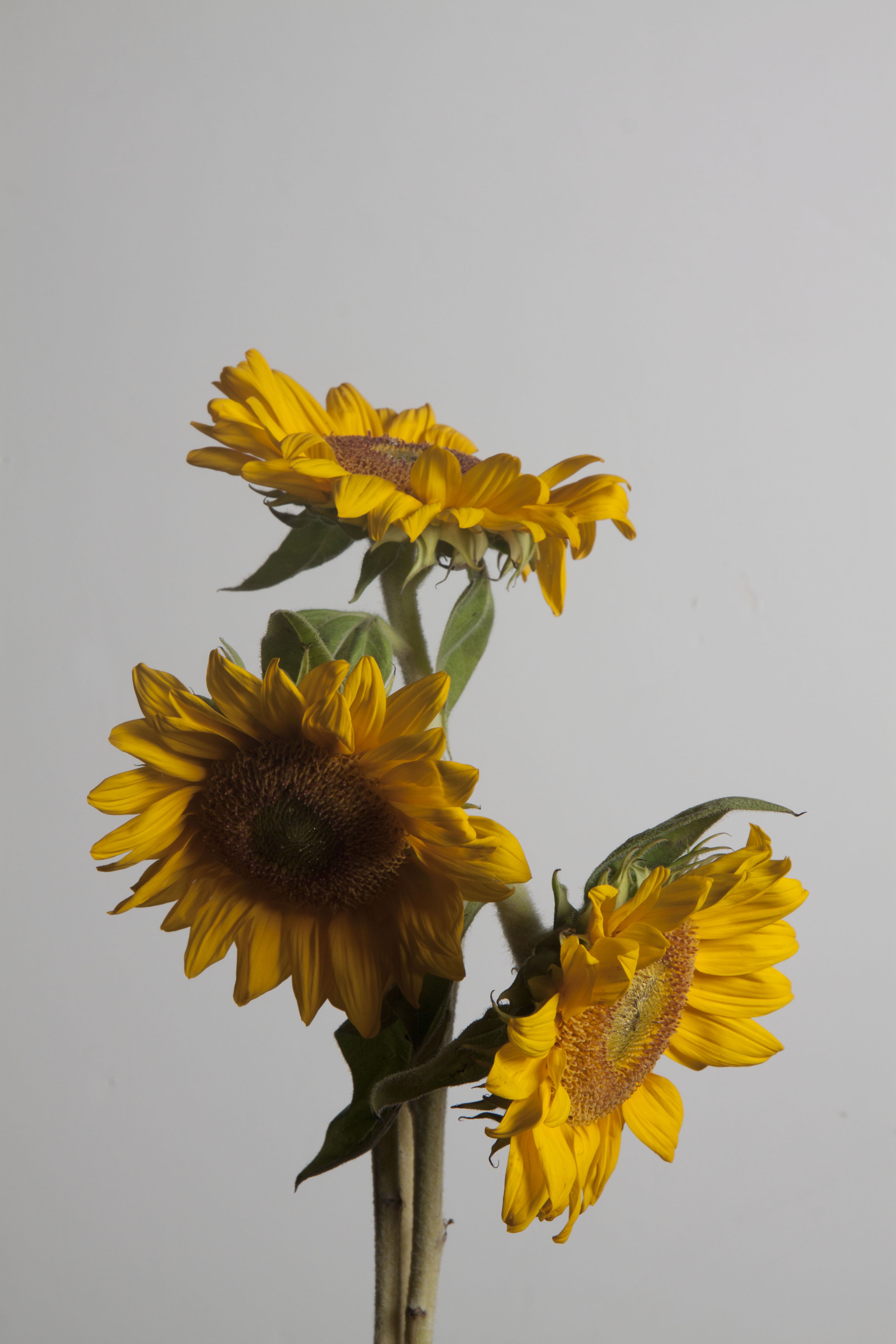
I like this picture of the way the lighting hits the outside of the flower.I also like the set up of the way of the flowers are together as a whole.
Filed under Uncategorized
Today i learned that rule of thirds is the screen divided in to nine even squares. Lighting is key to making dramatic shots for emphasize.IM hoping i learn more that can help me. Today’s assignment was fun.
Filed under learning log 1, Uncategorized
The photograph i Look at was of Bryant Park taking my Jeff Chien.The photo can be used in an ad to show one of the many beautiful parks of new york. This photo conveys the movement of New York by showing the people walking in different directions and also a place of relaxation has you see some people on the left of the photo siting and enjoy the day.He use selective focus to emphasis the beauty of the park by sharping the park and the people are not in focus.The photo has any impact of the movement of living in the city.
Filed under HW1, Uncategorized
Empire State Building, Study 2, New York City, USA, 2006
1. This is a photograph of Empire State Building and other buildings which appear smaller in the photograph and Empire State Building is tall and big.
2. The photographer intentions were to take a beautiful picture, and shows the biggest building in New York at night with all the lights even if the picture is black and white
3. The photograph is sharp overall.
4. No, the photographer kept his distance very good with the picture, it shows a good part of the building and the rest of the smaller buildings behind the biggest one.
5. Yes, graphic elements are important. In this photograph tone such as full scale is used. Straight line is used too, and for perspective is deep space.
6. This photograph also shows that the night is calm and the sky is clear. How beautiful the buildings are at night, and how most floors have their lights on.
7. The emotions in this photograph are amusement and peaceful.
8. This photograph can relate to other photographs done by Michael Kenna, but some of his photographs are a lot different.
Filed under HW1, Uncategorized
Kenneth Melendez hw1
Brooklyn bridge study 1
The photo that shows underneath the Brooklyn bridge taken by Michael Kenna, is the one I chose. It is in black and white, with a grey gradient. It’s the first image in the gallery on her website. This photo is a Landscape, showing off underneath the bridge and the city from a distance. The photographer’s intentions was to capture the beauty of NYC in a full scale tone. The photo shows emphasis on the overhead bridge and city in the background. The technical matters help the image. Overall the photo is sharp and clear. I believe the graphic elements are important. When I look at the photo it has a nice overhead view with the city in the background. The Image is in low contrast and when you stare at the image you can see the city. The photo gives off a gloomy vibe because of the low keys. All of the photos appear the same in tone.
Filed under HW1, Uncategorized
The OpenLab is an open-source, digital platform designed to support teaching and learning at City Tech (New York City College of Technology), and to promote student and faculty engagement in the intellectual and social life of the college community.

