I have learned so much in my photography course this year. I have always seen other photographers work, and wondered how they did it and was also impressed by the image itself; but now I haved learned the skills to do it on my own now. I have learned about the settings on the camera, which I had no idea about before and what they are used for. I also learned how to edit my pictures using Photoshop. I learned how these photographers take our potrait pictures. What I enjoyed doing most was learning how to do shadow depth of field, by moving close to the object and using a wide aperture. I think this makes the photo interesting to me. I also enjoyed painting with light. This course has showed me how to improve my photography and I am happy I can produce good pictures just as good as other photographers or better.
Category Archives: Uncategorized
Final Log Kristina Blum
| During this Course i learned the different types of lighting and portrait and also viewed other Photography work.When using lighting in a photography there are different ways you can place the light for example in a portrait front light is when the camera is directly in front of the light, when you use side light is angle at a 45 degree from the person who you are photography it gives them soft shadows on there face. When using lighting outside you use the sun you move around the object or person to create the different light front , side and diffused. I learned how aperture is what give the camera it light source.I learned that Shallow Depth of field is when only one thing in the image is in focus and extensive depth of field is when everything in the image is in focus. |
Filed under Uncategorized
Grand Finale
As a child I have always been enthralled with photography. For this reason, I am happy that I have gotten the chance to explore a photographers world-finally having the chance to be behind the camera. It truly amazing how the camera lens was invented based on the human eye. Unbeknownst to us, our eyes focuses just like the lens of the camera; no wonder why this invention was created. During these past months I’ve learned various lighting techniques; which was a lot of fun. Additionally, I was blown away by how we can make our bodies look like cartoon characters. Have you ever seen something that you were trying to decipher and you kept saying to yourself, “How did they do that?” Well, thats exactly what I used to say. Similarly, when I went home my children were saying the same to me. I am happy that I’ve manipulated those techniques, because I was able to let my children know how it was done. In the future, I would like to have my own photography studio which is why I am elated that Ive learned all these new techniques.
Filed under Uncategorized
my final log
what i learned in this class was new techniques on how to become a better photographer. i learned interesting photographic tricks like painting with lights, silhouette, portrits.by far my favorite was painting with lights because you can really express your creativity to the fullest with just some lights. i also enjoyed the trips we had so we can get some experience outside instead of being in the classroom for four hours. but overall this was a very positive experience and i learned a lot and recommend it to anyone interested.
Filed under Uncategorized
Final Learning Log
Take stock of the semester. What were the most important things you learned about photography in this class? List and describe three at least three. How will this help you in your career development? What would do you think could be expanded or added to the course to improve it? Please make at least one suggestion.
Filed under Final Evaluation, Uncategorized
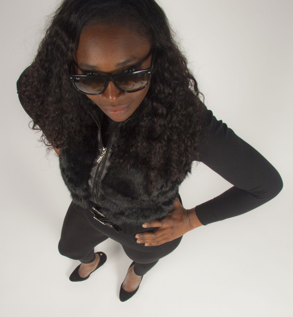
caricature pics
This new style of new style of photographic effects was interesting. The subjects had to look directly into the camera while having fun. With this style ours head look enormous, on the other hand, our feet look minute compare to our heads. It was rather funny to see ourselves in this caricature style.
Filed under Uncategorized
portrait styles
This is an idealistic portrait because it shows the key triangle. In addition, it is effective because the model is looking directly into the lens of the camera making it a strong image. The emotion that the model portray is confidence.
Filed under Uncategorized
Museum Faking It Exhibit
Thompson Truong
Professor Michals
Gra2330
Faking it: Manipulated Photography before Photoshop
On my visit to the Metropolitan museum I’ve witnessed a lot of great works by some of the best photographers and artists around the world. One of the exhibits that caught my attention was the Faking it exhibits. I thought that this exhibit was great and it definitely shows the evolution of photography and retouching.
The Faking it exhibit consists of before and after pictures have been retouched. The most interesting part about this exhibit was how the photos were retouched. Before we had the technology we have today people did everything by hand. Just like the pictures that were in this exhibit. A photo that has definitely caught my attention was a photo by Jim Shaw. He used created illustrations of ordinary people and turned them into bizarre like creatures by retouching them. It is a Gelatin silver print and the photo was created in 1978. The way the before picture was laid out the theme was definitely interesting. The man in the photograph was symmetrical and was looking directly into the camera. The surrounding of that portrait was like a dark tone. While near his body there is sort of a light glow around him. It was surely an intricate photograph. The positioning, the tone, contrast and darkness of the picture captivated my attention and I think that Shaw wanted to capture the audience’s attention like that.
The exhibit showed a lot of great work by different artists and photographer’s retouching photographs. When I walked into the exhibit the first thing I thought to myself was how different the retouching and photography would be in today’s standards. With the technology we have today it is not a surprise that I would compare how a retouched photograph would be done with the programs we have now, such as Photoshop. The picture that I can describe about would be the retouched photo by Jim Shaw. This is the picture that he turned humans into reptile looking creatures. All of this is done by hand and it was done in 1978. I wondered how much time it took him to finish the retouching. The retouched photo showed exactly why the exhibit was called faking it. The head of the human was cropped off and a reptilian like creatures head was put in as a replacement. Every little detail had to be done by hand and I was amazed how things were done back then.
The whole theme of faking it impressed me the most. How we can take a flawed photo to retouch it and make it into a whole new photo. Retouching photos by hand every single detail was fixed by hand and there were no such things as an undo button so if they messed up they would have to redo the work again. The audience they aim for are designers, artists, photographers etc. In terms of a general audience I believe that different pictures would captivate different people’s attention unless you are an artist, designer etc. This is definitely an exhibit to visit for anyone because it shows how much work designer’s put in to get a piece finished and their work should be admired and appreciated.
Filed under exhibit review, Uncategorized
Reflextion
This image captures the essence of its reflection. It is captivating and alluring. It depicts a mirror image brilliantly.
Filed under Uncategorized
Museum
The exhibit in Museum of Modern Art was interesting in way they take the techniques of contrasts and sizes to make an image come alive. The black backgrounds added to the overall feeling of darkness and mystery within most of the images. The image had elements that applied to all viewers like the use of use of highlighting contours of the body and also the movements that person is creating with their body.
One piece that I saw interesting at the exhibit was an image of an eye and cutter on the black background. The black background makes the white background of the eye standout but also pop out. The differences in background bring focus to the reflection of eye and also the original eye with the eyelashes. The eyeball is enlarged and the main attention of the photograph of the eye. The enlargement of the eye gives the photograph the overall feeling of creepiness and fear. The light is coming from the front where the eye is staring at us. It feels like us as viewers are looking through the eye in a way that makes it our one eye just up close and personal. The contrast between the white and black but also the light and dark makes certain elements of the eye stand out and also come alive. The ways the squares are going back in the cutter create depth of field and perspective. It feels like the squares are going back in space. The artist that made this image was Anne Collier.
The second piece that I saw the exhibit as a new take on photography where artist challenged the principles of photography. They take the old techniques and highlighted certain aspects of the photograph. A second piece that I saw interesting at the exhibit was an image of a male driver that seems strong and has a good body. The man’s muscles are showcased in the photograph as he is driving from the platform. The photographer is using sidelight to highlight the contours of the man’s body. In this photo the muscles in the legs were the focus of the image but also the movements. The photo was asymmetrical with the positing of the legs. The leg give impression that the man was about to dive right into the water and make a big splash.
A third piece that I saw interesting at the exhibit was an image of a woman’s face and up to shoulders. This image is the only piece in color. The pose is very interesting and creates an asymmetrical composition. The woman is not seating in the center which makes the image unique. The colors bring the overall image to life and make it vibrant. The image looks like it was dropped in the water with the bubbles it produces and looks ruined. The eyes are looking away from the camera where we as viewers can only see one eye which introduces a new style in photography. I find the use of image to just make the image really pop and make it the best it can be.
Filed under exhibit review, Uncategorized


