In this class I learned about lighting for portrait shots and how to get the best product in the end. There are three lights used in the shot which are main light, fill light and background light.The main light has the subject facing the camera using softbox. Small, distant light sources cast sharp shadows with high contrast.Large,close light sources cast soft shadows with low contrast. A second light is fill light which adds light to the shadow or until side of the face using a reflector.Background light is the lighting the background separate from the backgrounds.It add depth to the photograph.I also learned about exposure which can make a picture either darker or lighter.Exposure tells with ISO, aperture and shutter speed. Slow shutter speed deals with big light and capture unique movements whereas fast shutter speed deals will small light.This class taught me alot about the principals of photography and their elements for editing.When it comes to my career and editing images all these skills that I learned in class will come in handed.
Author Archives: college126
Museum
The exhibit in Museum of Modern Art was interesting in way they take the techniques of contrasts and sizes to make an image come alive. The black backgrounds added to the overall feeling of darkness and mystery within most of the images. The image had elements that applied to all viewers like the use of use of highlighting contours of the body and also the movements that person is creating with their body.
One piece that I saw interesting at the exhibit was an image of an eye and cutter on the black background. The black background makes the white background of the eye standout but also pop out. The differences in background bring focus to the reflection of eye and also the original eye with the eyelashes. The eyeball is enlarged and the main attention of the photograph of the eye. The enlargement of the eye gives the photograph the overall feeling of creepiness and fear. The light is coming from the front where the eye is staring at us. It feels like us as viewers are looking through the eye in a way that makes it our one eye just up close and personal. The contrast between the white and black but also the light and dark makes certain elements of the eye stand out and also come alive. The ways the squares are going back in the cutter create depth of field and perspective. It feels like the squares are going back in space. The artist that made this image was Anne Collier.
The second piece that I saw the exhibit as a new take on photography where artist challenged the principles of photography. They take the old techniques and highlighted certain aspects of the photograph. A second piece that I saw interesting at the exhibit was an image of a male driver that seems strong and has a good body. The man’s muscles are showcased in the photograph as he is driving from the platform. The photographer is using sidelight to highlight the contours of the man’s body. In this photo the muscles in the legs were the focus of the image but also the movements. The photo was asymmetrical with the positing of the legs. The leg give impression that the man was about to dive right into the water and make a big splash.
A third piece that I saw interesting at the exhibit was an image of a woman’s face and up to shoulders. This image is the only piece in color. The pose is very interesting and creates an asymmetrical composition. The woman is not seating in the center which makes the image unique. The colors bring the overall image to life and make it vibrant. The image looks like it was dropped in the water with the bubbles it produces and looks ruined. The eyes are looking away from the camera where we as viewers can only see one eye which introduces a new style in photography. I find the use of image to just make the image really pop and make it the best it can be.
Filed under exhibit review, Uncategorized
Westcott’s Brooklyn Historical Society and Greenwood Cemetery
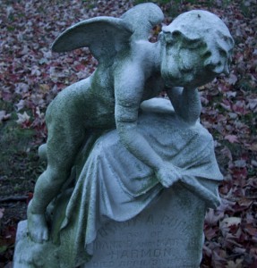
When we went to Brooklyn Historical Society we about the greenwood cemetery like where plots were and stories of some buried there.We also learned about Daguerreotype and old way of photograph processing.I learned about some of the history of Brooklyn.Ultimately I learned the back story to the cemetery.In the cemetery I saw statues of angels and also unique designs on walls. I saw stones but also family of stones where you would see mother and father next to each other and also on top of stone.
Filed under Learning Log 4-Green-Wood Cemetery
Westcott photography format
Daguerrreotypes was a direct-positive process which help create highly detailed images without the use of negatives.It required great care in which the surface of plate used would like look a mirror.When these plates were exposured to light during development hot mercury was used to make the image appear. These plates were put in a solution of sodium or salt and then toned with gold chloride. The exposure time ranged from three to fifteen minutes but these are unique. The cameras utilized a sliding-box design where lens were placed in front. Another slightly smaller box,slid into back of larger box.The photos itself had a reflected present to it where if you move to a certain angle or direction you cant see the image.
Digital pictures are much clearer and have more of a zooming capacity.You make a item that is far seem close and be the main focus right in front.The exposure is faster which means you take a lot of picture with three minutes. The lighting is also better flash but also the professionals light that any photographer can get. There is also no need for film or a dark room.Now a days all you need is a copy to print out pictures. There are all different size lens that can be added to a camera to make the item pop out at you which can create depth of field. Angels can also make a picture be more interesting with the lens and zoom that can be achieved.
Filed under Photography Formats
Brooklyn Botantic Garden HW#4 Westcott
This picture gives a good example of shallow depth of field with the vibrate shade of pink right in focus.In this picture the one flower stands out by its self while the other others are blurred.I also like the light that I captured on the flower petals. It brings out the contours and shape of the flower and petals.The flower in front has its own spotlight while the others are backstage.
Filed under Learning Log 3 (Botanic Garden)
Classwork
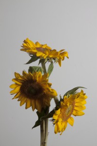
I like this picture of the way the lighting hits the outside of the flower.I also like the set up of the way of the flowers are together as a whole.
Filed under Uncategorized
Learning log
The term that I learned new from today was shadow space.Shadow space means that most objects are close together and seem to be in focus. Our group take a chair top and focused it on the cracks and the bolts of the chair.We also used this picture to emphasize the texture on the chair. The texture was rough and jagged.
Filed under learning log 1
Jessica’s HW1
I looked at pictures taken by Eugene Richard in the stepping through the ashes gallery. I like the eighth picture in the gallery.This picture is of a silhoutte standing against a wall and looking sideways looking at the ash and also whats left of some kind of city or town.This photograph can be an advertsing photograph for times magazines.It can a photograph featured for magazine cover story.This photograph is meant is show a time when things where felling apart.The photograph is dark with mostly high key tones and high contrast. The photograph shows extensive depth of field and is filled with direct light. Everything in the photograph is all in focus since the lighting gives the whole photo a darkness and blackness shade. The lines in the photograph are diagonal with a shallow space. The figure has a positive space with the shadow being isolated and standing out in front of the background of buildings being taller and the most important element in the overall picture.The buildings or cities are faded into the background but still important because it stills helps tells the story behind the photo. The photo gives a physical and emotional impact of sorrow and heartbreak. This photograph relates to others ones in the same series because all the photos deal with sorrow and tragic with the dark colors and their shadows.
Filed under Homework


