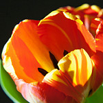
This picture is an extreme close up and the flower is taking up the whole shot. The dark background brings out the light and the colors pop. With this photo we used a spotlight at the side creating a side light which helps cast shadows trough the petals. We also see reflected light showing the texture of the subject. I love that you can see the beauty of the whole flower. You can see small bits of green. The light brings out the yellow, orange. and red in the petals. You can see into the flowers also making you have a 3D perspective.
-
Recent Posts
Recent Comments
Categories


The flower is tightly framed. I agree that the black background makes the bright flower stand out.