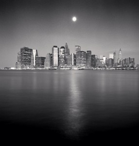
Moon Over Downtown, New York City, USA, 2006
The picture shows a beautiful skyline of downtown New York City over a body of water. The picture’s alignment is perfect with the extra reflection streak of the sun/moon on the water. I think Michael Kenna is trying to show the beauty of New York City from a distance because people think of the city as loud, overcrowded, and busy. But from afar NYC looks just like every other landscape and can look peaceful from a distance too. When I look at the picture, I feel a sense of freedom and peace.
According to Steve McCurry’s formal elements of a photo, the most obvious and noticeable element would be the 9th one, symmetry. If the photo is split in half, the viewer would be able to see half of the sun/moon and its reflection on the water and there would be buildings on both sides too. Another element that’s present would be the 7th one, contrast of light and dark. The sun, the reflection, a few buildings, and the light in the background shows contrast to the dark part of the water, the sky, and the other buildings. A last element that can be seen is the 2nd one, leading lines aka perspective. The reflection of the sun/moon on the water leads the viewer’s eyes towards the buildings with its one point perspective. The land is the horizon line and the building in the center of the photo stands as the vanishing point.


One thing we haven’t talked about in class is the placement of the horizon in a landscape or cityscape photo. Classically, the horizon is placed right in the middle. In this photo, Kenna places it quite high. This emphasizes the water and makes the city look kind of small and vulnerable.