A Timely Study: A Statistical Study of Daylight Saving Time and Crime

Here is a timely story, given that we set our clocks back over the weekend for Daylight Saving Time.  NPR had a segment this morning titled “Study Sheds Light on Criminal Activity During Time Change“, about a statistical study by two social scientists which indicates that the Daylight Saving time change leads to an increase in crime.

If you’re interested:

  • Listen to the 4-min NPR segment: 
  • Read this phys.org summary of the study. An excerpt:

    Researchers are no longer in the dark about when criminals are most likely to attack. William & Mary economist Nicholas Sanders teamed up with the University of Virginia’s Jennifer Doleac to study the connection between Daylight Saving Time and criminal activity. They found that when it comes to crime, that one-hour shift makes all the difference.

    Sanders, assistant professor of economics, explains that it’s axiomatic that some criminal activity is highest when it’s dark. Whether they know it or not, the trip home for commuters is riskier during the winter months, as deepening dusk makes them easy targets for muggers and other robbers.

    But just how big is the Daylight Saving effect? To answer the question, Sanders and Doleac focused on the hour where daylight is most affected by Daylight Saving Time. They used data from the National Incidence-Based Reporting System (NIBRS) to track hourly crime rates over the course of the three weeks prior to and following the day on which we set the clocks ahead. Sanders and Doleac found that robbery decreased by 40 percent in the hour most impacted by Daylight Saving Time—that hour that was dark or twilight in Standard Time, but is still daylight when DST kicks in.

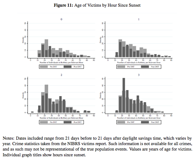
  • If you’re really interested, take a look at Sanders and Doleac’s paper, “Under the Cover of Darkness: Using Daylight Saving Time to Measure How Ambient
    Light Influences Criminal Behavior
    ” [pdf].In particular, look at Sections 4 (“Data”) and 5 (“Empirical Strategey”), and also some of the figures.For example, shown below is one of the figures consisting of a series of frequency distributions, which the authors discuss in the text of the paper as follows:

    Figures 9 through 11 show demographics of victims from reported crimes during the four hours after sunset, before and after DST….They fall for victims of most ages during hour 0, but increase particularly for victims in their 20s during hour 3. These graphs jointly suggest, to the extent that there is any increase in later-evening crime after DST, it particularly impacts young adults.

crime

Posted in Uncategorized | Tagged , , | Leave a comment

Halloween Probability Humor

Via George Takei–a timely cartoon since we’ll be talking about normal distributions next week!

1450192_786162574746531_1138835235_n

Posted in Uncategorized | Tagged , , | Leave a comment

Book: “Statistics: A Very Short Introduction”

If you’d like to get a more conceptual overview of the topics we’re studying, you could take a look at this book:

statistics-veryshortintro

The nice thing is that you can access an electronic copy of this book via the CUNY library–try this link.

Here is description from the publisher:

Statistical ideas and methods underlie just about every aspect of modern life. From randomized clinical trials in medical research, to statistical models of risk in banking and hedge fund industries, to the statistical tools used to probe vast astronomical databases, the field of statistics has become centrally important to how we understand our world. But the discipline underlying all these is not the dull statistics of the popular imagination. Long gone are the days of manual arithmetic manipulation. Nowadays statistics is a dynamic discipline, revolutionized by the computer, which uses advanced software tools to probe numerical data, seeking structures, patterns, and relationships. This Very Short Introduction sets the study of statistics in context, describing its history and giving examples of its impact, summarizes methods of gathering and evaluating data, and explains the role played by the science of chance, of probability, in statistical methods. The book also explores deep philosophical issues of induction–how we use statistics to discern the true nature of reality from the limited observations we necessarily must make.

Posted in Uncategorized | Leave a comment

The Combinatorics & Probabilities of Powerball

On the exam last week I asked you to calculate how many different entries there are for the New York Lottery’s Powerball game, given the following instructions from on “How to Play“:

Fill in your choice of five numbers from 1 to 59 in the upper section of a game panel and select one Powerball number from 1 to 35 in the lower section of the same game panel.

Assuming that the the five numbers from 1 to 59 must be chosen “without replacement,” i.e., the same number cannot be chosen more than once, and that the order of the five numbers matters, we arrived at the following answer:

(59*58*57*56*55)*35 = 21,026,821,200

Just to review: the first part, in parentheses, is the number of permutations of length 5 taken from 1-59; in the notation of the book, 59P5, or often written as  P(59, 5)–think 59 choices for the 1st number, times 58 choices for the 2nd number, and so on.  Then P(59, 5) is multiplied by 35, for the 35 different choices for the Powerball number.

But as we subsequently discussed in class, it turns out that the order of the five numbers does not matter, i.e., we want the number of combinations of size 5 taken from 1-59: 59C5, or C(59, 5).

(That the five numbers 1-59 are chosen without replacement, and that they are chosen without regard to order, is clear from the format of the Powerball playcard. You fill in your 5 choices in the red-shaded part–so you can’t pick any number more than once, and you don’t specify any order:

Powerball Playcard


So how do we compute C(59, 5)? As I explained, it helps to think of the number of combinations C(n, r) (of r objects selected from a group of n objects) as the number of permutations P(n, r) divided by how many of those permutations are just rearrangements of each other, i.e., that correspond to the same combination. The latter number is just how many different ways there are to list r objects, i.e., P(r, r) = r!

In terms of the Powerball entries, consider one of the P(59, 5) = (59*58*57*56*55) different permutations of length 5, for example 5-16-27-38-49. But there are many permutations that are equivalent to this if we’re thinking about combinations, i.e., if the order doesn’t matter: 5-16-27-38-49, 5-16-38-27-49, 5-16-38-49-27, and so on. If you think about it, it should be clear there are 5! = 5*4*3*2*1 such different permutations of any given 5 numbers (5 choices for the 1st place, 4 choices for the 2nd choice, etc.)

Thus,

C(n,r) = P(n,r) / r!

or, in the case of the five numbers in a Powerball entry,

C(59,5) = (59*58*57*56*55) / 5!

So the number of distinct Powerball entries is C(59,5) times 35:

35*(59*58*57*56*55) / 5! = 175,223,510

and indeed, on the “Chances of Winning” webpage the given odds of matching “5 + Powerball” is “1 in: 175,223,510”:

Powerball - Chances of Winning

But that table shows that you also win something if you match some of the numbers drawn, and gives the prizes and chances of winning for matching the 5 numbers 1 to 59 (but not the Powerball), matching 4 of those numbers + the Powerball, matching 4, and so on, down to matching just the Powerball.

Where do the chances for those lesser matches come from? That gets slighty more complicated. I’ll come back and write up an explanation of those soon.


Posted in Uncategorized | Tagged , | Leave a comment

Example: CDC & WHO Growth Chart (Percentile) Curves

Here is the CDC webpage for their pediatric growth charts that I discussed in class this week:

Growth charts consist of a series of percentile curves that illustrate the distribution of selected body measurements in children. Pediatric growth charts have been used by pediatricians, nurses, and parents to track the growth of infants, children, and adolescents in the United States since 1977.

The webpage has the following links which contain the growth charts, describe the methodology used to produce them, and recommendations on how they should be used by pediatricians:

It’s worth skimming these documents, especially if you’re interested in health care.

Posted in Uncategorized | Tagged , , , | 1 Comment

Example: Boxplots of Olympic Athletes’ Age Distributions

We have discussed boxplots as a nice data visualization tool. Here is a good example of how a series of boxplots can be charted side-by-side as a way of comparing a large group of distributions. Via a blog called “Stats in the Wild“:

Recently, I saw this pretty cool chart at the Washington Post (I originally saw the chart at this wonderful blog here) about the ages of olympians from the past three olympics.  I commented to myself that I thought it would be more interesting with boxplots of the data, rather than simple ranges, and I also wondered what it would look like if we used data from all of the past olympics.

So, I wrote some R code and began scraping sports-reference.com/olympics to get a data set with all of the olympic athletes from all of the games.  This took me quite some time (and work kept getting in the way), but I eventually got it right and collected the data.

Here are some of the resulting graphs:

Below is a graph of side-by-size boxplots of age for each sport by gender with blue for male, pink for female, and green for mixed competition.  And no the 11 year old female swimmer is not a typo like I originally thought.

Via http://statsinthewild.com/2012/07/09/olympics-boxplot/

The previous graph was kind of messy, so I’ve sorted this one by median age.  Not surprisingly female gymnastics and rhythmic gymnastics have the lowest median ages of competitors while equestrianism has the highest median age of competitor at over 35 years of age.

Click thru to read the entirety of Stats in Wild’s discussion of these and a couple more charts.  Also compare with the original Washington Post chart that Stats in the Wild references and was inspired by, which shows only the range of each age distribution (i.e., max and min values), and note how much more information about the distributions the boxplots give you.

Posted in Uncategorized | Tagged , , , | Leave a comment

Example: Map of NYC Household Median Income by Census Tract

We’ve discussed the median as a measure of central tendency of a distribution. It’s often used with income data. For example, a headline in the NYTimes a few weeks ago was “Median Income Rises, but Is Still 6% Below Level at Start of Recession in ’07.”  Here is the graph which accompanied the article:

This shows a time series of national median household income since Dec 2007 (actually, it shows the percentage change in national median household income since that initial point).

This data and graph are useful for getting a picture of what happened to US household incomes over the past six years. But looking at national median household income groups together a lot of data–it’s a “coarse” statistic that ignores how household income varies geographically.

Take a look at this map of New York City that WNYC’s Data News team put together, showing “median income by census tract, as estimated by the U.S Census American Community Survey, which questioned a sample of people in each tract from 2007 to 2011.”

You can (and should!) read the accompanying WNYC article, headlined “Census Pinpoints City’s Wealthiest, Poorest Neighborhoods.”

Posted in Uncategorized | Tagged , | Leave a comment

Example: Histograms Showing “The Aging of America”

We discussed frequency distributions and histograms last week, and they will be central concepts in the course. Here are two examples using histograms–both show the age distributions of the US population over time:

  1. From the New York Times: “The Aging of America
  2. Via the WashingtonPost’s Wonkblog: “This is a mesmerizing little animation created by Bill McBride of Calculated Risk. It shows the distribution of the U.S. population by age over time, starting at 1900 and ending with Census Bureau forecasts between now and 2060.”

What do you notice about how the distributions evolve over time? Click thru to either the CalculatedRisk blog post on which this animation first appeared or to the WashingtonPost link to read some discussion.

Posted in Uncategorized | Tagged , | Leave a comment

Welcome to Math 1272/5196: Getting Started with OpenLab

Welcome to the course blog for our section of Math 1272 this semester. The first thing you should do is set up an OpenLab account (see the “Getting Started” instructions) and join the course group.

Posted in Uncategorized | Tagged | 1 Comment