-
Recent Posts
Recent Comments
Archives
Categories
Meta
Monthly Archives: September 2013
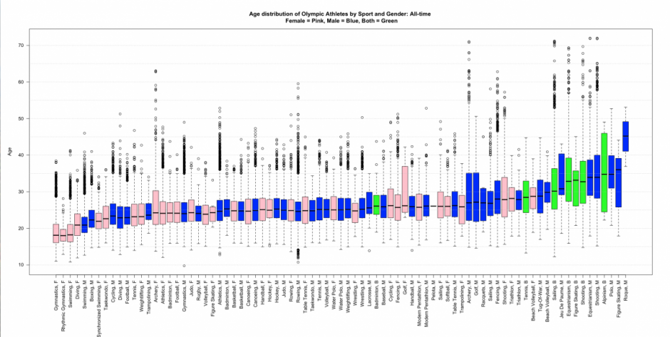
Example: Boxplots of Olympic Athletes’ Age Distributions
We have discussed boxplots as a nice data visualization tool. Here is a good example of how a series of boxplots can be charted side-by-side as a way of comparing a large group of distributions. Via a blog called “Stats … Continue reading
Example: Map of NYC Household Median Income by Census Tract
We’ve discussed the median as a measure of central tendency of a distribution. It’s often used with income data. For example, a headline in the NYTimes a few weeks ago was “Median Income Rises, but Is Still 6% Below Level … Continue reading
Example: Histograms Showing “The Aging of America”
We discussed frequency distributions and histograms last week, and they will be central concepts in the course. Here are two examples using histograms–both show the age distributions of the US population over time: From the New York Times: “The Aging … Continue reading

