We discussed and illustrated in class how to use the =FREQUENCY spreadsheet function to calculate a frequency table. Here are some more details about the inputs and outputs of the function:
Recall that =FREQUENCY(data, class_endpoints) calculates the frequency distribution of a one-column array (“data”) into specified classes, where the class intervals are defined by the list of “class_endpoints”.
The output of =FREQUENCY will be a vertical list of frequencies of length one more than how many “class_endpoints” are input, since the final value is the number of elements in data greater than the last class endpoint.
But how do the list of “class_endpoints” define the classes? The numbers in the class_endpoints split up the number line into a set of intervals, and then =FREQUENCY uses what’s called the “right-endpoint inclusion convention”: the right-endpoint of each interval included in the interval.
For example, =FREQUENCY(A2:A28,L11:L15) takes as input the 5 class_endpoints in L11:L15, and will output a list of 6 class frequencies for the data set in A2:A28, where:
- the first frequency will be the # of data points x in A2:A28 such that x ≤ L11
- the second frequency will the # of data points x such that L11 < x ≤ L12
- the third frequency will the # of data points x such that L12 < x ≤ L13
- the fourth frequency will the # of data points x such that L13 < x ≤ L14
- the fifth frequency will the # of data points x such that L14 < x ≤ L15
- the sixth frequency will the # of data points x such that x > L15
Here is a screenshot of how we used =FREQUENCY in the “Class Age Data” spreadsheet to generate a frequency table:
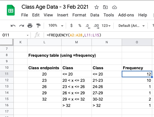
The input “class_endpoints” are the list numbers in L11:L15; we typed two different types of class labels in M11:M16 and N11:N16 (to make clear what the class intervals actually are, and which we could use as labels in a histogram).
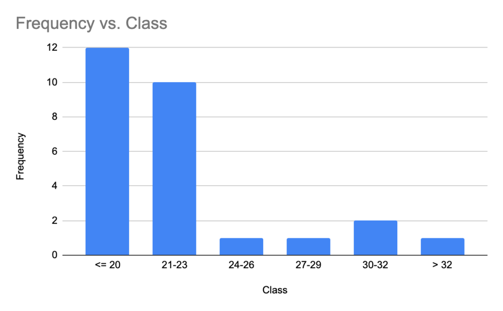
For instance, selecting the region N10:O16 and clicking “Insert Chart” will automatically generate the following histogram.
Note that the class labels along horizontal axis are the nicely formatted ones we typed in N11:N16, and the column headings in N10 and O10 are used as the horizontal and vertical axis labels, respectively!
Here is a very short (< 2min) YouTube video demonstrating how to use =frequency to create a frequency table and the associated frequency histogram in Google Sheets:


Recent Comments