Objective: In this assignment, you will explore the process of sketching and brainstorming to generate ideas for your personal logo. This exercise will help you develop a strong foundation for creating a logo that reflects your personality, interests, and aspirations.
Materials Needed:
- Sketchbook or drawing paper or digital drawing tools
- Pencils, erasers, and drawing tools
- Reference materials (if desired, e.g., images, symbols, or words that inspire you)
Step 1: Thumbnail Sketching
Start creating small thumbnail sketches. These are quick, rough, and small-scale drawings that help you explore your ideas visually.
- For each idea or concept you referenced in your mood board, try to visualize it as a simple, iconic symbol. Sketch multiple variations of each concept.
- Experiment with different compositions, shapes, and layouts for your logo. You can use basic geometric shapes and lines to simplify your ideas.
Examples of logo thumbnails
Step 2: Reflection
- Post your logo exploration (15-20 sketches) in the comments with a summary of how your logo relates to your mood board and the thought process you had while creating your thumbnails (200-300 words)
This sketching and brainstorming process should help you generate a range of ideas and concepts for your personal logo. It’s an essential step in the logo design and brand identity process as it allows you to explore various possibilities before moving on to more refined design work.
Due Monday 9/18


At first my logo was not inspired by my mood board. The initial sketches I made inspired my mood board. These sketches incorporated symbols that I have always identified with such as the symbol of the Sun, a landing space ship, mountains, waves, the symbol of a crescent moon and that of a vessel. My thinking on what image, and what symbol to use for logo only finalized after I completed my mood board. My mood board had many of the elements of my initial logo sketches, be them manifested shapes or negative space. Yet there was something way more concrete, and more complex it it’s expression that made me want create the simplest, the most readable, most resonating and ultimately the most powerful logo I can now create that communicates all that I believe I am as a brand. My final logo design is a simple abstraction of a bird upright in flight surrounded by an oval. Beside it I will use the letter mark of my first and last name, Marcia Jackson.
https://openlab.citytech.cuny.edu/lulucomd2300fall2023/files/2023/09/Sketches-.pdf
My sketches that I created relates to my mood board because I tried incorporating a floral design in my self branding logo. In my mood board I included that I love nature and flowers. I want my logo to be floral themed to show what I like and to showcase who Jessica is. In some of my sketches I used my initial JL instead of using my whole name to show simplicity and adding flowers to add some creativity.
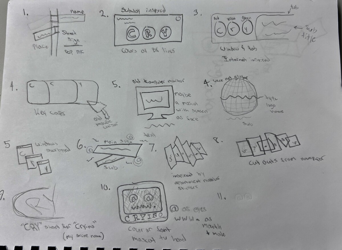
When creating and drafting these ideas for a logo, I wanted to represent NYC and my love for the internet. In my first I tried going for a street sign design that would rep NYC. In my vision, it was going to be tagged up with graffiti and stickers but I think it would be too much. Second is inspired by NYC subway station signs. I used the letters C, R, and Y because on majority of my social medias you can find me as @cryino, my online alias. With a lot of these logos, i’m using both cryino and cry. Short for cryino. I want to use this alias as my brand name because its a future project I want to do with my name. For the rest of logos, I went for a more internet inspired theme for my logo. From computer tabs, windows, net globe, internet explore inspo, and a tv head mascot. My favorite designs from them all are 2, 4, 9, and 10. I think all 4 of those hold potential to be a great logo but will need a lot more revision and work. I am leaning towards more sketch 10 because I did want to include a mascot of some sort in my logo but also because I like the idea of an old tv with “@” as its eyes and “WWW.” as its mouth and beauty mark. It’s the most unique out of the rest and see it being the logo I pick.
 “>
“>
I started with a minimalist line design with just my first and middle initial. I like how the p and s connect together. my mood board was big on connectivity and I also wanted a no fuss clean and elegant theme. I also love type with negative space so i tried playing around with removing aspects of type from the different letters and seeing how they fit together. I always get compliments on my signature so I also tried playing around with that to see how it would look.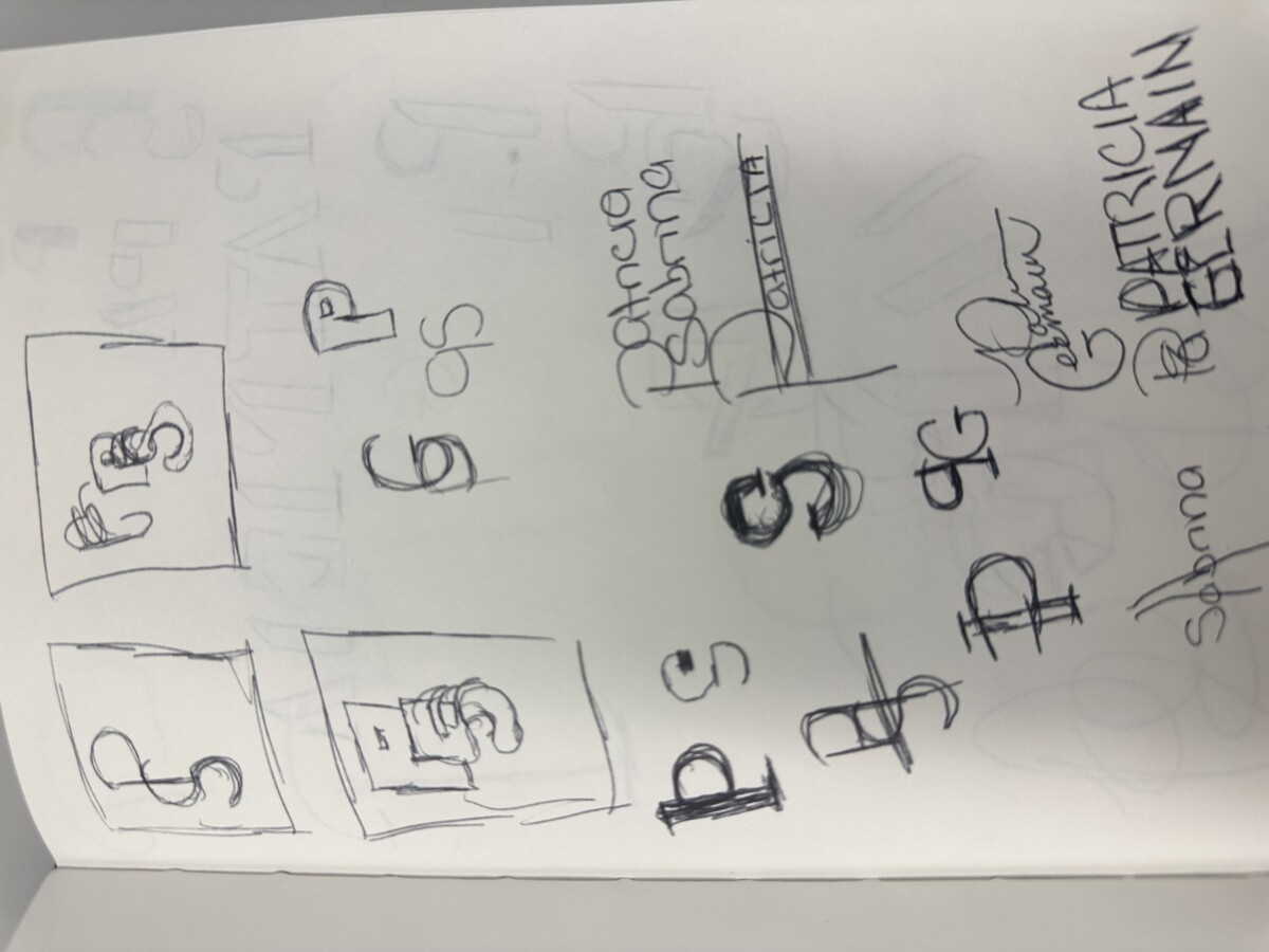
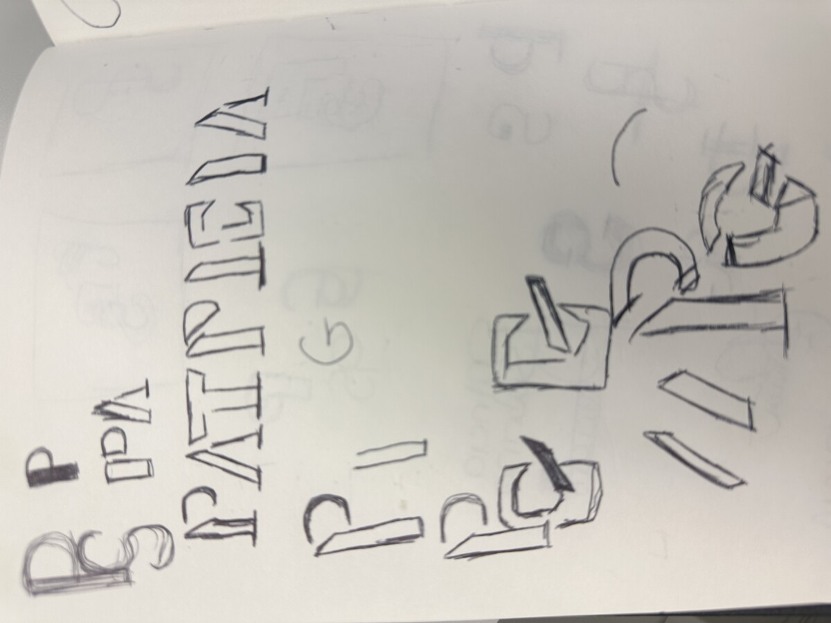
as for my logos the things that inspired me were the beats logo, sound logos. i also have some of the logos that has to do with track such as sketch number 7, 13, and 16.
My sketches came from the concept of my mood board and I tried to tie in all the emotions that my mood board gives off into a symbol that would represent not only myself but also some of the things i’m passionate about. At first the sketches started off with some abbreviations that have the letters SG and BSG. The abbreviations stand for Sneaker Growth and Basketball Sneaker Growth but I felt like my mood board told a bit more about how I like peace and fashion along with the color green. I wanted my logo to stand for motivation and peace while also demonstrating certain things I love as well. As I started to brainstorm more throughout the class period I started think about motivation, luxury, money. At the end I came up with my initials that include a signage of growth and movement in the arrow embedded in the letter M and the initial of my last name (R) with a L underneath it to abbreviate lifestyle and luxury .
In my mood board a lot of examples I chose were simplistic in design and creatively combined different aspects of the specific individual. Whether it is combining their initials or using their nickname in their logo. I wanted to go down a similar path, and combine my initials, T and H, for my logo. To try and accomplish this I tried many different ways of breaking up the letters by splitting them up and seeing where they coil be combined. I have an idea of how I want to do it, I just have to play around with it more and try different fonts and shapes to really find a logo look.
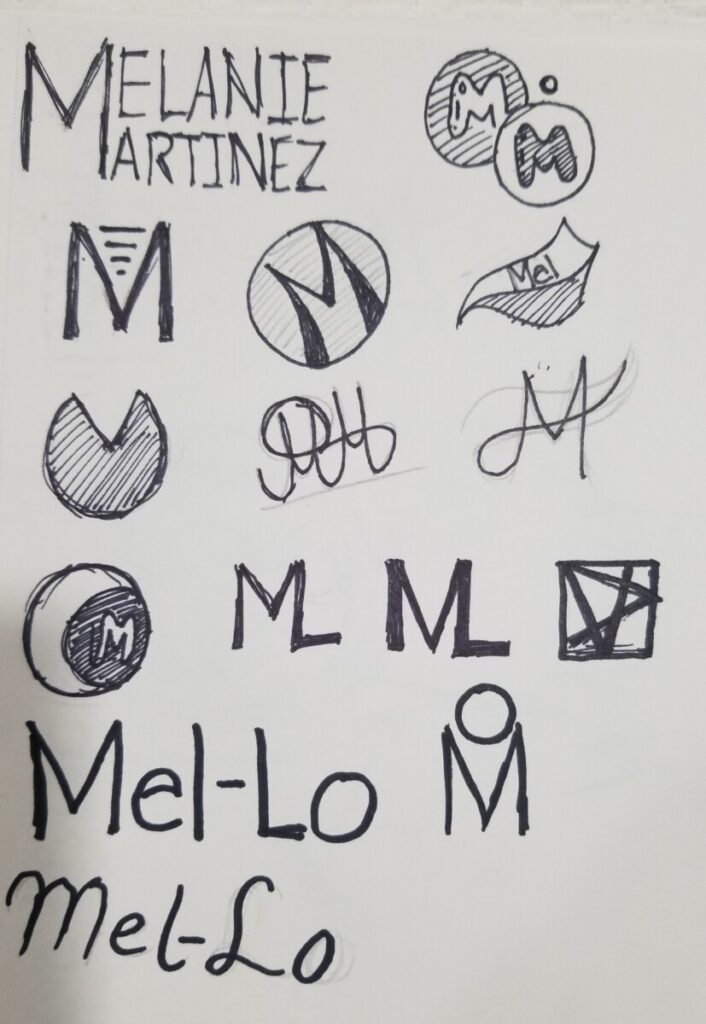
When making these logos I noticed that my logos differed than what my mood board had and what I intentionally wanted. In the making of these logos I noticed how much I really enjoyed doing curves and circles, when my original intent was to have geometric symmetric shapes. When doing these logos I noticed how hard it actually is to make logos. Honestly I still am wondering the name and design for this when designing a logo. At first I was gonna go for my initials M & M but all that came to my head was that m&m’s. It was pretty annoying, but then I decided to go with Mel-Lo. Why Mel-Lo? Well I wanted the M to stay and found out that mellow means pleasantly smooth or soft which sounded great to me. Since Mellow and Melanie have Mel I used that and used Lo at the end. Mel-Lo didn’t sound and look like a bad brand name. Im still figuring these out so its not all my sketches!
The sketches:
 “>
“>