Assignment Description:
In this project, you will delve into the exciting world of personal branding through the creation of a comprehensive moodboard. A moodboard serves as a visual representation of a brand’s personality, values, aesthetics, and overall vibe. This assignment will allow you to showcase your graphic design skills while exploring the intricate elements that contribute to an individual’s personal brand.
Project Objectives:
Understanding Personal Branding: Gain insights into the concept of personal branding and its significance in today’s professional and creative landscape.
Visual Storytelling: Develop the ability to visually communicate a cohesive narrative that encapsulates the essence of an individual’s personal brand.
Aesthetic Exploration: Experiment with diverse design styles, color palettes, typography, imagery, and other visual components to create a harmonious and visually appealing moodboard.
Research and Curation: Practice effective research and curation skills to gather relevant inspiration, references, and visual elements that align with the personal brand you are working on.
Composition and Layout: Learn to arrange and compose various design elements on a digital canvas to create a balanced and impactful visual composition.
Digital Design Tools: Utilize graphic design software (e.g., Adobe Creative Suite Photoshop or Illustrator or InDesign, whatever you are comfortable with) to craft your mood board, showcasing your proficiency with these tools.
Project Guidelines:
Brand Exploration: Research and gather information about the values, aspirations, hobbies, and any other relevant aspects that you want to contribute to your your personal brand.
Visual Elements: Collect imagery, colors, typography examples, textures, patterns, and other design elements that resonate with the individual’s personal brand attributes. (You can gather references for websites such as google images or Pinterest)
Design Composition: Arrange the collected design elements on a digital canvas to create a visually cohesive moodboard. Experiment with different layouts to find the most effective arrangement.
Typography: Integrate typography that complements the individual’s brand image. Experiment with various fonts, sizes, and styles to convey the desired emotions. (doesnt have to be the final font you are planning to use in your final product)
Color Palette: Select a color palette that resonates with the your brand personality. Ensure the colors evoke the intended emotional response.
Examples of mood boards:
Presentation: Prepare a final presentation of your mood board. This can include a digital file (PDF or image) that can be easily shared and a brief description explaining the design choices you’ve made.
Deliverables:
- A high-resolution digital moodboard showcasing your personal branding design exploration.
2. A brief written description (approximately 200-300 words) explaining the design choices you’ve made, the reasoning behind your selections, and how they reflect the your personal brand.
Evaluation Criteria:
Your project will be evaluated based on the following criteria:
Concept and Creativity: The originality and depth of the visual concept that aligns with the individual’s personal brand.
Visual Execution: The quality of design elements, composition, and overall visual appeal of the moodboard.
Coherence: The degree to which the chosen elements collectively convey a consistent and unified personal brand identity.
Typography and Color: The effectiveness of typography and color palette choices in conveying the intended emotions and brand personality.
Presentation and Communication: The clarity and conciseness of the written description that accompanies the mood board.
Submission:
Submit your project as a digital file (PDF or image) along with the written description via the discussions on Openlab.
Post by Monday, 9/11, for in-class discussion
Comments and feedback on other’s posts is highly encouraged.
Remember, this project is not only about design skills but also about understanding and effectively communicating the essence of a personal brand through visual elements. Good luck and have fun exploring the world of personal branding!


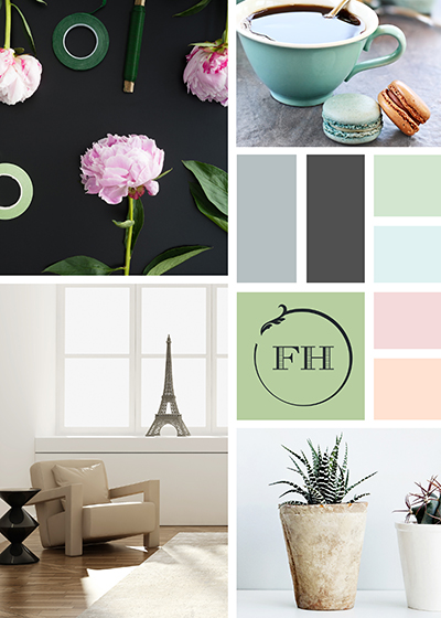
For my mood board I decided to go with the colors white and purple as my theme. The reason I chose purple is because purple is my favorite color. Lavender purple is a elegant and a relaxing color. I use different images to showcase what I enjoy and things that I like to do. For my mood board I made it look aesthetic just like how I want my logo to be. I included my hobbies in the mood board such as music, going to concerts, nature, baking, drawing and sketching, playing games, and lastly going out and getting bubble tea. For my self branding logo I want to show a sense of playfulness, calmness, and aesthetic. To conclude, this exercise has really helped me bring out ideas and concepts of what I want to produce for my brand and logo.
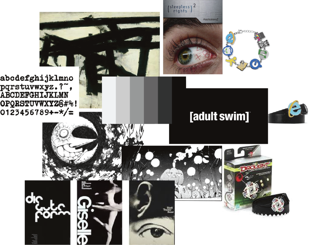
For my mood board, I went for a black and white combination and abstract sort of art. I like the idea of simplicity and abstract combining like making something abstract look so simple or the other way around. And I think black and white goes hand and hand with this combination as well. I grew up liking weird and funky things like adult swim shows, toonami, boomerang, cartoon network, and early internet scene. And growing up till now, I enjoy a lot of old abstract paintings and art that really doesn’t make sense or art that looks weird or creepy but can still appreciate. I always dwell on that pass of the early age of the internet and always loved the nostalgia it brings to me looking back on it.
 “>
“>
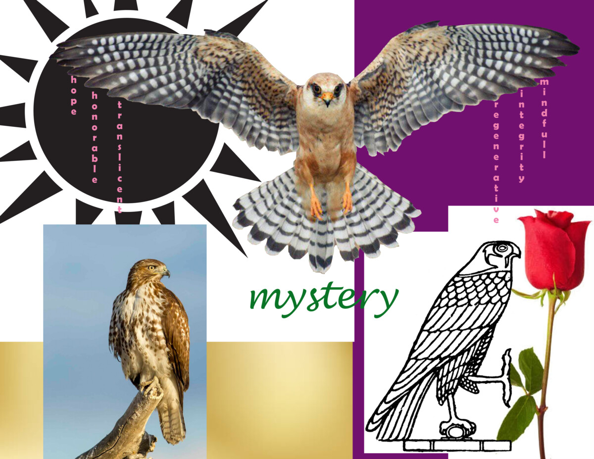
My mood board and my vision for my company are two different forms of expression since the language I speak to myself is different from I want to share on a business card. Thus for this reason my logo will be more abstract than the images I choose for my vision board. However both are symbolic manifestation of what I am all about. The images I use on my vision board are literal symbols of what I want and need. I need freedom, clear vision, bravery, ambition, my intuition, and to see my dreams come true. All are which are represented by the hawk and the falcon. The hawk representing raw power and the falcon representing arial combat and speed. I need gold, because it is the currency of the world, and it symbolizes value. The rose is the romance I appreciate more than gold, and the black sun is my heritage, my worship.
 “>
“>
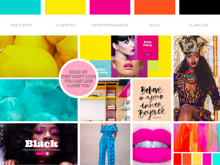
For my mood board I choose themes and aesthetics that fit my personal style. Minimalistic patterns in earthy tones with a pop of color, a non traditional nomadic lifestyle that conveys confidence and freedom. Modern but funky typefaces that convey a element of fun. Travel is a huge part of who I am while still staying connected to home so visuals of my favorite cites was important to add.
Tamaric Hyppolite
Assignment 1: Part A & B Personal Branding Brief
When creating my brand/logo I would like it to be somewhat simple and recognizable. I would consider myself innovative, easy to work with, and reasonable. For my brand I want people to know that I am willing to work with the client as best as I can. If I can, I’d like to use shapes to establish a creative logo or even use letters from my name to accomplish that goal. I like the way some basketball athletes utilize their name or quality about them in their logos. Personally I’d default to black and white for my colors but would be willing to change the colors for whatever purpose. I would definitely use my logo in social media, website, and other branding methods.
I’ve selected these images based on what I like and feel. For my mood board I decided to stick with my go to colors black, white, and blue. Why these colors? I feel like I always see these colors outside especially when its cloudy and rainy and I just love the feel of it. Visually I personally really like geometric patterns, empty wide spaces, and photography
This is a mood board that relates to who i am. i am a sport person that loves the sport Track and Felid. it just made me feel stress free and i really enjoy the sport. i also have the love of music, listening to music helps me calm down and worry less which made me start to DJ.
My first mood board image was just a draft. Here is the final submitted on this date. 09/10/2023.
My mood board is inspired by my love for the renassance era , i. love the idea of love and i hope to experiance real true love one day. i try to romantizise my life as mch as possilbe bc i think there is always someting to look foward to weather that be an iced coffe at the end of the day or a trip youve dreen dreaming about for years.