COMD3504 - Section OL10 - Spring 2021

Author: Or

Or szyflingier_Assignment 9

Connoted – Figuratively- the use of word as its association and not necessarily based on the literal definition. 

Denoted– Literally- the literal meaning of a sign. /. Designate a sign. 

Priori– not basing the theory on observation or personal experience but on a general universal law within a reason. 

Ontology– a combination of concepts in a subject depicting their attributes and relations to one another. 

Metalanguage – multiple phrases, used to describe another language 

I am familiar with the text from Topics In Graphic Design. I read the article, but didn’t have any specific questions or thoughts. It is interesting how there is so much to say about the ad, design, and meaning of the picture itself. I wonder if people would have gotten the true meaning of the ad, and if that ad was success enough to increase sells.

Or Szyflingier_Assignment 7 for April 5

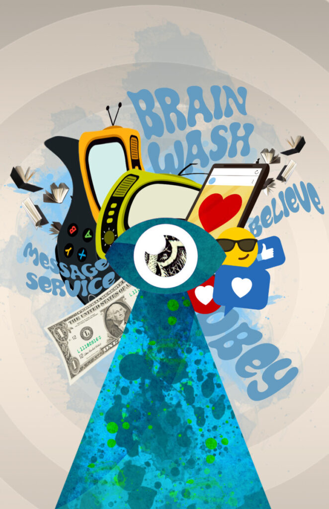
Message Windmill

The Windmill is made with 4 blades, depicted by the different impacts of messages that we get exposed to everyday. The center of the windmill is an eye, and the base of the windmill is a beam that washes the eye with a creative splash of messages designed to convince us that we want or care about something. Messages come in different mediums such as TV’s, social media, video games, books, etc., but there are also many subliminal messages that occur on different occasions such as the owl on the dollar bill.

inspiration:

Or Szyflingier–Assignment 4 for March 8

Based on our reading of Herbert Bayer on typography, it was believed that it is just a tool to serve one purpose. Typography has its own attributes that demonstrate different expressions, and can give different experiences based on the medium it is being used such as magazines, television, or posters. Different typefaces, have different purposes and thanks to the development of technology, designers nowadays have more options, and can experience more. 

However, Typography still doesn’t get the attention it deserves, and people still underestimate the importance of typography, even designers in the 21st century. Based on a report published by the U.S Department of Education, about 54% of the population is lacking literacy proficiency and reading below their level. 

Many people have tried to tackle the issue and have invested millions of dollars in our education system without progress. A research conducted by Thomas Jockin found that in order to improve reading skills, text must be adjusted specifically to the reader– meaning, people can have their own ‘prescription’ if you will. By working smartly with type, adjusting the leading, kerning, or x-height, reading proficiency increased by 20% among the subjects in the research.   

In addition, technology has had a huge role in the way information is now being delivered to the audience. We are able to have photographs with descriptions that allow us to visualize the information, or a film with subtitles so it is more accessible. In the article by Moholy Nagy about Typophoto it is mentioned “Typophoto is the visually most exact rendering of communication”. Social media such as Instagram or Facebook are the perfect examples to demonstrate how people document their lives by uploading pictures or videos along with captions and hashtags.

With that in mind, designers today should be more educated with the way information is received, and the different techniques that help relay information better. Using visuals is helpful, especially when combining visuals with typography. Using the right fonts  would help readers experience the content better, understand the visuals more, and make media more accessible.   

Or Szyflingier_Assignment 3 for March 1

The readings were somehow difficult for me to understand. What the three articles had in common is talking about technology, and how it affected us as artists. In order to develop and advance, artists/ designers must realize their responsibilities in society. Artists must collaborate, examine, and not take everything as granted but think about how to take what we have and make it better based on society. 

When an invention becomes part of everyday life, it is time for a designer to think how to improve. Books back then were only for the rich and educated. However, over time more and more people learned to read and the market  for books increased. Yet, some designers understood the difference between having just words, or having words and illustrations. 

Designers understood that when you have just words in a book, it may not be understood by everyone, where if you add illustrations, colors, shapes, even people who don’t necessarily speak the language may understand what it is about. This way of thinking led designers to understand marketing better. Automobiles became an inseparable part of society, and the demand to read fast grew. Meaning, posters, or billboards, didn’t have to have paragraphs on paragraphs explaining the product or the services, Posters meant to be seeing fast while in motion, therefore with the way technology advanced, it required printing, marketing, illustration, copywriting, or even engineering to step forward. 

With that in my, the Lissitsky_OurBook, reminded me of an issue i’ve heard not too long ago. Many people in the U.S are not reading proficient, as a matter of fact the statistics show the way less 50% of the population is on their reading level/ grade. Millions of dollars are being poured into the education system with no lack. Long story short, a designer noticed that some books have certain typefaces, with specific leading and kerning, which affect reading, especially among the younger generation who’s just learning how to read. 

With a collaboration of engineers, and designers a research was conducted among 20 students, and the results prove what they all suspected. Similar to eyeglasses prescription, students needed their own reading prescription, meaning ‘typeface’, ‘leading’, ‘kerning’, etc. Thanks to the technology we have today, setting a typeface that would be customized to the reader is not as a big deal as it used to be. Now, er can adjust the text so reading proficiency would increase, which only happened thanks to a designer who didn’t take books as what they are, but thought about their responsibility in society, and wanted to improve the product itself based on demand. 
Or Szyflingier_Assignment 2 for February 22

Language can come in various forms, as long as it depicts speech, or represents an idea. We understand the language that we inherit, and the language we inherit is being affected by the environment.  For instance, eskimos can have more than ten words to describe snow or ice, because their survival depends on it. However, people who live in urban areas such as New York, don’t necessarily depend on the condition of ice, or snow and wouldn’t need ten ways to describe it.

What interests me the most is the fact the written language started as pictographs, documenting people’s day-to-day lives. As time progressed language became more abstract and we eventually got phonetic signs. With all the “progress” we made through the years learning how to express ourselves, it feels like we are almost going backwards in time. Emojis are definitely how I would describe; modern pictographs. 

Pictograms are based on physical objects, and as language evolved it became more abstract, and ideograms emerged. Emojis are symbols that represent our feelings, ideas, and we can always group multiple of them to make up complete sentences, or describe concepts better. Pictograms were found on stone tablets and cages, where our modern ideograms, aka Emojis are found on phones and other electronic devices.

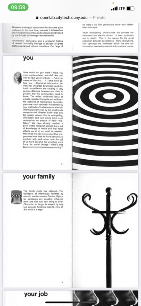
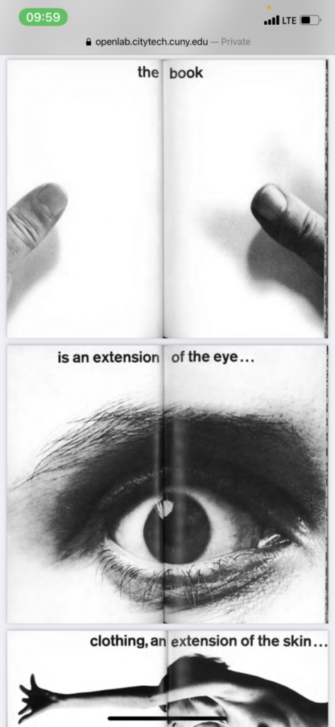
Overall I thought it was interesting how I was reading through the articles, and realized there are so many pictograms and ideograms throughout the whole article of Lupton Miller, called “Design Writing Research”. It is clever how each icon is being introduced separately to the reader, allowing them to get familiarize with the graphics and the meaning. When the symbols/ icons showed again on different pages, readers already know the meaning. I have never saw a book written this way, and incorporating design elements into the text definitely made it more appealing, interesting and fun to read. It feels like the writer kind of made his own language. 

Or Szyflingier – Assignment 1b

Design plays a crucial role as a mediator between functionality, aesthetics, and society that creates balance all around us. Modern artists are called designers, who share a purpose of establishing a connection between art and the public, while being aware of feelings, and needs, they also carry the responsibilities to respond to demand, and solve problems to better life.

Designers are trained to be open minded and thrive on creativity. It allows them to envision products, and scenarios which makes them capable of understanding society’s needs, and solve issues by using different methods and technology. One of the tools that designers use is visual language, which consists of signs, colors, and symbols. They help convey messages in the most sufficient and efficient way, and change based on daily needs. Meaning, back in the 1900’s we didn’t have cars or highways, so the need to use symbols along the road didn’t exist, where now signs are used to direct or even alert drives before they get into a construction zone, or a steep road. 

Along with visual language, technology is another tool that helps empower designers who actually carry the responsibility to engage more culturally, politically, and create thought provoking conversations in manners that are at the forefront such as sustainability and social justice. Designers can advocate, promote, share and even reach out to people from different cultures, and countries. 

And although technology is helpful and plays a crucial role in design, it is also design that plays a great role in technology. Similar to what came first, ‘the chicken or the egg’, we have machines such as X-ray that allow us to see beyond our physical capabilities, and yet a designer had to think, plan, test and build such a machine to answer the demands of people who’re having internal pain. 

Designers carry one main responsibility and it is to keep the world moving. They are always up to date with technology, social issues, and different trends. They help raise awareness, highlight issues, solve problems and engage with society by using a visual language to convey/ deliver a message. Designers think, observe, search, plan, and strategize, so our beliefs, and dreams would turn into reality, so we don’t compromise but advance and learn.