Author: Joshua Steele
Steele – Final Idea
Analyzing the success and message of the Yeezy brand
https://www.businessinsider.com/how-kanye-west-made-yeezy-brand-a-success-2018-4
https://www.instagram.com/yeezymafia/?utm_source=ig_embed
https://openlab.citytech.cuny.edu/langecomd3504sp2020/files/2018/08/Barthes-Rhetoric-of-the-image.pdf
AnalyzationEssay_Steele
March 31st Reading
The author offers a delving into linguistics as far as it relates to advertising, discussing not only the more obvious decisions that we as viewers make on a image, but goes so far as to further break down and specify the layers to our perception of advertisement, frankly, in a way that is important to much more then just advertising. The reading, though difficult, is an important study on what advertisers are truly doing on a technical level, and what the viewers are doing as well. This knowledge is, while not perhaps applicable to every situation, is important back-hand knowledge to understand what it is a designer must aim for in their projects.
The author states “Thus there are four signs for this image and we will assume that they form a coherent whole” here he expresses that though there are multiple ways in which to convey a message, there can be multiplicity as well as singularity in an ad. For example, an ad for coke might show someone drinking it in a glass filled with ice on a beach and the text reads “DRINK COKE” here we have two signs, one is the coke in the glass informing the reader it is a refreshing beverage good for the hot weather, the second, is the command to buy and consume that product. The author identifies four total ways of speaking or rather, conveying meaning to the viewer, but this does not undermine the singular plot of the advertising agency. This basic affirmation, seems to be the continuous plot of the entire writing.
One manner in which the simplicity and complexity of language can be observed in the reading is where the author states “An advertisement… shows a few fruits scattered around a ladder; the caption… banishes one possible signified,” here the author demonstrates how the written language can clarify and constrain the possible interpretations of the art, thus it is important if not needed for proper art.
While this information is less important for junior designers it offers invaluable knowledge for art directors and those who want to become them. One might be able to design well, but not understand the linguistic underpinnings and rules to what they do, thus, in a leadership role they might falter.
Joshua Steele March 24th
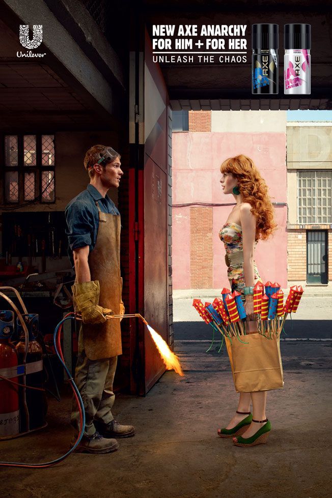 This ad was taken from DavidByrne.com where it depicts a man and woman each in stereotypical garb staring eachother down, the sprays for both are positioned above them, it’s taken straight forward, playing to gender in that without it the contrast would lose meaning
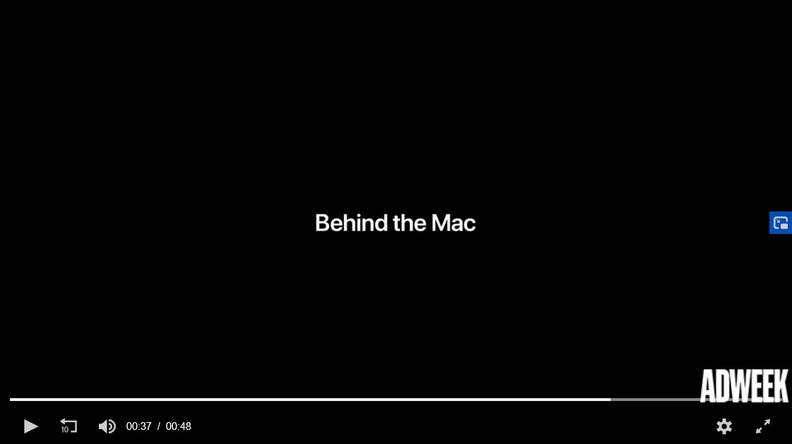 This ad was found on adweek.com, it’s actually a video that can be found here for the MAC computer, where it shows several influential women with MAC computers. It shows the concept of femininity positively without a reference to men, unlike the AXE ad above.
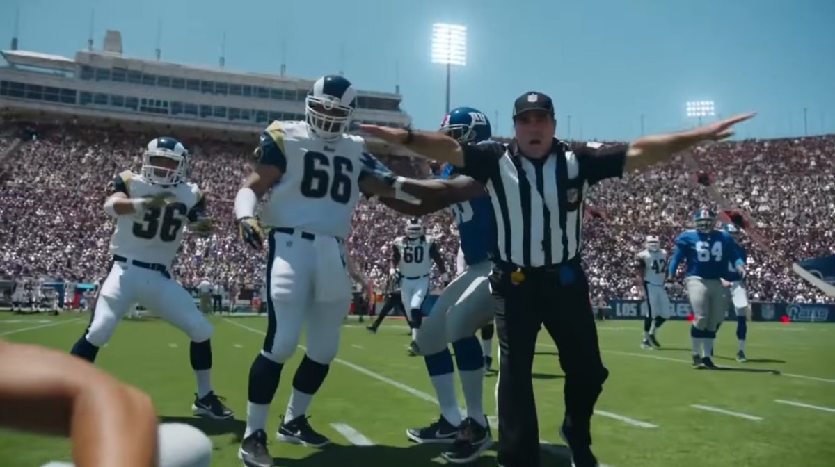 This third ad was a Head & Shoulders ad featuring Odell Beckhams Jr., it can be found here and shows Black hair in a positive light.
McLuhan Reading
Media is everywhere, many people have gone to great lengths to describe, as good or bad, what the effects of our heightened exposure to media outlets might mean for human psychology and experience. In Understanding Media by Marshall McLuhan, the author goes to great lengths to discuss how the new media of sights and sounds, might be being mishandled by our society, even going as far as to say that even previous technologies such as printing had been mishandled, for the simple reason that we did not view them rightly.
McLuhan makes the case that “the ‘message’ of any medium or technology is the change of scale or pace or pattern that it introduces into human affairs” meaning that rather than seeing the content of say, a movie, as the story or music, we should see it for what makes it what it is, cinema itself, what it carries, a story, is something separate. So the author makes the case that for example, a railway does not create anything at all, not movement, not metal, not the sound really, but rather it defines the manner in which people will use it, it exists unto itself and has good or bad effects all its own. To use a railway rather than walk is a restriction, a new kind of movement, but not altogether its own thing as if it were altogether separate, at least, that’s how I understand him.
In this way, when we understand that a railway isn’t a product unto itself but a restriction, a medium, something more abstract like motion, that McLuhan would make the case that a company like General Electric, is in the business of moving information, not something which might be more obvious like lightbulbs which was the more obvious product. It’s a confusing concept to me but it makes sense, what really gets me is where he makes this consistent claim that the “medium is the message,” reading it over though and really taking in the examples that he gives it becomes more clear. A post-it note is a medium by which we define and give shape to language, which is essentially information, so then the post-it maker is not in the business of making post-its so much as he is trying to transfer information. McLuhan would go on to say that every message is a medium, a post-it is a message insofar as it gives shape sound and color to information, it is not passive, but it is a medium for the written word, the characters written give a tone and character to the sounds they represent, whose sounds give character and shape to nonverbal ideas, this basic but dizzying idea he elaborates on in the very first page, needless to say the rest of it was equally if not more complex for me.
Having established this though is crucial to understanding his claims throughout the rest of the piece that mediums are not massive, they all give color and effect to how we as humans interact and while he harped again and again on this point, lamenting how the world did not seem to realize this crucial reality, and making clear that only the artist, someone deeply involved with medium, would be able to know this, I couldn’t find whether or not he thought whether or not something like television was truly evil. He described in grandiose terms how the television and music could take our senses, get inside us, that this was powerful, he likened it to a gun, making it seem much like he was describing some sci-fi mind-control device.
“it is not the incised area that is most affected [by new media]. The area of impact and incision is numb. It is the entire system that is changed. The effect of radio is visual, the effect of the photo is auditory.” what I think he means here is that the addition of a new media outlet changes how everything works, radio is not the same when television is also available because now that information, that sound, is perceived in a world where sound is also perceived with images. I’ll be honest, it’s something that mostly flies over my head, he goes on to discuss how society doesn’t usually make any effort to shift or change when a new medium is adopted, except by artists, he seems to again see this as dangerous, irresponsible.
It reminds me of previous topics we’ve discussed like responsibility in design, the role that we play, especially since our work is generally mass-market, in how society at large will take in and experience the world, but this also brings to mind the question of whether the author was too inward in his thinking, he never goes on to consider teaching the masses, he seems to consider the artist an expert all his own, one who carries a weight, a responsibility, a great power. Perhaps, this has something to do with, in these many readings, can only be described as a much larger ego held by those in what would come to be seen as design fields, with professionals wanting to create new and more perfect mediums for communication or bring in a new age of human experience all together, these efforts ultimately having either failed or mostly failed with their good bits taken in and adopted. Was this author more of those failed ramblings, watching as the world changed so rapidly and in that confusion making grandiose judgements and statements, not unlike say, Pope Pius IX against what he knew as modernism, rationalism, against what was a more traditional world. In contrast, maybe us designers are the ones who simply have a small perspective, thinking about how to keep a jpeg the right size but not considering the wider cultural and artistic impacts of what we do, or maybe should be doing, are they thinking too large or are we thinking too small, or is the answer more inbetween, and can I afford to find the answer while living in a city rampant with gentrification and a pandemic?
Towards the end he likens human society today, maybe thinking of America, with that of the Romans and Greeks, he states “the strange falsification of history by archeology, insofar as the survival of many material objects of the past does not indicate the quality of ordinary life and experience at any particular time. Continuous technical improvement in the means of warfare occurs over the entire period of Hellenic and Roman decline” here seemingly making the case that we shouldn’t be too optimistic about new ways to describe and shape information so much as we should be stewards to society always on the lookout, knowing that this is no indication of us actually doing well as a society and, I would infer, as designers in general. A VR advertisement might be a million times worse, more damaging, and ultimately be backpedaling, even from 1980s magazine ads, at least I’d imagine that’s an argument he’d make.
Ultimately I agree with him more then I disagree, but that might also be because I don’t really like all the different ways the world screams at us, I like print, I prefer it, so what I understand from this reading already sides with what I already think, even so it goes in areas I wouldn’t think of and this is a reading I want to go over more.
New Perspectives on Type
Reading over the different excerpts I found that the idea of innovation became increasingly common, in Typophoto the writer laments the past use of type and looks forward to a new innovative realm where video reimagines the role of typography in the world. Gropius’ “The Theory and Organization of the Bauhaus” goes over the more educational side, the way in which they go over how limited experience can stifle creativity, and that the designer needs to understand and experience many things in order to be proper. In “On Typography” the writer goes over a mesh of both, the new diciplines of designers, as well as the horizon that is new media.
What does this have to do with us, how does it relate to what we’ve already learned? The sources are a bit old, we know now, especially from reading some of the “Graphic Design Theory” book, that some of their ambitions fell flat, the new era of design either did not come or did not come as fast as they thought, the new era of design and type a universal system of communication, didn’t pan out, however it’s hard to reject how with the biological and scientific approuch that some of these articles take, that their push could simply have been premature rather then entirely misguided.
We know that type and books are taking on weirder roles today, more niche roles, why not have an entire book written in those paragraph fragments, ink must be getting cheaper, why not darken the page of a very large book up a bit? While the status quo of an industry is hard to break, surely, it can only be a matter of time,perhaps we can be the ones to push it? The question might be how, not for some delusions of granduer where the world is forever changed, but for the real and humble goal of better communication, and ease of comprehension? How could be bring that about?
Perhaps as art directors or even as freelance artists people could get together and work on a project, a book of poetry in a new typographic layout, or a large book in the darkened pages, maybe try for a cross between a book and a photo album using typophoto? I’m not sure, but these excerpts bring out an optimism and a creativity that I can’t help but indulge.
Language and Design Culpability
Reading this article I was yet again stuck wondering what it had to do with Communication Design, but yet again, was surprised at how well it fit, the writer first going into what linguistics was and how it differed from other scientific ventures, defined language and then moved onto the main topic which was the abstraction and nature of language.
The writer makes clear, spoken language is only one small part of a wider whole that is language, where we take certain things, assign meanings, and then communicate them, a physical process by someone takes note of a physical phenomenon and attaches meaning. The writer makes clear, the relationship between the physical sounds and the meaning that the receiving party pulls from them is completely arbitrary, the idea of a car, and the signs and sounds associated that we use to communicate the idea of a car, are not the same.
How does this relate to design? In the recommended class book “Graphic Design Theory” as designers we collectively, through the universality and remixability of design, play an integral role in what signs and symbols are associated with such and such a meaning, part of our responsibility might be to safeguard language, as it is produced on a massive scale, cheaply, though we often claim no authorship, still play an active role in creating the environment that the author states will be inherited by the next generation to then pass on and build upon themselves.
A clear question arises from this of course, how can one without authorship truly be a steward over their career? Is the lack of an individual mark jeopardizing our language, since we can remain anonymous, and not own up to the work we do and are a part of? I don’t mean to be over-the-top, would the “detached neutrality of the International Style” promote disregard for social responsibility?
Reflection: Counting Sheep
Day to day I never really spend time thinking about the alphabetic system that we use all day, the way the words look, the history of the glyph and so on, especially in different cultures, the relationship of that with numbers is another history that I never bothered to look into. The article “Counting Sheep” goes over in great detail not only a short history of both, but also the psychology of both, moving from how tally systems relate to how we think of values in relation to objects, to the psychology surrounding image association with Freud.
One part of this large document that really had me thinking was where it made the statement that depending on the times, many civilizations had made a shift from seeing the quantity of an object as central to the object’s character, to those two being separated, the author even goes so far to say that this would make the value abstract. It’s the kind of stuff that only someone specializing in these fields would think of.
The idea of a number, a value, separate from an object, making values abstract, seems something very interesting to me, and upon thinking back on how that might effect design it brought about something new in my mind, really, that system is designed, sure it’s not graphic but it showcases a manner of communication, this one of values and amounts, designed in icons and style in a numerical system. As a graphic designer, my first thought is to wonder “What about color? What about shape?” but the first thought here, at least from the outside looking in, is how does this make me think of it, what are the underlying assumptions, how would I live my life only knowing this particular expression of a universal fact?
It reminds me a bit of how some language, I can’t think of it on the top of my head, has two words for blue, some languages, older ones, don’t have words for colors we do, some divided the spectrum differently, so it calls to mind, what role to designers have in affecting how people think? As a graphic designer my end usually comes in making some text larger or a color brighter, to change how the tone of a poster comes out, or changing the font, maybe make it round to seem fun or a sans-serif to keep it neutral. This article then kind of just brings to the extreme what I already do on a smaller basis, and brings new meaning to it, a new reverence.

