Author: Paulina Tipantasig
Paulina Tipantasig- May 5th

Milner, John, and Kirill Sokolov. “Constructivist Graphic Design in the U.S.S.R. between 1917 and the Present.” Leonardo, vol. 12, no. 4, 1979, pp. 275–282. JSTOR, www.jstor.org/stable/1573888. Accessed 5 May 2020.
“The Life and Work of Paula Scher.” Paula Scher, garwin00.github.io/paula_scher/.
“Paula Scher.” The, 26 Sept. 2019, www.the-artists.org/paula-scher/.
“ABOUT THE PUBLIC.” Public, publictheater.org/about/About-The-Public/.
“The Public Theater – Story.” Pentagram, www.pentagram.com/work/the-public-theater/story.
Paulina Tipantasig – April 28th
Steven Heller, the most prolific design writer says that underground designs have a great impact into the mainstream because it takes egotistical ideals and advertise them. As the article states, many futurists and constructivist masterworks were self advertised for their new ideas. Back in time many art related concepts were later adopted into mainstream. They come into the idea that what was old and forgotten should be remodel in a way that consumers would want to use or buy them and benefit from those ideals. Underground is just a broad term that can include many things like bands, art pieces and more. The main idea is to alter or disrupt the main message of the things like culture jamming. While mainstream are the ideas, attitudes, or activities that are normal or conventional of what is called “trendy.” The mainstream leeches’ alternative cultures but the underground takes ideas from the mainstream in a tactic to disrupt media culture and consumerist leading them into false reality. As the article says, magazines were examples of the underground where they caricatured and disrupted, the main message of things which was made it into a non-real message. Underground idealists can modify ideals altering or joining the mainstream and a significant amount will follow because people mainly go towards the things that are trendy or cool.
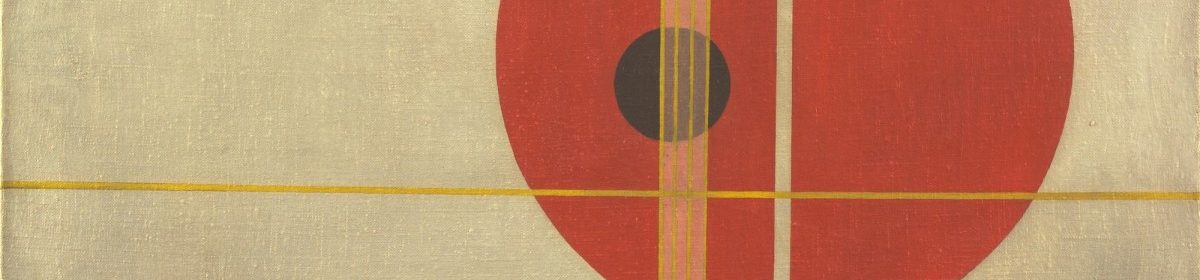
Paula Scher, the designer as well as the designs made for The Public Theater were all influenced by the constructivism which in this article is touch as Heller said that they self-advertised for their new ideas, their main point was to remodel and create the new. In “Carnival Modern,” Heller says that the underground that can be anything which was known before produced effective advertising into the mainstream, he stated that Scher’s campaign for the public theater was influenced by some artists,“ Like a work of Russian Constructivism, they embodied the design attributes of balance, harmony, and proportion, demonstrating that flat colors and sans-serif typefaces resulted in eye-catching designs.” This quote demonstrates that the underground alter or disrupt the main message from the old constructivism to the new constructivism that Scher implement in her work for the public. She got influenced by constructivists to advertise her work, but in her work she tries to implement something new by including a variation of flat colors such as red or yellow or even green or other colors, also a variation of sans serif type in which Scher plays with its boldness and thickness, location and position, which eventually contributes to the eye catching to the public theater audience.
Scher wanted to create a new message for the theater, so the best way for her to do that was with type usage. In the article named, “Street Theater,” Heller said “Scher believes that the best way to communicate to New Yorkers is to SHOUT. “What better way to get a message across than for someone to yell something like ‘I’m pregnant!’ down a corridor; it’s better than the Internet,” she says. And this is exactly how she designs for The Public: She SHOUTS with type.” In this quote, she illustrates the main message and point of her designs as well as the identity that the theater will have which is to Shout out the normal. But, as she said it was made for New York, which is a city that contains millions of people, but what if people from other countries or cities wanted to go there, maybe one has to be a New Yorker to truly appreciate the impact of The Public’s language on the public. It is not a hidden idea to the society that Scher made for the Public Theater, Montgomery talked about the latest release from the design publishing powerhouse Unit Editions that looks at the niche but rewarding subject of combining typography and images. In “Type and Image”, Montgomery said “Type Plus looks at how designers use graphics and type together to Cyturbo-charge meaning and impact’. This is demonstrated through examples such as Paula Scher’s striking 1990s posters for the Public Theater.” This quote tells that another idea from this designer was to have a combination of image and type in her posters to get into the mainstream of what public would not avoid seeing, she wanted to be more innovative, to put the theater to trendy standards. Scher mainly contain the message to shout out from the normal, but at the having the mainstream from what was normal seeing and implementing some type of ornament into her designs that were influenced by constructivism.
Heller, Steven. “Carnival Modern.” Print, vol. 51, no. 6, Nov. 1997, p. 112. EBSCOhost, search.ebscohost.com/login.aspx?direct=true&db=eue&AN=498617&site=ehost-live&scope=site.
Heller, Steve. “Street Theater.” Print, vol. 50, no. 3, May 1996, p. 29. EBSCOhost, search.ebscohost.com/login.aspx?direct=true&db=eue&AN=9609220725&site=ehost-live&scope=site.
Montgomery, Angus. “Type and image.” Design Week Online, 18 July 2014. Gale General OneFile, https://link-gale-com.citytech.ezproxy.cuny.edu/apps/doc/A375443429/ITOF?u=cuny_nytc&sid=ITOF&xid=147ad268. Accessed 26 Apr. 2020.
Paulina Tipantasig | APRIL 04/21
March 31 – Paulina Tipantasig
In the Rhetoric of Image essay Roland Barthes’ analyzes image as an illustration or a representation of something. He also analyzes how meanings are associated with specific images. How does Barthes examines the images? How does an image reproduces any meaning if you are just seeing it and there is no description?
Barthes said that the message in an advertising image is pre-conceived and is therefore graspable, meaning that it contains a purpose. Barthes gives an advertisement example of Panzani, in which he looks at the different messages it could contain. The advertisement displays a slightly opened string bag, falling from which packets of pasta noodles, tomatoes, and more. The advertisement generates a linguistic message characterized by the words and texts that are scattered throughout the ad. The iconic message is displayed by the pure image, a series of signifiers pertaining to an intended signified. Barthes contradicts the previous article of linguistics which says that a signified is the meaning or idea expressed by a sign, while a signifier is a sign’s physical form. In this case it is going the opposite images trying to portrait a message that is not written on the ad, there are signifieds trying to portray a signifier. So, in this part I got confuse, What he is trying to convey and mean by saying that signifiers are pertaining to an intended signified, when I see the opposite signifieds trying to portrait signifiers? Also, Do images go beyond illustrating texts?
He also discusses the nature of photography as a form of representation. Barthes said that it creates a new space-time category: spacial immediacy and temporal anteriority offering an illogical conjunction between the here-now and there-then. How does photographs create space and time and does it involve any meaning?
Overall, this essay tries to show us how images on advertisement act by involving a meaning that can be in specific words or just by seeing images that will produce a meaning.
March 24 – Paulina Tipantasig
 This ad was made in 2017 for Nivea which is a German Skincare company. As you can see from the advert above, the choice of words for this campaign was very poorly chosen as it says “White is Purity.” to make this worst, they specifically aimed the campaign at people in the Middle East which caused many people to call the advert racist. This ad is also controversial since it identifies whites as more than other races because of the tagline used. Even though it says white as the color, it is characterizing white people.

In early January of 2018, H&M which is a clothing company came under fire for an advertisement that shows a African American child in a sweatshirt that read: “Coolest Monkey in the Jungle.” This emphasizes racism because it is telling that African American are monkeys in the jungle as a black boy is wearing it. And also it characterizing whites as survival experts, meaning that whites have power while blacks are powerless .
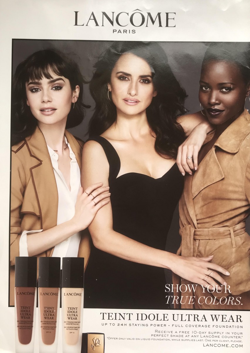
This ad was made for Lancome in 2019. Lancome is known as a French company that makes perfumes and cosmetics. This ad touches the race and skin color of each of the models to represent the color foundations that the company is selling. This is seen as been characterizing or identifying people by its skin color or race since the left model is light skin, the middle one is brown skin and the right one is dark skin.
March 17 – Paulina Tipantasig
In Understanding Media, Marshall McLuhan describes technology and media as “extensions of man” which means that media is a helpful tool in man’s life. Media and technology had made huge impacts in humans and the world. McLuhan says that the way we acquire information affect us more than the information itself. Medium insert itself in the message, creating a symbiotic relationship in which the medium influences how the message is perceived. He says that the extension of ourselves, or the medium, shapes our associations and our actions. We create technologies to construct new media that improve and reshape our lives, and in turn we are then able to create even more sophisticated technology. He argues that we need to be able to create content so we may continue to hone our digital literacy. For example, books and articles communicate messages much differently than radio or television as well as emails or letters communicate messages much differently than if that message was communicated orally. McLuhan also recognized that not only does the medium shape the message but in turn that medium also shapes us as human beings. He describes technology and media as extensions of some physical, social, psychological, or intellectual function of humans.
Technological progress brings individuals and society to the electric age. This age create hazards in which people may get affected badl The automation of technology could turn human jobs downwards, fragmentations are the elements which are essential for machine technologies, and how it would influence our life. Technology is an impact, to blindly that accepting these technologies without awareness, opens the door for them to control us or even oppress us. The forms of receiving and communicating messages to one another has evolved and it is not to say that technology itself is the problem because it is fine to use it, if we have control on it. It’s more on how we use it and for what purposes we use it.
Marshall McLuhan on his book said “The medium is the message” which talks about the meaning of the content which is defined as a medium. The way we acquire information affect us more than the information itself. Medium is the “message” refers to the message or treatment of our senses. He urges us to take control of the medium and not let it control us and to implement our ability to produce content through the increase intake by media ( television, print advertisements, newspapers) which throughout the years has been growing. He also states that “Nothing follows from following, except change.” Which means that, change is always going to happen. This is especially true in our culture today, due to that fact that following is now the norm. He also says that there are no original thoughts or principles. Instead, there are simply pieces from the original as designers we mainly recreate designs but others want to go beyond than that and create something new that will impact the industry. As designers we work with technological software that help us design and we act as the ones that technology is controlling but there are also the ones who decide to take a piece of paper and a pencil and start to create with their own hands as what MacLuhan is trying to say that we have to control technology and not let technology control us. The aim is on us to be lifelong learners, for our own enrichment as well as to be competitive in today’s digital workforce.
Paulina Tipantasig – March 10th
From the reading I learn that Gerstner was an artist in the concrete art movement who developed the visual synthesis of graphic design. He created a system connected to computer programming that produces design solutions. He said that to make creative decisions, designers need to use exact and complete intellectual criteria to produce creative work. With the help of Fritz Zwicky instructions, Gerstner created a diagram called “the morphological box of the typography.” This diagram has the parameters on the left and relative components on the right as well as it contains marks and signs designed from letters. The variation of darkness on letters are combined, the parameter of shade will be when the solution crystallizes. Furthermore, Gerstner said that squared paper is a grid which is not a programme. The typographic grid is a program that has a proportional composition in which it is difficult to find balance.
Jan Techichold, was in the new modern typographic movement. He was imprisoned by the Nazis and escaped to Basel during WWII. Techichold said that old typography based on ornament should be taken out as it always had its central arrangement. Moreover, he said that for creating typography, clarity was needed because of the many claims for attention made by the higher amount of print which demands a higher amount of expression. He thought that if designers used clarity and approach each task with fresh and a determined mind, the result will be a good solution. Furthermore, every part of the text should connect to every other part by definite, logical relationship of emphasis and value which is established by content. Techichold said that typography needs asymmetry to be more optically effective, more natural order, and to give an extended range of variations in typography. As we, humans read by starting at one side, axial arrangements are illogical because word sequences vary from line to line. The New typography develops visible form that gives direct expression of the spirit of modern man. The printed text function is to communicate, emphasize and create a logical sequence of the contents.
Josef Muller Brockmann divided and was for him it was a ordering system for design, for this he used the Swiss typography grid as well as he took design elements such as subjectivity, irrational and chaotic. He wanted his work to look constructive, capable of analysis and as an orientation for the future in which he thought that a designer must have clearly intelligence, objective, functional, and aesthetic quality of mathematical thinking. The basis of democratic behavior is based on a well composed and refined design. The use of the grid system is based on solid, purpose, creative and technical production with color, form, and material as well as architectural control over surface and space in a settled way of thinking. Brockmann believes that every design its characterize by its designer.
Paulina Tipantasig – February 25
From the readings, I learned that the old art lacked many unique characteristics that might differentiate from contemporary art through time and space. Also, I learned that many years before, artists didn’t use their total potential in order to create art. Bayer thought that traditional art didn’t contain the aesthetical approach of print media and mass production because of they were not able to use machines and special tools of copying and typewriting. Gropius talks about how artists are in a state of isolation in the world. Gropius shows that past art typography was not preserved, since a Bauhaus aesthetic idea of the theoretical approach was not practiced. Moholly-Nagy also shows past art lacked technology in photographic effects and in the purity of linear effects as there were no typesetting or printing machines.
Art needs to show what every artist can do in the future and the academy should teach the artist about their field due to the changing world of art. Bayer thought that typography doesn’t need to be simple but something different. With this he says that for the future, artists need to try to use something different that not only helps the new artist and the future artist. The future of art should come from a school in which you get more and more knowledge from teachers who already study what is art. Gropius argues that artists have to see the outside world, so the artist can be able to grasp the meaning of art. For Gropius is getting more experiences as well as making an exploration of what’s out there. Moholy-Nagy used art differently by combining type and photo into what is called typophoto. This is where the artist is using both two methods of art into one. All three articles talk about creativity, experience, knowledge and the combination of all of them, where these are what the future of art needs. Nagy views of typography, shows that in the future, every printing press would have to possess a block-making plant since it is from photomechanical processes. Art will help to continue preserving the history for future generations and modern society to understand the changes that are happening globally. Art in the future will preserve people’s cultures that will be important for studying history.
In the 21st century, the idea that is still used for art is typography. The reason why typography is important is because it creates a message and attracts people’s attention. Making a pretty design helps but it is not enough, it needs to put a meaning into it. Typography is important when designers want to create logos for companies such as museums, and others. Behind typography, there are a lot of typefaces that can be used on designs, it will implement both or just or more.
Paulina Tipantasig – February 18th
By reading these texts, I learned that every artist such as Marinetti, El Lissitzky, and Aleksandr Rodchenko have different ways to improve art. They found that the old style was already too old and decided to create a new revolution of art. I also learned that for them, there was a need to find and explore new ways of expressing the field of art and to take away the old art that they express how images recall from memories and with it bring the artists’ expressions from the old and how it rekindled painful memories that were a discouragement to the author’s dreams. This was to make original artworks and to combine it by incorporating expressing emotions that can be identified easily by the audience. Therefore, this helped the artists to integrate technology to build art in what is called modern audience.
In the manifesto, I learned that artists had to reconsider the design, the type and space of a book to help the writers create new writing methods. The text of El Lissitzky was based on new possibilities or ways for typography and its combination with printing, writing machines duplicating and copying instead of handwriting which is in a way too tired and old. Rodchenko, Stepanova & Gan Manifesto focus on constructivism which is an art movement. This is also based on communism which focuses on designing new products and geometrics to have mass production of products in the industry. The artists focus on trying to pass this idea and not being afraid of any risk.
In order to follow, the artists had to look forward to the art and design without leading the outside to bring ideas in which they think wrongly about what they are doing. They had to be courageous in order to make their ideas passed as well as they focused on leaving the orthodox and embracing the unorthodox. The manifesto gave the artist a bravado to continue on with the hopes of passing this idea and not being afraid of taking the risks even if it meant putting themselves at any risk.
I noticed that a lot of the authors’ ideas intersect as they have mainly the same idea of taking away the old and constructing new ways of reproducing and revolutionating art as well as technology. Technology is a main factor today as it helps to make digital art as well as it can be printed on paper and put the art outside for the world for people in various copies to appreciate it.

