COMD3504 - Section OL01 - Fall 2020

Month: October 2020 (Page 2 of 6)

Media and Technology

In Marshall McLuhan’s Understanding Media: The Extensions of Man, he talks about media, technology, and how it affects human beings. 

The first chapter called The Medium is the Message talks about the division of things as means of control. He also talks about technology and how it changed our relationship with other humans and for that reason he splits these aspects into two: content and message. “The “content” of any medium is always another medium”.. “and the message of any medium or technology is the change
 that it introduces into human affairs”, he says. As from my understanding, the content is the use we give to technology, and the message is its introduction into human nature. 

McLuhan’s also talks about technology and media as “extensions of man” because “it is the way they are use what that determines their value”. Personally, I agree with this because Technology has changed the way we interact with each other, in a way another, it has improved the world we live in. 

In chapter seven, he talks about The Nemesis of Creativity and the importance of artists in a world of technology and media. He states that “the serious artist is the only person able to encounter technology with impunity”. He couldn’t be more specifically when talking about it because most of the time, designers have to put away their bias in order to create something. In other words, we have to see the world with the eyes of a child. 

I am going to cite two of my favorite quotes from the readings:

  1. “The artist picks up the message of cultural and technological challenge decades before its transforming impact occurs. He, then, builds models or Noah’s arks for facing the change that is at hand.”
  2. “The artist is the man in any field, scientific or humanistic, who grasps the implications of his actions and of new knowledge in his own time. He is the man of integral awareness.”

I think he is absolutely right because that is how media and technology works for designers. They always go hand in hand.
Assignment 6 – Isaac Maldonado

In these 3 articles, we can see 3 systems where the designers rule under 3 different styles. This is a direct response to that part particularly. Josef Muller-Brockmann rules his work under the laws of universal validity, the use of the grid in the process of creation is a must be. The grid allows the work to be constructive, oriented, and organize. Those characteristics give a clear view which will be the objective of the project while is being built. The best example of that, it is “the morphological box of the typogram” developed and explained in his “In Grid and Design Philosophy”
As for Karl Gerstener, the system that he created to bring the extraordinary set of works that he did during his life. He started a path that almost all designers of our time are transiting. In which, we combine the arts with science. He was able to adapt amazingly the ever-evolving field of computer programming to what we called design. He translates topics like blueprints, outlines, and grids into the programming language, he used similar guidelines in both environments, and that allowed him to translate his work from one environment to the other with the maximum fidelity. This uncapped the possibility of creating drafts on paper. Where he can decide the color, appearance, thickness, and even place where the typefaces will be integrated into a project.
Jan Tschichold rules under a system where the clarity and order are the primordial bases of his designs. He claimed that in the past, the typography design was centered in a sole form of central arrangement and beauty. This put great limitations on the possibilities of the designer to express through the typography itself. In the “New Typography,” Tschichold stated the view of bringing forth an unambiguous form of communication with your audience. He emphasizes the appreciation of simplicity. You must be able to not using unnecessaries elements or too many ornaments. And you can fill the eyes. But not overwhelm the eyes of our audience.

Assignment 6 – Garnet Garcia (emailed on time)

Jan Tschichold believed that design was meant to focus on clarity. He mentions how “old typography” aka the designs of the past such as the Renaissance focused more on elaborate beauty of the design itself as opposed to the focus being on what the text was trying to communicate. Tschichold believed that one should design with “form being created out of function”; the form of the design must come from what is needed for the content to be communicated as clearly as possible. Clarity triumphs ambiguity. Everything that is not absolutely essential to communicate the content is to be removed.

Karl Gerstner believed design could be approached from an entirely scientific/mathematical approach. He believed that just like science, possibilities could not be delimited absolutely and that there was always a group of solutions that worked best to solve the problem. In this case, it was design problems. Similar to Tschichold,  Gerstner believes that design should be thought out. Using his grid, the elements of a design could be simplified and reduced to only the bare bones of the necessary design elements. 

Josef MĂŒller-Brockmann also believed in a very mathematical way of thinking like Gerstner (another who worked and focused on grids as guides) and emphasized a focus on the simple and objective like Tschichold. He also however believed that design had a level of social responsibility on the creators part. He believes that the use of directness and systematicness in design is “vital” for sociopolitical life. The focus of design, according to MĂŒller, was to cultivate objectivity, rationalize the production process, and “penetrate to the essentials”.

I believe all 3 designers would agree on these points: Less is more. Design should be broken down to only the elements that are absolutely necessary to communicate the context. Design must remain objective as opposed to subjective, being created from a technical, almost mathematical process, though that should not completely eliminate the creativity that goes into the design. If anything, the limits of the process forces the designer to come up with more creative solutions that prioritizes the function to create the form.

Assignment For Oct. 19 – Julian Townsend-T

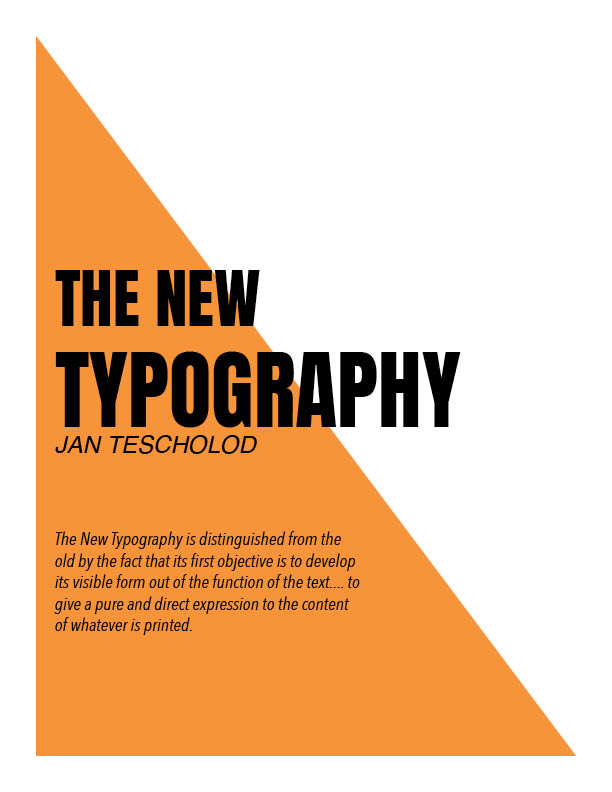
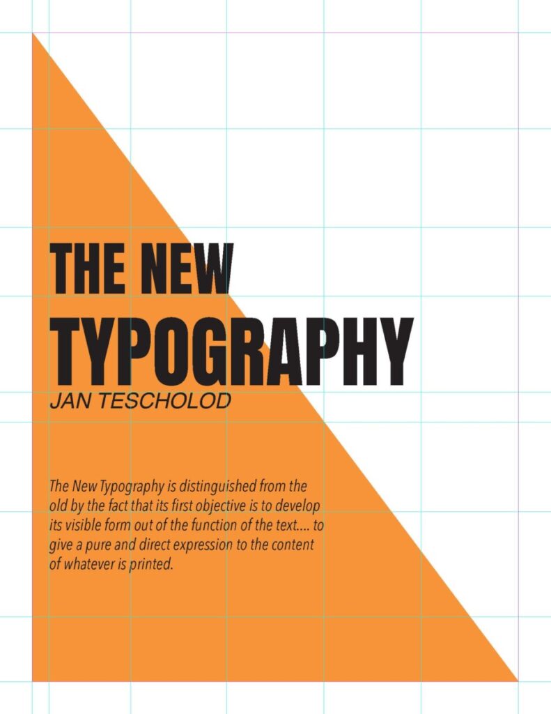
Typography is very essential when it comes to design in the this day and age. Type can communicate in more way then what it say, the font, color, size, width and even how its position are all ways it can mean different things, and thats what Tescholod described as the new Typography. it solves designs problems and give the reader a better understanding of the composition. Here is a little example of that.

Assignment 7 for October 26

Our next reading will be a couple excerpts from Marshall McLuhan’s influential 1964 book Understanding Media: The Extensions of Man.

We’ll read the Introduction, Chapter 1 and Chapter 7, all of which are included in the attached PDF: McLuhan_UnderstandingMedia_exc

Please consider the following questions, then as per our usual, write 3-4 paragraphs considering related ideas:
In Understanding Media, Marshall McLuhan describes technology and media as “extensions of man.” How do media extend human beings, or humanity in general? What hazards might technological progress bring for individuals and society? If “the medium is the message,” what role can artists and designers play in creating new ideas? How is the work of a designer subordinate to the media they use to create or distribute information? 

Sidenote: I also highly recommend Marshall McLuhan and Quentin Fiore’s experimental book, The Medium is the Massage. To tell the truth I prefer it over the text we’ll read, but it would be nearly impossible to create a good PDF. It is an incredible example of design and theory merging. Bonus points for anyone who can access a copy and make reference to it your response!

Assignment for Oct 19


According to Jan Tschichold, design should be simply based on how it is read and legibility from a readers stand point. As for having an alignment, we should avoid putting text centered on a page since it is difficult to read and limits variety on what can be done. Having a logical sequence of the content is also very critical for the person trying to evaluate the content. As for the last thing on how one should design is to be objective and to adhere to the quality of work that should be done. From the old typography to the new, we take away ornaments that are used heavily and focus more on type that should provide the right way of communication without any distractions.

As for Karl Gerstener, a different approach was used to find a systematic way to come up with a broad range of designs. He had Incorporated art with science with this he connected this system to the evolving field of computer programming. As a designer, creating an outline or a blueprint of what will be used in terms of typeface, color, appearance, and placement of typography should be picked out before getting into the designing part of the project itself. A systematic way for placing type and illustration that should be used is a grid. Designers need to be able to use a grid to ensure a structure and an organized way to put elements on a page without having to guess where elements should be placed.

Design must have a structure as Joseph Muller-Brockmann popularized the grid with swiss typography. The use of the grid became a way a functional way to fix the problems that would arise without the grid of subjectivity. To enhance the design appearance, one must think mathematically as well as in cooperating with the aesthetic element as well to the piece. As constructivist design follows laws into practical solutions such as the grid being used, with strict formal principles to ensure directness, and intelligibility.

Assignment 6 – Ashley Leon

According to the three articles, each designer uses their own systematic ways by using different design elements when creating their own work. Josef Muller-Brockmann preferred working within the grid system which meant submitting to the laws of universal validity. His design elements were subjective, irrational, and chaotic. The use of the grid was a system that shows a designer and their work to be constructive and oriented. As for the designer’s work, it should have a clear objective, the functional and aesthetic quality of Mathematical thinking. As for Karl Gerstner, he went for a rational, systemic approach. He developed a comprehensive system that is capable of generating a broad range of design solutions related to computer programming. There was a grid included that was the ‘typographic grid’. It is a proportional regulator for composition, tables, etc. It worked well when creating but hard to find the balance and conformity to a rule with maximum freedom. Lastly, Jan Tschichold was a typographer that was influenced by the Bauhaus Exhibition. He then began his book ‘The New Typography’ which gave an essence of clarity. He was very big on asymmetry which gives an unlimited score for variation and also expresses the diversity of modern life apart from variations of the typeface.

Assignment 6- T.Twist

After reading the three short articles, these three artists Jan Tschichold, Karl Gerstner, and Josef Muller-Brockmann. All give insight on how design should be viewed and depicted. It is stated that design should be simple to read and understand. One’s eyes must be able to travel from letter to letter, word to word with no complication. The visual layout should have some type of structure and organization. In other words, the design should be clean and crisped.

In Jan Tschichold “New Typography” it speaks about the road to New Typography and how it changed over the years. In the past, it focused primarily on “one basic form” of central arrangement and beauty. This allowed many artists to be confined in a box when creating. The need for clarity and communication was restricted and many wondered how to bring forth a clear and unambiguous form. This is where the New Typography comes to play. The principle of asymmetry limits an individual from making variations in the New Typography. Artists and designers have a wider playground area to explore and have more flexibility. Tschichold stressed that as designers and artists we have to have a sense of order and clarity and nothing too overpowering that you can’t understand. Our purpose is to communicate with our audience.

To achieve this sense of order and clarity the Gerstner and Muller readings both speak on the use of the grid system. Gerstner stated that the grid creates a passageway and placement location for each block of text or design elements needed to be displayed. The series of lines and boxes makes it easier for everything to harmonize as one making the visual outcome be more crisp and legible. Muller continued to express these same thoughts, by saying “the grid system implies the will to systematize, to clarify the will to penetrate to the essentials, to concentrate the will to cultivate objectivity instead of subjectivity the will to rationalize the creative and technical production processes the will to integrate elements of color, form, and material the will to achieve architectural dominion.” Thus, explaining what the grid system is all about and the benefits of it. This helps provide structure and clarity as to what Tschihold was expressing.

All three artists all had the same view on how design is supposed to be, which is to have order, system, and communication. Nothing too complicated and complex that makes it hard to read and understand for our audience.  We as designers are solving problems of communication not to create more problems. With the discarding of old typography ways, it opens new horizons and pathways to explore the world of type for designers. Today, the grid system is being implemented in all designs. Some even use it as the design itself. While others use it as a backbone or structure to place elements. The grid system makes way for easy replication of posters, ad campaign designs, other print and, digital media. Creating a story that links them all together. For example, if we look in a magazine our eyes flow across the page with ease and little to no complication. We can even see the invisible grid and structure incorporated in the layout itself.  As a result, creating order and structure. As I look deeper into the grid system it still holds connections to the past. This is beauty, the grid system holds a pure and airy beauty for design, making it be simplistic but dynamic at the same time.

« Older posts Newer posts »