Author: Obed Ledezma
Homework #6 – Obed Ledezma (Missing)
Obed Ledezma – November 25th
Obed Ledezma – November 11th
Obed Ledezma – November 4th
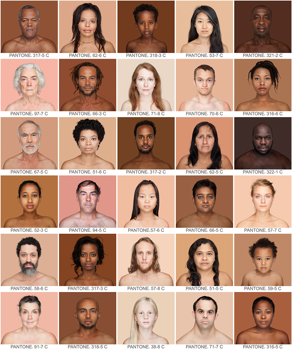 Humanæ by Angelica Dass is a project and ad campaign that focuses on the idea of race as a social construct, rather than a biological one. I think this is a good representation of diversity because it represents every one of all ranges of complexions. She has already taken about 4,000 photos. https://news.artnet.com/art-world/4000-skin-colors-in-pantone-squares-1254683
 Zuri is a makeup brand from the sixties catered to Black women. I think this is a positive ad because at the time makeup lines were very limited for Black women. There is also the upliftment of Black beauty in this ad. (Pinterest – ADs from the 60s)
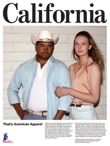 Although the brand is dead American Apparel was known their controversial ads. I think this is a negative ad because of how tone-deaf they were especially with the usage of the real Mexican farmer being used as a prop. There are currents of exploitation in this ad. To a lot of people, it seemed odd given how much the company has done for the Latino community. https://gawker.com/5911787/american-apparels-hottest-new-accessory-farmers
 I wanted to incorporate university brochures because I remember during my college application process I used to see a lot of this. There were many examples where they would only add one Black person into their application brochures to make the school seem “diverse or inclusive”. https://www.rug.nl/about-us/how-to-find-us/huisstijl/toepassingen/informatiedrukwerk/poster?lang=en
 This brochure is from the University of Wisconsin. They photoshopped a Black person into their application brochure to make their school seem more diverse of students but failing terribly. The school received a lot of backlash for this back in 2003. https://www.snopes.com/fact-check/photo-finish-2/
Obed Ledezma – October 28th
Media extends human beings and humanity in general by allowing us to connect with each other through social networks even though we are miles away. When were across the world it makes it easy for us to connect within seconds. In the understanding of McLuhan and how technology along with media has become the “extensions of man,” it revolves around being innovative. In the reading, McLuhan quotes Shakespeare stating “Shakespeare states his awareness that true social and political navigation depends upon anticipating the consequences of innovation. How a lot of the times the innovation is the message within that product that will change and impact humanity.
Some Hazardous technological progress that brings individuals and society in the “electrical age” or within the current age are guns. Guns have been around for a while and for many centuries have caused nothing but violence. Guns have no other form of usage but to kill or cause harm. Guns have had a strong impact on our society. Within the reading and In accepting an honorary degree from the University of Notre Dame a few years ago, General David Sarnoff made this statement: “We are too prone to make technological instruments the scapegoats for the sins of those who wield them. The products of modern science are not in themselves good or bad; it is the way they are used that determines their value.” This statement caused controversy because people couldn’t see a way around it. Guns are made to kill and there’s nothing else we could really do with them. That is like saying “Apple pie is in itself neither good nor bad; it is the way it is used that determines its value.” Or, “The smallpox virus is in itself neither good nor bad; it is the way it is used that determines its value.”
If “the medium is the message” a role that artists and designers can play in terms of creating ideas is the way they send out their messages within their objectives. I think it is important to have an objective when it comes to design and whatever form of creation. An objective determines the way your message plays out and how your audience will receive it. In many instances, its been the content and the idea behind the medium of art but still lacks in other forms like what is the meaning behind a house or something like a chair. In the passage, McLuhan speaks on how in the electric age a lot of the message intertwines and follows the lines of force in the field of numbers.
Obed Ledezma – October 7th HW
Some key elements that were lacking in the art field of the past were individuality and having the space to be creatively open as well as the process and production. They were so consumed with the orthodox that it hard for them to break free from it. They also lacked reproduction and the change of ownership. In the text, Gropius shows that typography of the past was not preserved as a Bauhaus aesthetic idea but more of a theoretical approach to the instruction that was not practiced. Moholy-Nagy also partakes that past art lacked the right amount of technology in photographic effects and purity of linear effects since there were no printing machines. Bayer argues the same claim in regards to that of traditional art and how it lacked the aesthetic approach of mass production of media due to the lack of special tools of typewriting, and machines. The insufficient provision of these materials that are major components and so critical to the process of creating art really did damage to the elements of production.
To me, the necessity for making art in the future is to still have a connection to the past in terms of elements but also creating a new idea that will be ahead of its time. It’s more of a feeling from within that artist to receive. Bayer in the text said that typography doesn’t need to be simple but encouraged that is should be different. He wanted to help artists from whatever time. In the text, I was able to read about Moholy-Nagy and his views on typography and how every printing press would have to possess a block-making plant as it lies in the photomechanical processes. In my opinion, art is something that must continue and be preserved because of its one of the things that live on forever. This idea or view within a piece of work that lives forever will help history and future generations. It is also important to still have a connection to new ideas and the advancement of the world as it changes every second. To be aware of the surroundings and changes happening every day globally in order to grow.
Academia should teach artists how to express themselves individually. I don’t think art should always be drawn from or have a certain connection to something other. The more individualistic art becomes the more individuality and fresh set of ideas submerge. It will help with the advancement of humanity as well as the brain. As well as being honest. Criticism goes a long way and is very healthy because it helps you grow as an artist to become stronger and more insightful. The world is changing rapidly and modernity is everywhere so its important to have those sets of artistic values in order to navigate within the art world.
Typography, color, and hierarchy are still used in the 21st century. Typography is one of the key ones because you can constantly play with it and reinvent, depending on the environment of a place as well as the time in which you’re living in. When it comes to color it has the ability to shape the mood of the environment and plays with our brains differently. Hierarchy is my favorite because it comes to play with the aesthetic of my designing process. Hierarchy is so important and elemental because it is what attracts the viewer and what you’re usually graded upon.
Obed Ledezma – September 23rd HW
Authors Marinetti, Aleksandr Rodchenko, and El Lissitzky found that it was time for something new within the art world to emerge from the 20th century. They all shared the common interest of bringing a new style of art to their societies in order to advance and progress. They each wanted to bring, new ideas of art to form and reflect the new wave of technologies that inspired a generation of artistic movements. From the reading, I understood that they found these ways by deconstructing everything from the past and reshaping it into something new in order to create these new ideas. Seeing it more as an evolution rather than something completely out of the ordinary. The MO was to move past everything monumental like museums, libraries, etc. and bring in new and improved ideas for a future that is equal and liberated from those that oppress it and keep it from progressing itself.
In order to follow, the artists had to anticipate their art and design without allowing the outside world to bring in their ideas, that what they were doing was wrong. They had to be brave and bold in order for their ideas to be passed along. They were more focused on leaving the orthodox and embracing the unorthodox. The manifesto gave the artist a bravado to continue on with the hopes of passing this idea and no being afraid of taking the risks even if it meant putting everything including themselves at risk.
Reading the passages and each of the authors work I realized that a lot of the ideas of the authors intersected. Marinetti, El Lissitzky and Aleksandr Rodchenko wanted to intertwine and uplift the idea of technology and art within a movement. They each wanted to push away from the orthodox since it was leading nowhere and push more towards the sciences, technology and what was evident. The futuristic campaign wanted to stray away from older art and bring in a newer model of art, fashion, etc. A lot of it was about progression, innovation, and process and how they can add to the evolution of art and the world, to spring a newer and more advanced society.
Obed Ledezma – September 16th HW
What distinguishes semiology from linguistics is that semiology deals with signs, as for linguistics it is the scientific study of language. In the reading, it talks about how semiology is a science that studies “the life of signs within society that is conceivable.” Linguistic is a part of the general science of semiology in the reading its described as a tool for design to tell and describe with words so it can be understood, in order to understand what it is trying to say. These two terms show importance with communication and how it extends in order to be much deeper than just words or visuals.
When it comes to everyday language and signs we use them more than we know unconsciously. Whether it’s waving at someone or giving them the finger, signs are more than just a movement of the body even the ones signaling us to get to where we are going. I believe psychology plays a big part with signs, especially as a designer because you have to step outside of yourself in order to be the person from the outside to understand this sign and where it comes from as well as its meaning, origin, etc.
Signs, signifiers and the signified employed are general communications because of the concept and task they do in order to get their messages across. Its a form of general communication because it doesn’t make you think twice since it’s so commonly gazed upon on an everyday basis. While I was reading the passage I found that signifier can be termed as the form which the sign takes, and the signified is the concept the form takes. It could be described as something also automatic, where in your brain it’ll click and put the two together.
Obed Ledezma – September 9th HW
When it comes to rudimentary communication methods and their relevance to contemporary information systems always find a way to connect to the principles of communication design because they are one of the basic principles of communication design. When I first heard rudimentary I automatically connected it to its definition which means lack of or lacking basic principles. Communication design was a lot more different a couple of years back. When it came to the basics of the foundation of design one of its top priorities were to still find its way to connect to its present as well as its future. You don’t want to create something that is half made or still in the process you want to be able to expand on this principle that is limited.
Contemporary designers usually have this motive to create something that is very in “the now” or in other words what is mostly being acclimated towards in terms of audiences etc which could work but shouldn’t always be so heavily relied upon. Contemporary designers should concern themselves with long-obsolete writings so they can conceptualize and have a stronger backbone to their designs not just for themselves but in order for them to explain. When you are able to explain your designs to a broader non-artistic audience you are successful in the field of communicating this idea especially when you are able to do it proficiently. You always need a reference but being able to drawback to the basics always helps you as a designer because your process is more organized and well placed this applies to counting and printing techniques as well.
The texts provoke ideas where you are able to expand and make more out of something less. Some facts and details from these texts and creating design strategies and which I think is the most important because I personally have issues with it is including less of yourself in these designs, strategies, texts, etc and more of who you are making them for. In order to connect to the audience, you need to put yourself in their shoes and find ways to succeed. There is strong psychology behind the design process of creating content for consumers that provokes ideas for creating new design strategies.

