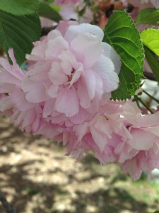
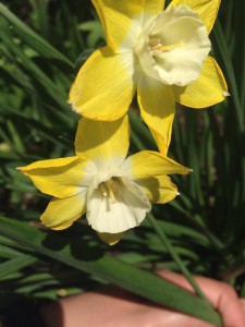
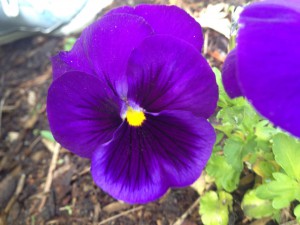
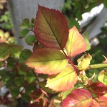
The botanical Garden is a beautiful place to take nice photography and enjoy the beauty of nature. But I learned for this project that it is also a great place to study color. In search for color, I had to go around the garden and take pictures of tint (gradient from white to a color), shade (gradient from black to a color), and compliments ( gradient from two complement colors). I was able to easily find good examples of tint and compliments, but shade seem to be the more challenging one. I finally found a flower that gave the same or close idea of a gradient from black to a color.
Category Archives: Field Trips
BRIC House
I had an awesome and fun time at BRIC House. I saw the Art into Music exhibition and was blown away. I love both art and music very much, and in class, we try to collaborate the two together. But when I saw professional collaboration of art and music and how modern it is, it moved me. There were graffiti writing that were put together by an artist and played around with with color so that there is a musical pattern an rhythm you can see in it. There was also a wall that had pictures of people in concerts. This really showed the art in these photographs because from what I saw, they were taken simultaneously when music was playing, so there face expressions were natural almost. We saw a video that combined hip hop music with this type of opera music that were merged together so well, and in the video you had a woman expressing her body through the music she heard.
All this was really cool and inspirational and I related a lot of what I saw with what I was learning in class (which is the collaboration of art and music), but I have to say my favorite part of the exhibition was the vinyls. I am a huge vinyl fan! I love them because they are a form of traditional, old fashioned musical aspect of the past. I tend to lean towards things that were used in the past, and in this exhibiton they had a whole stack of vinyls and a wall that consisted of them too, and they put them in such a way that it lmost appeared as something very modern. The pattern that they were stacked up in showed an visual relationship between music and art. The stacked up vinyls showed monotony because they were all in one row, while the ones on the wall had a variety of vinyls that showed different types of music, and different colors too.
Coming out of the exhibition I was that much more inspired. I was inspired to continue on loving art and music and to continue on this path of becoming a graphic designer. I loved it and I will soon visit the BRIC house again with friends who will come to learn to appreciate these types of artistic skills. I was glad I was introduced to this place.
A Field Guide to Snow and Ice

This exhibition was pretty cool. I didn’t get to go through the whole thing, but we did see some awesome photography of ‘snow and ice’. People who don’t know, or don’t care about photography will not understand the meaning of these photos, or how hard it might have been to take some of these photos. I thought they were very nice, and despite the fact the publishers may have used fabrication throughout most of these photos, it was the color, or shades of gray and texture that gave it the meaning of what it was. I liked a lot of the photographs but my favorite piece was the high key value snow photograph. It was just plain flat snow and my focus was on that light gray shade that had a wavy curve to separate one level of snow from the other. It was very simple and I liked it a lot.
