Map design is very technical, you would think that you would just drag and drop assets(any object like a tree or bush) in a map and it will work, well its not that easy. With Unity engine and the way the parameters are set up, we have fixed sizes that we have to follow. In-order to optimize a map, a screen will load a 720×720 pixel map around our character Bob.
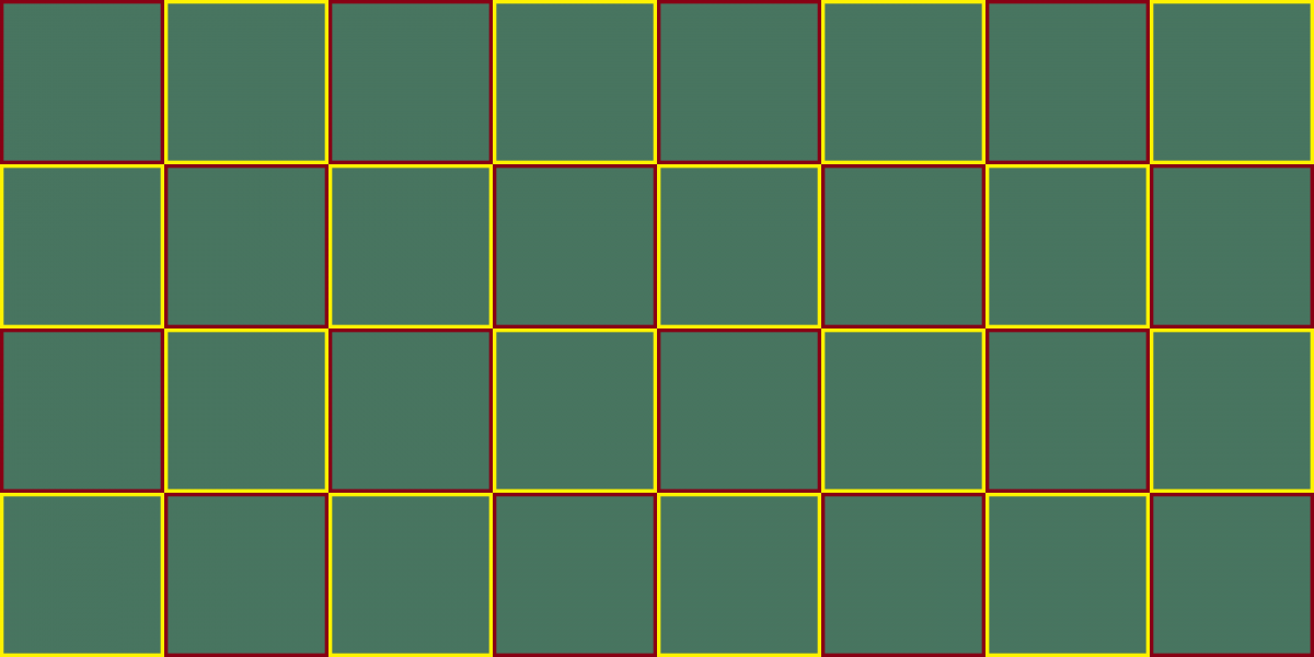
Each red and yellow box on the image above represents a 720×720 map. This is the starting point in how a map is laid out. I used a old program called Idraw(can use Photoshop or illustrator or even Microsoft excel) to map out the path in with Bob will take.
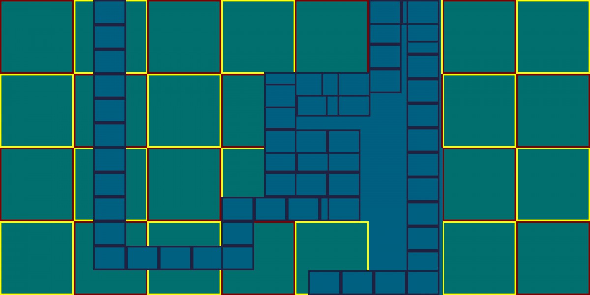
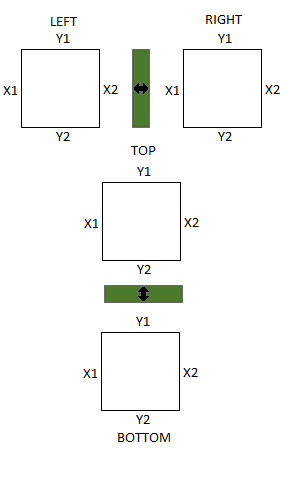
Above I mapped out the direction in which Bob will move at. As you can see I am not only moving on the X axis but also on the Y axis. When dealing with transitions from X and Y axis we always have to be conscious of our view. We use a method called screen locking to prevent the screen from over or undershooting our view.
Screen locking is very important in map creation. We never want the camera to appear jagged or jerk in anyway. A jagged camera will ruin the flow of the game play and appear buggy. We always aim for a smooth, seamless transition between X and Y axis.
Now that we understand all the technical, we finally are able to skin the map, as we discussed in Map design part one!