The Webinar I chose to watch is Monotype’s Type Director Dan Phatigan!
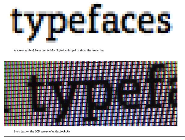
Dan spoke about how to make smart choices about where or where not fonts are appropriate for the project you are working on. He emphasized If the font functions for the project. He thought me to ask the right questions. The Issues he addressed is type on screen. How a smooth mathematical font is transitions into a web screen. How type looks different in each screen, for example a LCD screen on a Macbook or on a Nokia phone. He showed us how a physical device can change how a type looks like.
Dan spoke about how different fonts that were designed in the 16-17th century technically wont work for modern screen. He showed us fonts that are perfect for web. I enjoyed how he spoke about how weight, size can effect the legibility of the font and the relationship between black and white. How mixing font and the scale can change the personality of the message.
Dan spoke about the nature of dynamic text on the web. That you need to know the family of the type font. For example if you use an italic type font, at a small size, so much is going on that it becomes difficult to read.
He spoke about how color and how the eye tends to prefer higher contrasts for reading, for example white background and black text.
Overall I enjoyed Dan’s webinar because he did not just spoon feed me information on were I can find good type fonts, but how to use the right font for any given project.


