Previous Draft


For the 1st picture which is Dirty Harry with a revolver, I used the typeface Gabriola for the word “Lucky” the reason is because of the thin, present style serif created in 2008. The reason for this style is because of the way how it is curved and reminds me of a quote that uses a sort of similar style to emphasize something positive. As for the word “Punk”, I used the typeface Impact. The reason for this is that the style is bold and a sort of strong style characteristic that pops out when looking at the typeface. For colors, I used blue as a cool color background everything else I tried to match the color of the skin. hair, and clothing of Dirty Harry.
For the 2nd picture, the typeface is Constantia as for lucky I went with Gabriola again. The reason for Constantia is because of the clean, thin, modern serif style. For colors, I went with Green, blue, and yellow to help resemble and emphasize on the word “Lucky” and to help viewers feel positive feeling about luck.
Lastly, for the 3rd picture, I went with the same typefaces as the 1st which is Gabriola and Impact. For colors, I went with warm colors to help make the image more threatening and more popped out since the image is a hand holding revolver directly as the viewer to make it threatening and sort of aggressive with the warm colors in the background.
Revised Draft
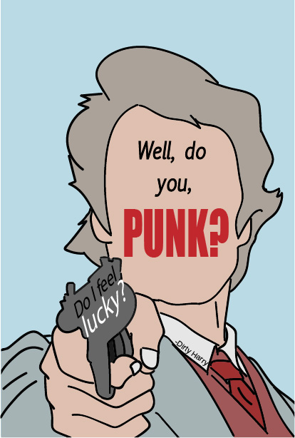
For this picture, I went with similar typefaces but also added a few more such as EuphemiaUCAS Italic to fit the style of the art I created and also moved the word around in the empty spaces in the artwork instead of putting the quote over the drawn image. I also made sure it also fit in the negative space so then the quotes doesn’t look like it is slapped over the drawing.
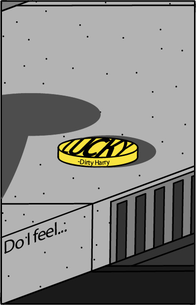
For this image, I switched the revolver image into a lucky coin on the ground to switch up the concepts. For the typefaces, I went with Perpetua a typeface with a simple typeface with san serif. For colors, I went for a dark gray and light gray color for the viewers to see and easy to figure out that it resembles the side of the sidewalk. I also used the color yellow to emphasize the word “Lucky” and to make viewers view the coin as the lucky coin on a sidewalk.
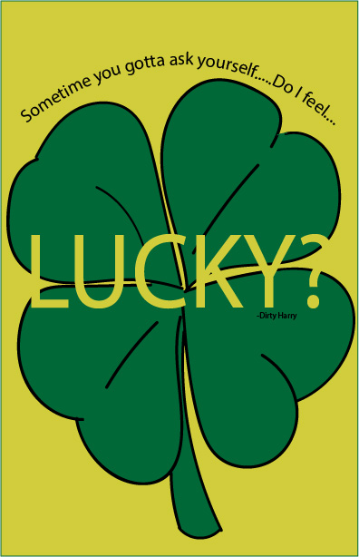
For this picture, I used the Helvetica typeface to keep the font simple and readable. I switched up the color a bit by making the background yellow to remind viewers luck as a yellowish gold color. I also used the negative space to form the word lucky in the clover and enlarged it to help bolden the word “Lucky”

