The History of Adidas’ Logo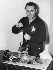

-An image of Adolf Dassler who is also a show maker in his past life creating the sports shoe that his company sells. (Image source: http://histografy.pl/adolf-adi-dassler/)
Adidas a well-known company founded in 1949 by a German Businessman name Adolf Dassler. The first logo was created by Dassler was 3 stripes on the shoes as noted in the “The History of the Adidas Logo” article in The Fine Prints Art. It notes that the first logo with the 3 stripes was created because Dassler was hoping to create a symbol that was simple and easy to remember. It also stated that the company’s wordmark was created using the ITC Avant Garde Gothic font to help make the company clean and, “…almost spartan” in other words making their company products look competitive sport or other outdoor activities.
Another thing about of the first logos is that has 3 stripes on the shoe and also have Adolf Dassler on the design since he is the creator of the product, another thing about the logo is that the word Adidas with the letter “d” having an extended stem as a way to also resemble the stripes. The way how Dassler used word placement was by adding his name on top of the logo as a way of being recognized. Meanwhile. In the middle, the word Adidas is placed with the image of the shoe to give the idea of what products the company is selling and also as a way to also help consumers have an easy time recognizing the name of the company. Another thing is that company’s logo was, “….based around the running spike that Adi was known for..”(“The History behind the Adidas logo’s”. Aphrodite. Sept 7, 2017) In other words, the first logo uses an image of the well-known shoe that Adolf Dassler made used, it was easily recognizable by the consumers.
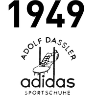
-This is the first logo created in 1949 by Adolf Dassler, as you can see there are the three stripes on the shoes however not darken and has Dassler’s name on top and the company’s name on the bottom to help with the recognition the creator, brand, and the company all at the same time. (Image Source:https://www.adidas-group.com/en/group/history/)
Later on, at around 1970, the company decided to switch their logo as time changes they decided to go for a trefoil look to make it look like a, “three leaf shapes branching outward to resemble a plant with the iconic three stripes…”(Israel Galante, “The History of The Adidas Logo”. Cop vs Drop. Jun 24, 2018) The reason for the resemblance of a plant look was a way for consumers to view Adidas as a company who creates products for outdoor activities and also venturing out in the open world environment. Most importantly the original three stripes mark, “…was actually a trademark of a Finnish sportswear label Karhu”(“The History of The Adidas Logo”) fortunately it was purchased for about $1,800 in today’s value. Now the company owns the iconic three stripes which consumers knew Adidas as the three Stripes Company contained the stripes that were always on the products of the shoes. The wordmark, of course, remained the same. The funny thing about the three stripes was that it was purchased, “…for today’s equivalent of $1800 and two bottles of whiskey.”(“The History of the Adidas Logo”. Fine Print Art) Guess things were different in the past compared to today when purchasing a logo. As for color, the logo uses the same color scheme. The company uses a mono-color logo on a mono-color background, it doesn’t have any set of shade and it is usually designed as a black on white.
![]()
-This is the Trefoil logo created in the 1960s, It lasted till the late 1990s. However, it is still being on some specific products like the Adidas Originals. (Image Source: http://logok.org/adidas-logo/)
The logo continues to stay the same until the late 1990s, the company decided to change their logo again this time into the 3 bars as we know it as today. The 3 bars on the logo was created by Peter Moore (A British Businessman known for being in charge of famous companies such as the overseer of the Xbox or the in charge of SEGA in America) and the bars were formed to look like a mountain the purpose of this as stated in the website Logaster “The Adidas Logo”, “…like it is challenging the people who buy Adidas products to push themselves to their limits.” Which means, the logo was created as a way to challenge people who use their products to push themselves harder when doing outdoor sports or activities and not worry about their sportswear since it is durable and it is up to the task to handle extreme sports. As for the fonts, it still stayed the same as a sort of a reminder of its origins and also that yes the company is still clean and have that “spartan aesthetics”.
Later on at 2005 the company once again lastly design their logo this time to a simple 3 bars place horizontally. This was created simply out of ease and with less difficulty branding it on the packages and box that their products were sold in. This also created because the company wants to stay consistent with the time and hoping to continue to be a recognizable company that is being the same as what it originally was, as for the fonts and the older version of the logo such as the trefoil continues to be used in other kinds of products just on some specific products. As time goes on and technology becoming more and more advanced Adidas used it effectively by creating commercials that have well-known celebrities. With well-known celebrities, there will always be consumers who are willing to buy products the celebrities wore throughout their daily life just to be as cool as celebrities. “Adidas expertly embedded itself in the second biggest pop cultural moments…” and basically “…found a way to sign on a hot new collaborator, then unveiled it in the perhaps the coolest way possible” (Jeff Beer. “Top 5 ads of the week: Nikia and Colin Kaepernick, Adidas, and Donald Glover”. Fast Company. Sept 7, 2018) This clearly shows that the company has a full understanding and the potentials when creating a simple ad for consumers to see and to spread their recognition by collaborating with famous figures of popular celebrities.
Even though time has changed, the company now make other kinds of products instead of the sports shoes in the early days to now sportswear, gears, accessories, and all kinds of clothing just because they are, “…obsessed with helping athletes of all levels to make a difference…”(Adidas “Consumer Obsession” Adidas-group) even though the companies no longer selling just sports shoes now becoming innovative creating effective ads for consumers creating different kinds of products for consumers to wear in their daily lives and of course continues to create other kinds of sportswear, their goal remains the same for the consumers to at least remind them that they have the strength, “..to harness the power of sport in their game, in their lives and their world – anyone, anywhere, always”(Adidas “Core – Accessible Sportswear For All” Adidas-group) and I think that’s just awesome!
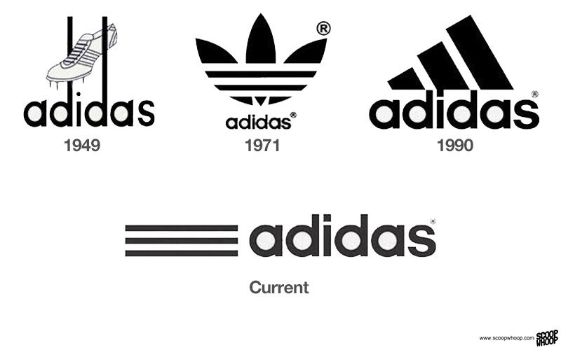
-This photo shows the history of the logo changes from time to time. From the 1950s all the way to now to the current time. (Image Source: https://www.scoopwhoop.com/inothernews/brand-logos-changing-over-the-years/#.0m5h1wmnz)
Sources:
–https://www.fineprintart.com/art/the-history-of-the-adidas-logo
–https://www.aphrodite1994.com/blog/index.php/the-history-behind-the-adidas-logos/
–https://www.logaster.com/blog/adidas-logo/
–https://copvsdrop.com/blogs/blog/the-history-of-the-adidas-logo

