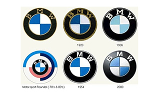
BMW is one of the most renowned Automotive manufacturers in the world. Its German based and one of the biggest automotive companies in that country. Their logo is sporty, efficient, and simple. It garners a clean presentation towards their customers and credibility to their competition. Its logo was made by Rapp Motorenwerke and it was inspired by the aircraft’s they use to design during World War l. The logos design represents the white propeller blade against the blue sky.
The logo has strong colors which are blue, black, and white respectively. The thick ring that makes up most of the design is shaded black to make the logo more dominant. There is a sleek, silk lining showcasing the BMW logo for a more modern touch. The type face is a simple non-serif font with the letters “BMW” in the top half of the black ring. The gap in the ring of the BMW logo is divided into four quadrants with alternating shades of blue and white. The logo went through a total of six redesigns, but still maintained the same look. You can find the BMW logo on billboards, magazines, advertisements, and anywhere else that will accumulate a lot of attention to people.
Sources:
http://www.logoblog.org/bmw_logo.php
http://www.famouslogos.org/bmw-logo


