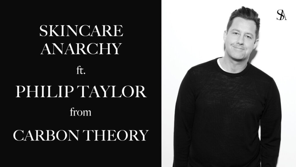
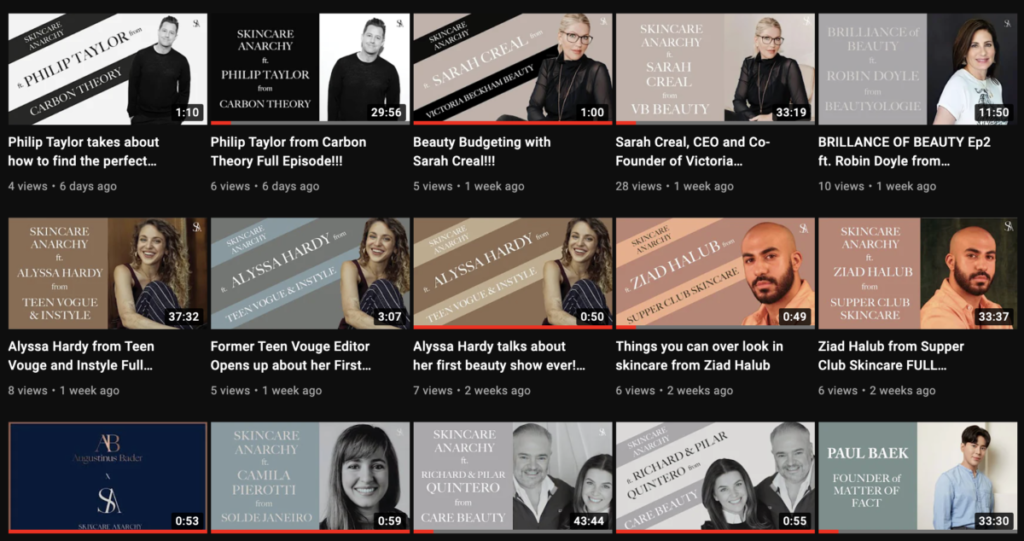
My internship is fully remote. All of the team connects and chats via Whatsapp. Currently, the podcast has been receiving many new guests weekly. On Youtube, three to four videos are uploaded on the channel weekly. Currently, I am assisting and working on thumbnail designs for the videos. Each thumbnail must be in the size 1280×720. The design must include the name of the podcast, the name of the guest, and their company. The design and look of the brand stand very simple and elegant. The typeface used in all of the designs must be serif unless specified otherwise.
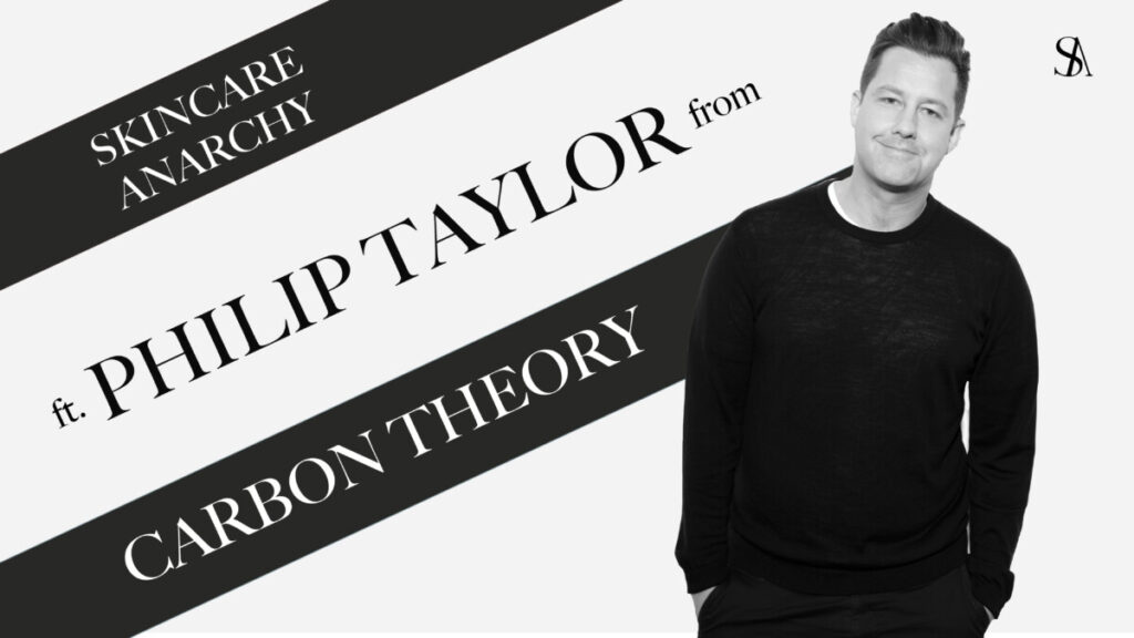
Since some of the videos are long I was asked if I could make a second thumbnail that has more of a click-bait-gossipy feel. This was kind of a challenge for me because a lot of thumbnails that are like that have symbols, red arrows and that is not the look of the brand. I definitely had to do some research to get some inspiration on how I can make these designs gossipy but still keep that simple elegant look. After some research, I notice most of the gossip thumbnails have cutouts of the person who will be featured in the video. So I opened photoshop and cut out the headshots from the guest that was going to be on the thumbnail and then on Indesign I began to design different layouts that will showcase the cutout precisely. After trying a few different layouts I sent the final design I thought looked best. My team loved it and it got approved. Now all gossip thumbnails will follow the same format.


