
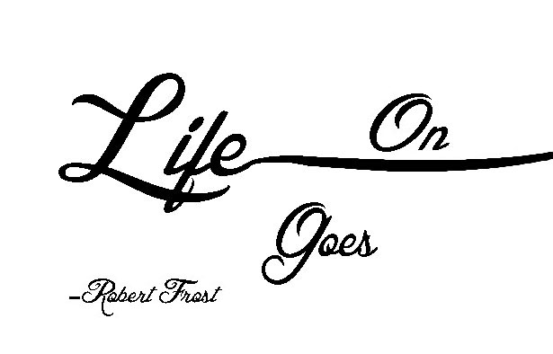
Quotation Design # 1
With this quote I wanted to literally emphasize life going on. So that’s exactly what I did. I took the “e” in life and extended it off the page to show that life goes on…. in this case, literally. This is my favorite out of the three quotations because I thought it was a cool, and nice way to approach it.
I feel like I should start to stray away from the black, and white though, because I feel like I overuse the color scheme too much. (See below.)
Quotation Design # 2
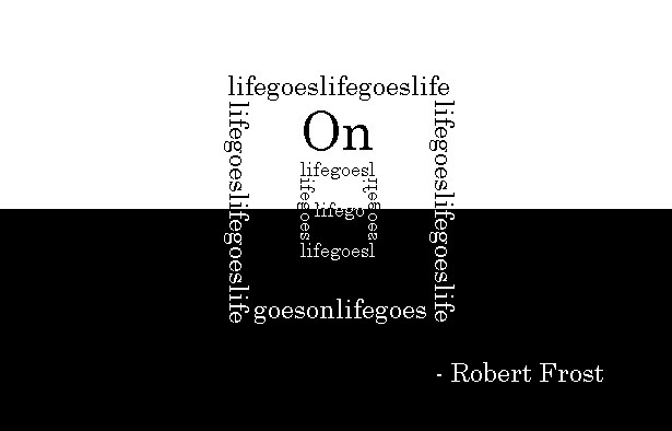
This one is my second favorite quote that I did. I used the quote to visualize what is to be a light switch. By having the body of the light switch have sections of the quote. Then have “On” on the brightest side of the image. I like the simplistic design. My favorite color scheme is definitely black and white, because they clash with each other so perfectly.
If I could do anything better with this one; it would be to somehow make it more obvious that it’s a light switch. However, it was one of my first times attempting something like this, and we all have to start somewhere, right?
Quotation Design # 3
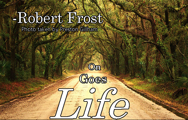 It seems to be a recurring theme of the pictured quotations to be my least favorite. I ran out of ideas on what to do with the quote because it was such a small quote. I couldn’t think of anything else that would go with the quote. So I went with the cliché “endless” road. It’s not my favorite one, and it definitely does not wow me. I definitely could’ve done better with this one.

