
SVA Gallery Field Trip | Master Series Exhibit | Tom Geismar
On Monday, September 29th, I visited the SVA Gallery with my classmates from City Tech to see the Master Series Exhibit. Tom Geismar is a legendary Graphic Designer who is the creator of many familiar logos, and icons around the media. The exhibit features logos, graphics and exhibition exclusive designs. They also feature some of his personal works, student projects, and books from his collection. Tom Geismar is also the founding partner of Chermayeff & Geismar & Haviv. They are a dominate exhibition design firm that concentrates primarily on developing identities for smaller companies around the world.
On my trip to the Master Series Exhibit, I’ve come across interesting, beautiful designs that caught my interest while visiting. The three logos that stood out to me the most are listed below, along with my insight, and feedback on the logos.
The PBS Logo.
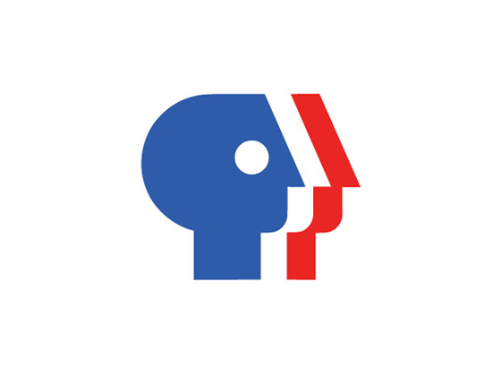 This is one logo that many people will recognize right off the bat. It is the PBS logo, which stands for Public Broadcasting Service. I’ve never really analyzed this logo before, but now that I took a better look at it, I came to the conclusion of what this logo is supposed to represent. If you look at this logo carefully, you can see that there are multiple people of color. I think this is supposed to intertwine with the concept of the “public”. The public being everyone of every color. Also notice the colors that were used. Those colors are red, blue, and white. Which are also the colors that are used for our flag. Could that mean that the public that it’s directed towards is the American public?
Tennessee Aquarium Logo
 The Tennesse Aquarium Logo is one of my favorites, because you can interpret it in different ways. When you look at this logo you can see that all of the different shapes are placed together in the form of sea life, primarily fish. However if you look carefully, you can interpret some of the shapes as different things. Such as the obvious brown duck on the bottom. Not only to mention the purple eel on the lower part of the corner. I think it was a clever way of visualizing what the aquarium is about, and what it showcases.
Chase Logo 
This is a logo that many people will recognize. It is the Chase logo. The chase logo doesn’t particularly have a meaning, but not all logos have to. It can be a symbol that represents you, or your company/group. That’s why I like this logo, because when you look at it the first thing that pops into your mind is “Oh, that’s the Chase logo!!” It’s something that makes someone recognize you, and realize what, or who you are. That’s what logos are in the long run. It’s a symbolic representation of what you are, or who you are.
–
I really enjoyed my trip to this exhibit. It really made me think of the logos’ concept, and what that had to do with the design process. I am grateful that I had the opportunity to go. Thank you Professor Goetz for taking us there! I learned a lot.

