
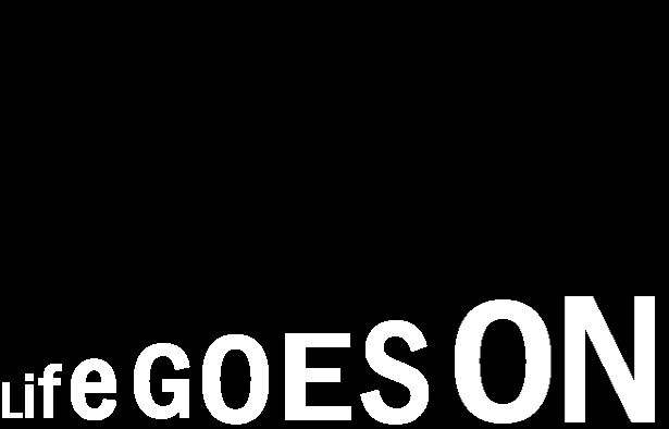
My first visual quote concept.
With this concept, I was trying to emphasize the “going on” part of this quote. I made each type bigger than the previous because I wanted to emphasize that life goes on through the enlarging of the text. Theoretically, the letters can get larger, and larger which goes on forever and ever. That’s what I wanted to relate with this concept. Life keeps going just like the size of this image.
I like this one a lot, but of course, it could be improved. One thing that I wanted to improve was the point size in comparison with the rest of the letters. They’re a little inconsistent, but that shouldn’t be a problem that’s too hard to fix.
My second visual quote concept.
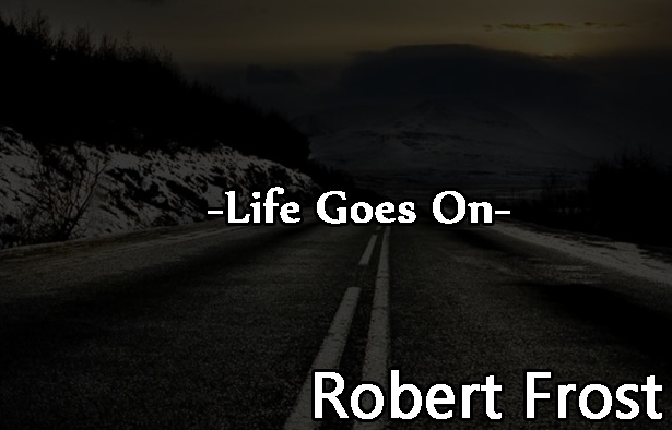
My second, and least favorite out of all three concepts is this one. The concept is a little cliché, because an open road is always binded together with the concept of extension. Hence the “life goes on” part. The image quotation was one that I actually had the most trouble with.
My third visual quote concept.

With this one, the white lines were merely a placeholder until the full design was finished. Originally, the lines were supposed to be miniature text. And then would resemble those of stairs. Stairs is always used to showcase moving forward. Thus, I wanted to have “life go on” by having the stairs represent the very thing that it is meant to represent. Which of course is moving forward with our life.

