
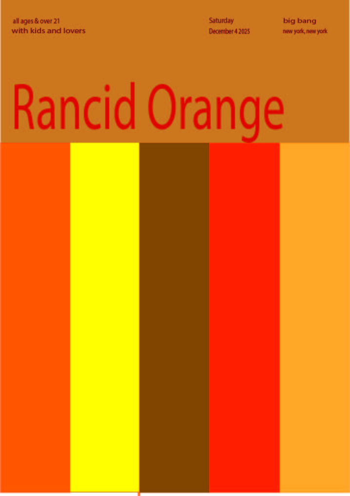
During the start of project #4, we began to work with the use of colors. First, we created a color wheel to visual see the colors and understand more of color. We later had to create a chromatic gray, muted, and prismatic color studies. For each of the following three, we created two collages one narrow and the other broad. Later, we worked with a partner to create a poster and than individual redo the same poster in Adobes Illustrator. In this project, I learned more between chromatic gray, muted and prismatic colors. I got to understand more between the value, towards high and low. I feel like I could do better when it came to the first chromatic gray collages, instead of having dark, unknown color. I have a bright colorful chromatic gray which is the opposite of it. Also, I feel like I could have done better in the crafting is the painting. I’m not use to painting and this is my second time painting for a project. If the project requires to paint I will be more careful however, I feel like this project helped me in learning the color value. This is important if its matter with colors, the range and value changes and can affect the surrounding to make it interested or not.

