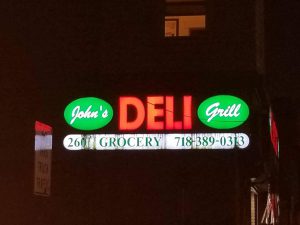
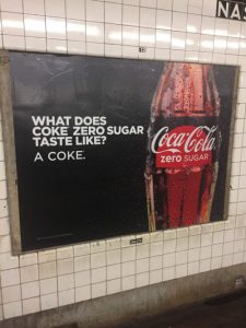
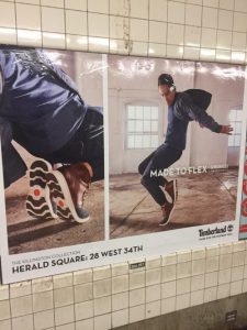
For the first picture the visual hierarchy would be, “coke cola”, then it would be the glass bottle, then it would the words to the left of it. The second picture would be the shoes on the left then the guy on right, then the phrase “made to flex”. Last picture would be “murder on the orient express”, then the cast of the movie, last the words on top of them. This all were posters in the subway.
Category Archives: Uncategorized
Movement from Coroflot
http://www.coroflot.com/skylargremel#specialties=51
http://www.coroflot.com/adriennedeluca#specialties=60,14,51
http://www.coroflot.com/oriolvidal#specialties=60,14,51
These three people shown in their artwork movement which really intrigued the way they shown it. Each may look like an drawing or art without movement but you are able to look at the artwork and picture the movement towards it. Not only the art work but the way lighting and shading was place so you are able to picture it carefully.
Design Student Artwork Interest
http://www.coroflot.com/richardkneale#specialties=57
I chose this student artwork because he is more involved in the game designs, he is able to create a 3D module with dark colors. I searched from the website coroflot.com and I looked game design and his artwork is what caught my interest the most.
Copper Hewitt Collection Post
https://collection.cooperhewitt.org/objects/18633987/
https://collection.cooperhewitt.org/objects/18471033/with-palette-css4/
https://collection.cooperhewitt.org/objects/18490249/with-palette-css4/


The contrast with these artwork is that it shows light and dark. As you can see there is bright hot pink color in all three of these artwork and they pop out. The reason they pop out is because the dark colors around it makes sure it blend in with the background. In the other hand, the first art with the leopard is a dark color of pink while all around is bright which still help it to pop out.
Texture Pictures
Perks
One of the best perks that I can think of is free membership to New York Times. It’s amazing how we get to have a membership for something because of college and cuny students.
Green-point Neighborhood
The typography around my neighborhood has lots of serifs on the letters but also does not have much on it. Throughout my neighborhood there has been graffiti all around factories but the letters show a certain type of ethnicity. It seems to be mostly white americans around with a little bit mixer of different ethnicity from different countries or from different states. The letter spacing from banners, from stores and from poster are different from other neighborhoods. Also, the alignment of the letters to the word is different with a font of times new roman. There’s a bunch of designs on how the letters are played out and grabs the public attention because it’s different from other letters that is in a different neighborhood. As I walked around the neighborhood, there is also old buildings with old letters which showed serifs on each  letter. But as the time passes that old letters has grown out and letters throughout the neighborhood changes with less serifs to grab the outsides attention. For instance, If an owner of a deli wanted to get a crowd of people into his/hers store then they would write in big letters “Deli” on the top of their store. The way it’s written and size of it would get the public attention but if it is too cliche then people would see it as every other “Deli”. Unless the owner changes the font size, the font, the alignment of the font and the line space then people see it as a different than other Deli’s.
however , throughout the neighborhood everything has its regular form of writing their fonts, Laundromats, Deli’s, pizza place and clothing stores. They all have just a bold letters with no serifs on the letters but in bubble letters or times new roman font on their banners. There is also punctuation on certain letters that goes with it but then some are not. Street signs lettering are bold and the alignment are right on the middle of the sign but they also don’t have strokes on the end of each letter. They’re just bold and solid color in letters that everyone are able to notice it from afar.
Thumbnail Sketches
It is actually important and very useful to start design process with thumbnail sketches because it helps you start fresh. It helps you learn the basic steps of sketches rather than learning advance which you wouldn’t know what to do. Just learning the basic steps can help understand advance steps that would be taught through out any class.


