Jean Carlos Pichardo
ARTH 3311
Professor Trofimova
May 16, 2018
7 objects – describe the design style to it – dates – why it belongs to that style – 5 pages
Final Project
The Cooper Hewitt Museum is a very unique museum compared to others. Many museums have a main focus on display to the public but, the Cooper Museum has a variety of showcases. There were seven objects on display from the Cooper Hewitt Museum that captured my interest.
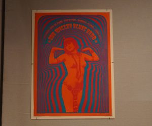
- Psychedelic Movement
- The Miller Blues Band
- 1967 – designed by Victor Moscoso
- The image has an illusion for the viewer of being high on drugs.
- It also has that specific pattern or effect to it similar to those in the Psychedelic Movement, such as shapes, colors, and types.
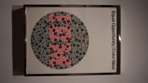
- Midcentury-Modern design
- Equal Opportunity / Color Blind
- 1974 – designed by Ken White
- The poster has a modern American look to it.
- It has a similar look and aspect towards Paul Rand IBM logo
- Baroque
- Drawing for Grotesque Panel
- 1650 – designed by unknown
- The drawing is very detailed on the way it’s displayed.
- It matches to that era by the amount of organic patterns and symbolism around the patterns.
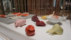
- Art Deco
- Volumes
- 2017 – designed by Marije Vogelzang
- I believe this piece is part of the Art Deco era based on the design and modern look to it.
- The pieces were made out of rocks, silicone, and porcelain, which give it that shiny modern look similar to that of Art Deco materials.
- Kitsch
- Compartes Chocolatier
- 1950 – designed by Jonathan Grahm
- The packaging of the chocolate bars has many different designs such as patterns, imagery, food, and so on, which gives Kitsch feel towards it.
- It’s basically to grab the viewer’s attention to purchase the chocolate bar beside on the cute or desirable design on it.
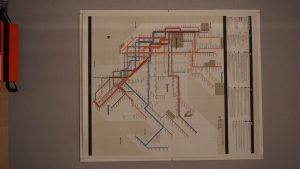
- Bauhaus design
- New York City Subway Map
- 1974 – designed by Massimo Vignelli
- The map simulates similar features of the Swiss design movement by the type font and lines.
- It has a modern look with the outline of the grid and unique font on this map.
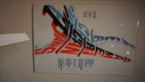
- Abstract Constructivism
- An American in Paris, Theatre du Chatelet
- 2014 – designed by Philippe Apeloig
- This poster is related to Constructivism by the bright use of colors and advertising of the film.
- It grabs the attention of the viewer to look forward more into the image and the message it has for the audience.

