Week 3; Employment contracts

A) My weekly update is I have been working at more sites helping teach art and design in elementary schools around Manhattan. We are finishing our last week at the afterschool program for the school year, and I am continuing to teach at the summer program again during July. In July I will be taking on longer shifts and I currently have about 85 hours signed weekly.
B) I read the link https://www.nolo.com/legal-encyclopedia/nondisclosure-agreements-29630.html
“Using Nondisclosure Agreements to Protect Business Trade Secrets”
One example that stuck with me while reading was the purpose of NDA, which is used to present confidential information in a limited context. Furthermore, some information I picked up from the article is the importance of knowing obligations and understanding agreements for what you are signing up for. Nonetheless, they broke down the 5 elements of the Non-Disclosure agreement and its relevance.

C) Employment contracts benefit both parties because they are held accountable and provide protection.
Week 2; Intro to Ethics

A) My internship update is I am currently working on experiments with kids at my internship teaching them about how things are designed will result in how we choose to use/ see them. I also am starting at a new school as well as my usual school to help teach motion design/ web design classes for 4-5th grade girls starting Monday which is exciting. 

B) The link I read was the article https://justcreative.com/networking-tips-for-designers/ some points that stood out to me is when they stated, “Set Quantifiable Goals” They explained how important it is for you to understand what you want to do when around other peoples in terms of connections and pitching yourself. Having an idea of what you can do to help your career is always a priority to help yourself get out there.

C) An experience I had at a networking event quite some time ago in a high school funded by the NFTE business program where I had to network and speak out loud to an audience of business owners for scholarships and opportunities to pursue public speaking. It was one of my first professional experiences and honestly, I haven’t gotten the opportunity for another so I don’t remember much. 

D) Adhering to ethics help a designer as it builds up your experience and confidence for your reputation as a designer. To the clients, they would appreciate the hard work and talent I could showcase.

E) My takeaway from this video is how communication can be manipulated by the use of resolving and even humor. 

Bio

Internship Summer 2023

Hello and welcome, my name is Jaylah Jones and I am a junior in City tech majoring in Communication design BFA . My internship is located at several elementary schools as well as a community center that’s focused on digital / hands on activities. At these locations I do something new everyday like teach, assist and monitor students grades K-5. We do crafts, ceramics, experiments, coding, stop motion, painting, film making and we also focus on how we design the things we make to make it useful while also creatively pleasing. I love working with kids specifically kindergarteners that has been my ongoing occupation for about 2 years now, I am a child at heart so they truly are my friends. I started the internship in May and continue in a summer day camp until August.

Visual quotes project

I loved the movie Coraline growing up. It is my favorite movie to this day so the quote I came up with is actually straight out of the movie, “be careful what you wish for.”

This is what I created first with playing aroud with image and fonts.
This is the second draft I created, I wanted more of a dark colored thriller look to appeal to the audience.
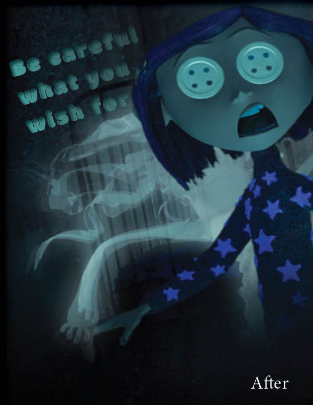
This is the last draft where I contributed more of a gradient into a bubbly looking font that goes with the image itself. It is also tilted to match the character herself being tilted.

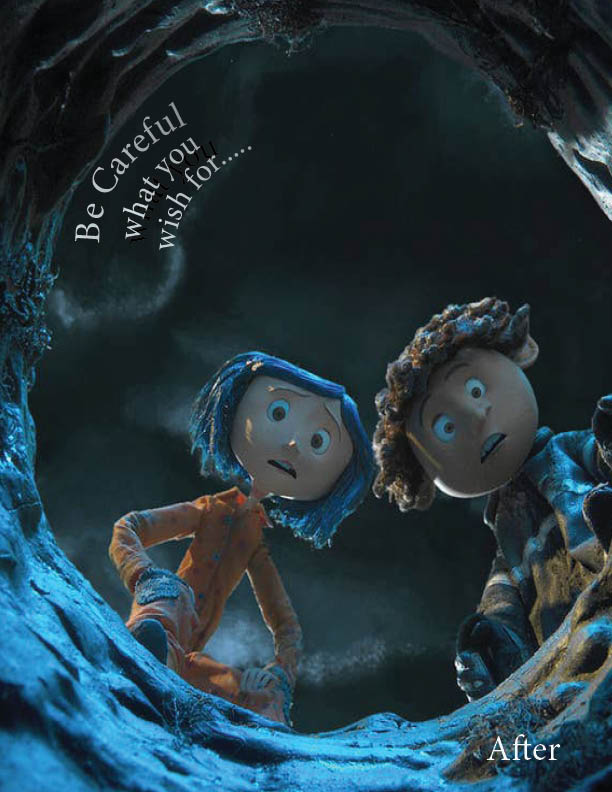
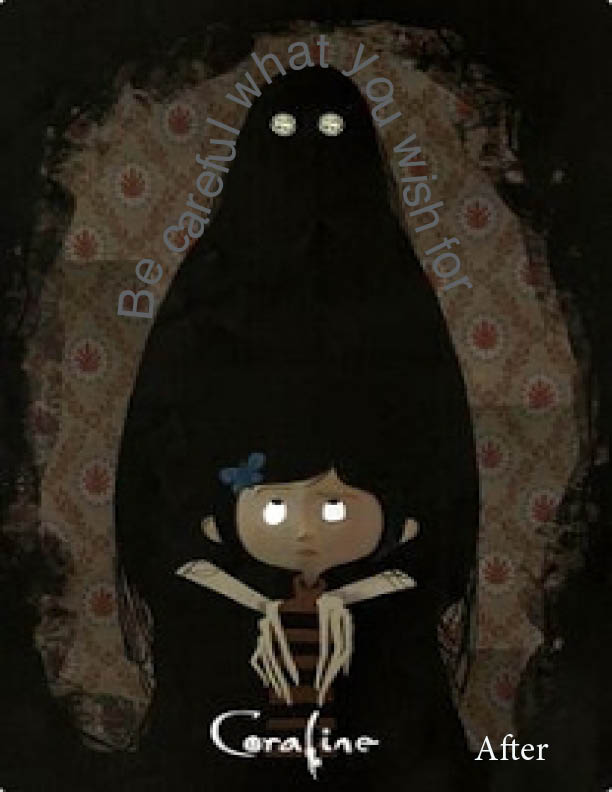
Now after closely looking at the image and coming up with more ideas these are what I decided to change it too.

The font is more straightforward and easy to read. The message gets smaller and smaller. I was having trouble figuring if this was the right font choice but it was hard to read or too big if I changed it.
I decided to go with the text wrapped around the figure in the image because I liked the look of that placement. Again wasn’t sure of the font color and the size but it kinda goes with the image.
This was probably my favorite image because of the color and how the written font ties to it so well. I used the bubbly font because of its hierarchy since the image is also so eye-grabbing.

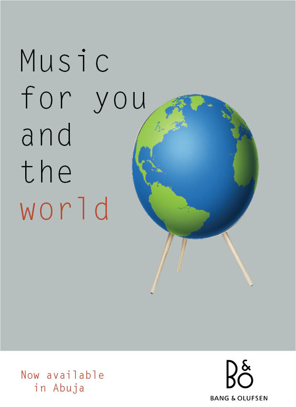
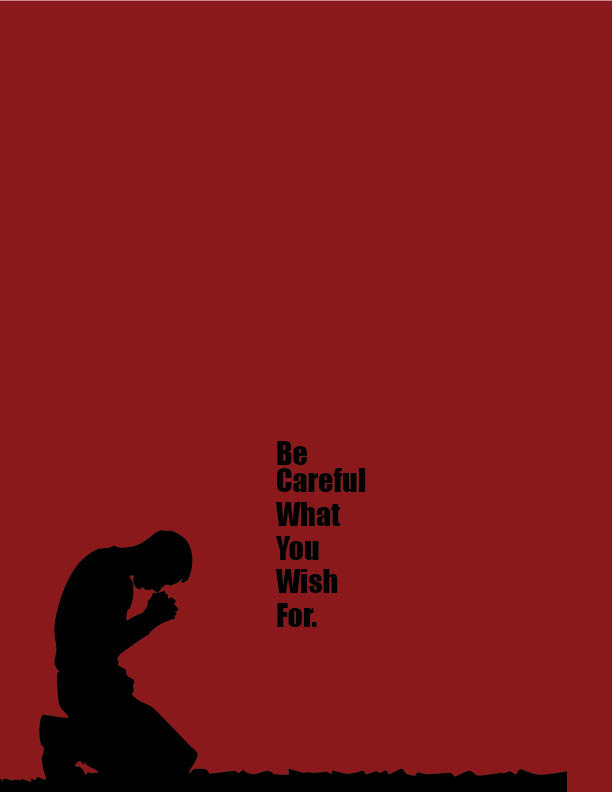
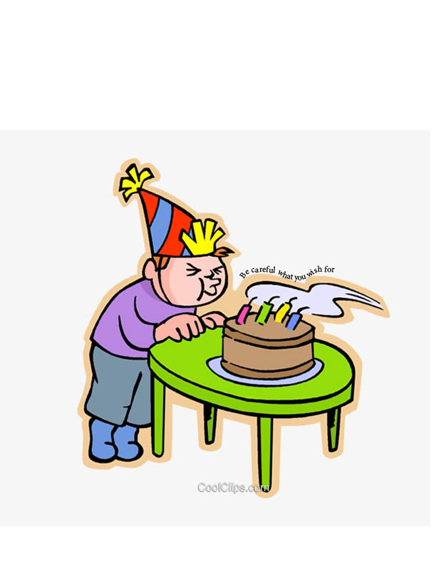
These are some designs using little illustration and mostly sending the message with the wording of the sentence and the font. I wanted to deliver a message with an easy subtle sentence but an obvious way to deliver this message.

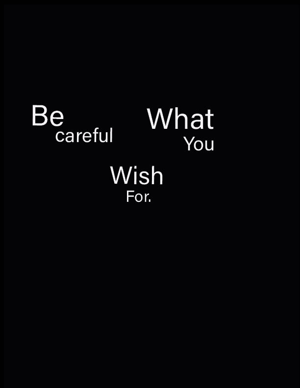
This is a design I made with just using the words and trying to deliver the message from different angles with a type-only aspect, playing with alignment and font.

I played around with more alignment and created this new poster using just type fixing the hierarchy.