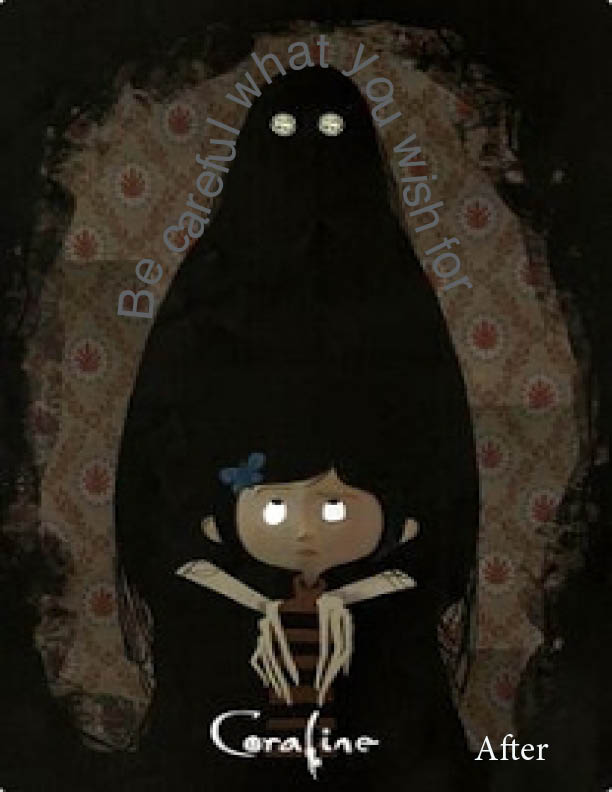
I loved the movie Coraline growing up. It is my favorite movie to this day so the quote I came up with is actually straight out of the movie, “be careful what you wish for.”
This is what I created first with playing aroud with image and fonts.
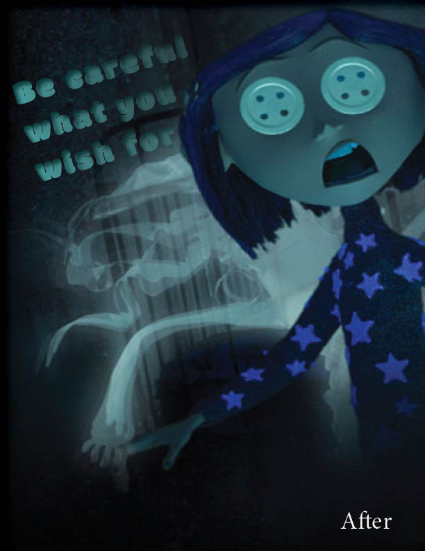
This is the last draft where I contributed more of a gradient into a bubbly looking font that goes with the image itself. It is also tilted to match the character herself being tilted.
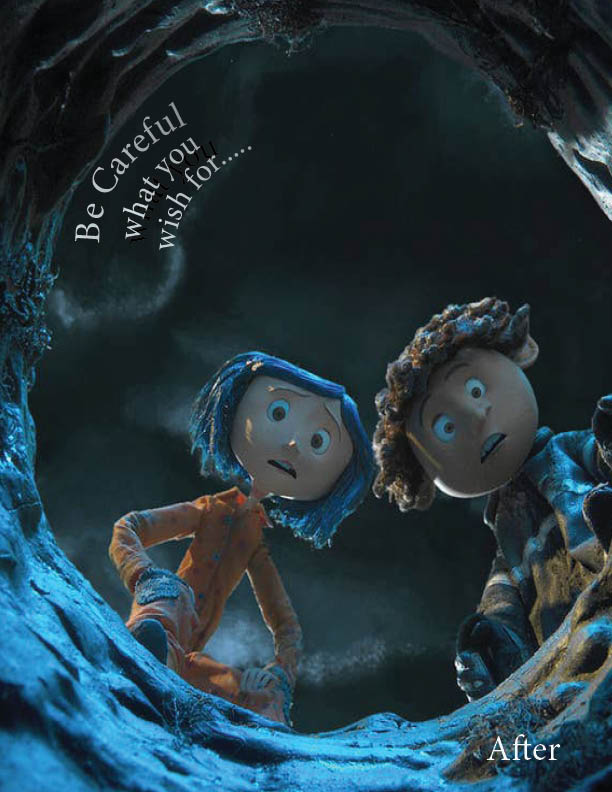
Now after closely looking at the image and coming up with more ideas these are what I decided to change it too.
The font is more straightforward and easy to read. The message gets smaller and smaller. I was having trouble figuring if this was the right font choice but it was hard to read or too big if I changed it. I decided to go with the text wrapped around the figure in the image because I liked the look of that placement. Again wasn’t sure of the font color and the size but it kinda goes with the image.This was probably my favorite image because of the color and how the written font ties to it so well. I used the bubbly font because of its hierarchy since the image is also so eye-grabbing.
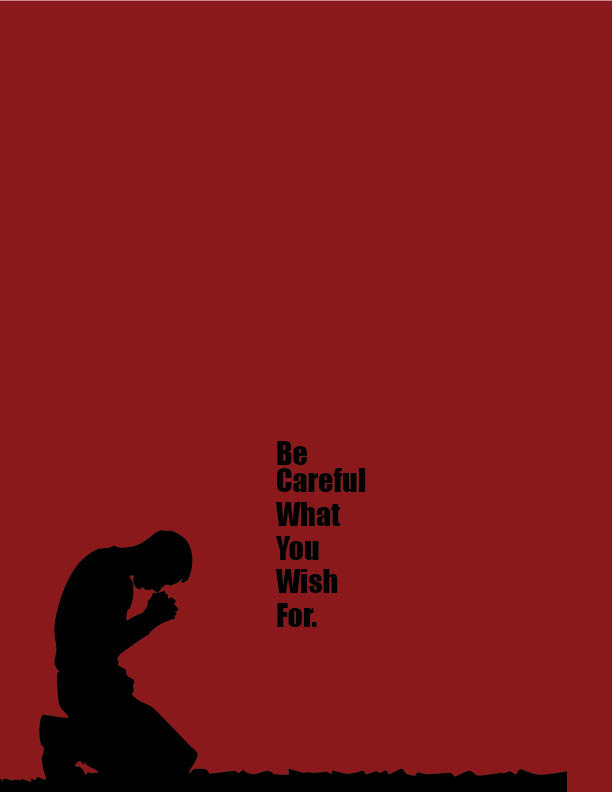
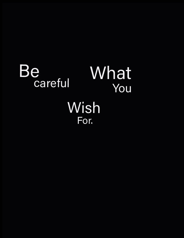
These are some designs using little illustration and mostly sending the message with the wording of the sentence and the font. I wanted to deliver a message with an easy subtle sentence but an obvious way to deliver this message.
This is a design I made with just using the words and trying to deliver the message from different angles with a type-only aspect, playing with alignment and font.
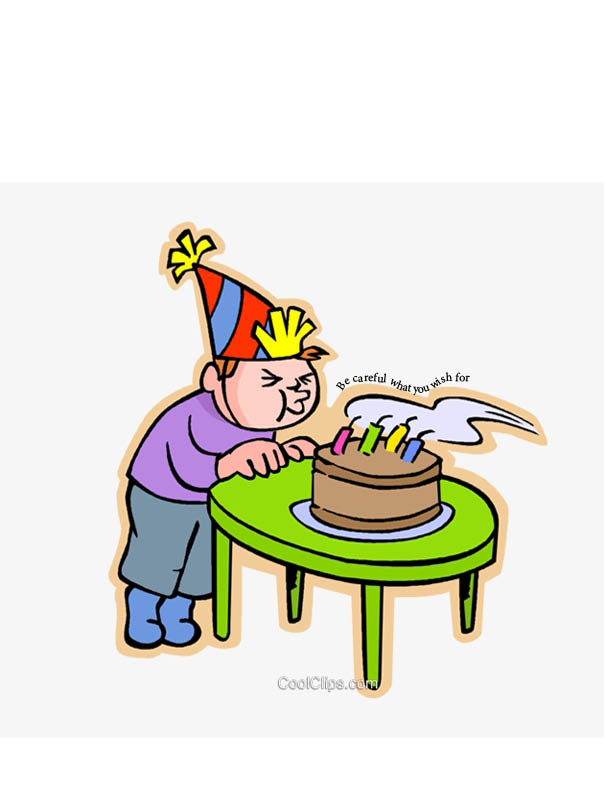
This image was using the “birthday wish” idea so the wording is blowing with the candles as well. I used a regular font in black so it is easy to read and not too distracting. This illustration was more of the creative side and although has nothing to do with the Coraline illustrations I made previously but focused on the wording.