I learned a lot of things in this class. On the first day I remember thinking great this is going to be an easy A and its just to color cut and paste. Then we had our first project and we couldn’t have any meaning to our work it just had to be simple with random shapes created on a 4×4 bristol. Learning how to perfect the use of the exacto knife was a mission of its own. Then having perfect craftsmanship happened and Im like Im so neat this is going to be easy and that didn’t happen it was actually one of the things that kept standing out to me in all of my projects even though I worked so hard on every one of them. Another thing is this class trained my eye to everything. Everything we learned this semester starts popping up in my head when I look at different designs that I see or even in a museum. From contrast to figure/ground relation to color theory I feel like I learned so much overall and it really changed the way I see everything and it even changed how I work on my own personal artwork for the better.
Category Archives: Coursework
Blendoku Extra Credit
1. This photo is an example of adding blue to yellow which creates a green color and as you add more blue you get a darker value of the color. So you can say this is an example of value and hue.
2.  This photo shows a gradient. It shows different shades of grey. This as well can be an example of value.
3. This is an example of hue.. showing vibrant colors of blue purple and red.
4. This photo shows how yellow and red which are primary colors and when mixed create a secondary color which is orange. So this can be an example of value or even hue.
5. Even though these colors look very muted even saturated I would still consider this an example of hue.
6. So the bottom row is an example of value and from the top to bottom it could be an example of saturation or even hue.
7. Every square in this example is a hue. However the middle squares seem to have a muted tone to them.
8. This can be an example of saturation but mostly I would consider this to be an example of hue.
9. This is an example of hue showing different tones of purple and red
10. In this example, the bottom row shows a value and the row going down shows an example of saturation where the red starts off so bright and vibrant and then as it goes down the color starts getting muddier and muted.
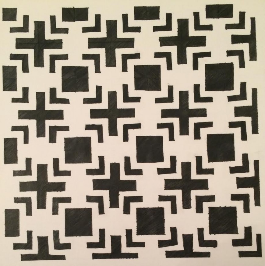
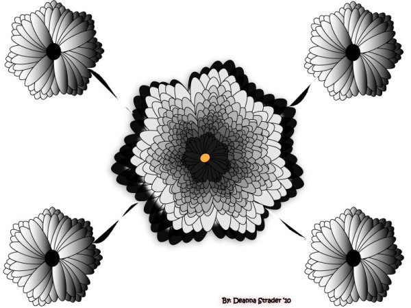
Project 1
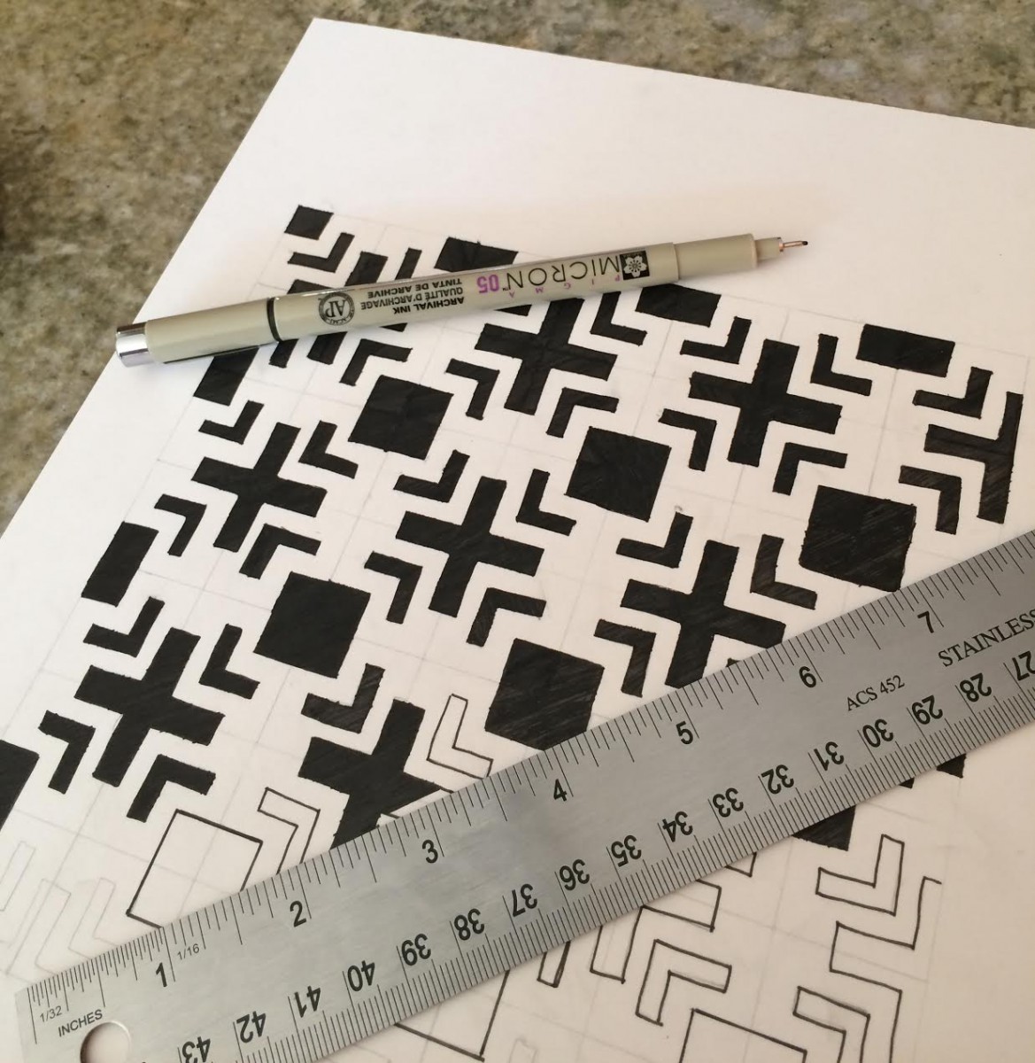
Doing Project 1 I learned that you need to have a lot of patience with these assignments. Craftsmanship is key, it can have a very strong effect on your project. Creating thumb nails and creating them into a pattern on photoshop and bringing those patterns to life was something really enjoyable as well. Here is a picture of my final project
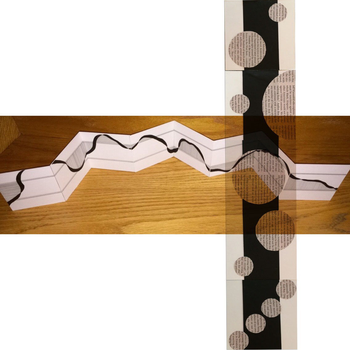
Designs Using Layering

Designs using Spacial Depth
http://www.vision-systems.com/articles/2012/01/time-of-flight-provides-cheaper-technology-option.htm
l
https://dstrader09.wordpress.com/category/school/fnd112/
http://www.angelfire.com/creep/draico/schoolwork/

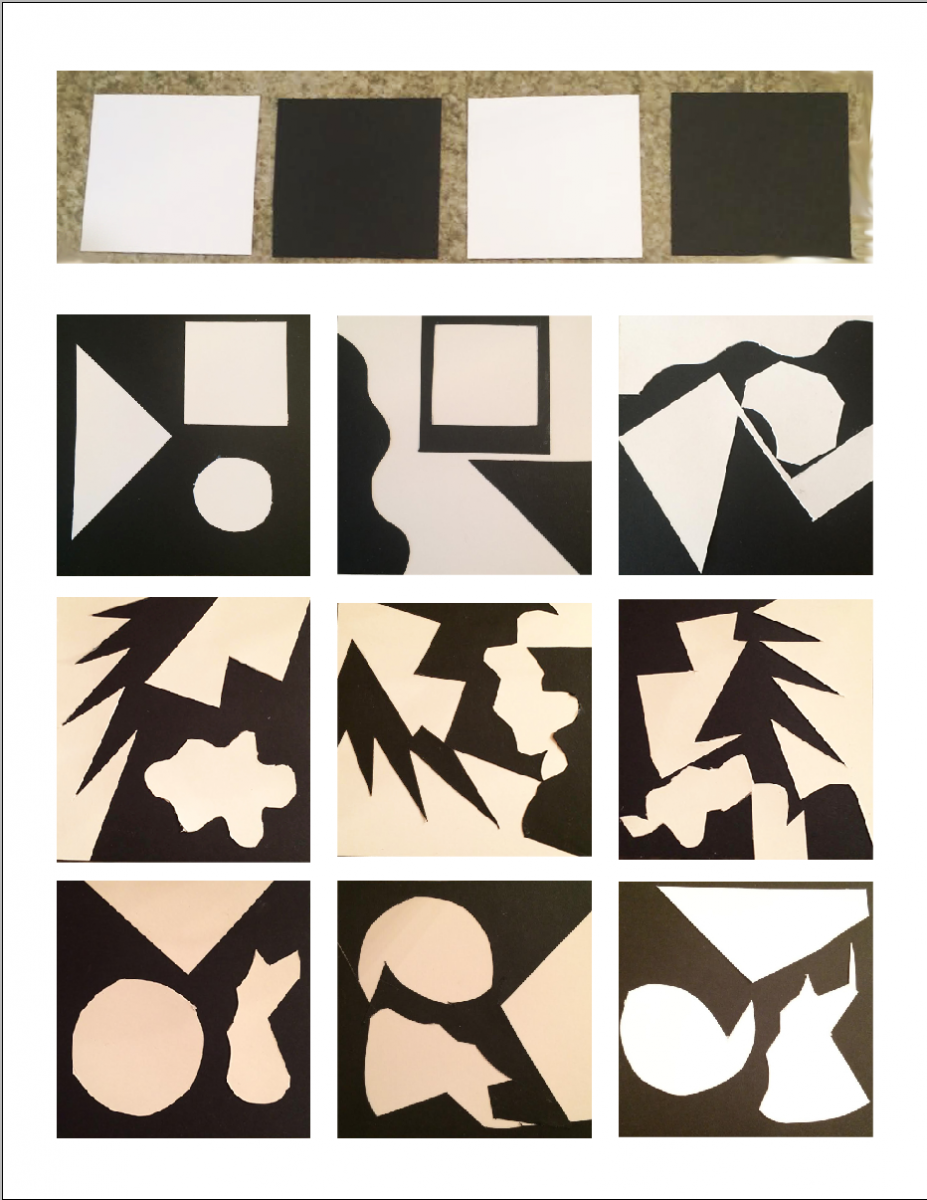
Organic Shapes Project
Image
Welcome!
Reply
My Inspirations:
1. The Met- http://www.metmuseum.org
2. The Moma- http://www.moma.org
I can just sit in the museum and draw. Just walking through or sitting in these museums I get inspired to create the artwork that I have done. Time passes me by when I am there

