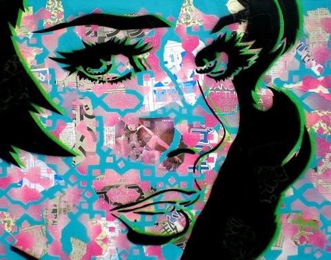
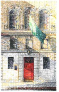
 On Tuesday April 19th we went to visit The Society of Illustrators located at 128 East 63rd Street in Manhattan. We had a chance to tour the grounds with someone who was really passionate about these illustrations as well as the society he was a part of. We first started in the room with all the comics throughout history, which were surprisingly uncensored. Then we went to the other floors, where we had the chance to see more modern work as well as historic. Each and every one of these illustrations were fascinating in their own way.
The Society’s mission is to promote the art of illustration, to appreciate its history and evolving nature through exhibitions, lectures and education, and to continue the services of its members to the welfare of the community at large. Since 1901, the society has had a distinguished yet lively history as an active participant in the ever-changing field of illustration.
On February 1, 1901, nine artists and one businessman came together to form The Society of Illustrators. The prominent artists of the time were Howard Pyle, Mayfield Parish, N.C. Wyeth, Charles Dana Gibson, Frederic Remington, James Montgomery Flagg, Howard Chandler Christy and on occasion Mark Twain and Andrew Carnegie. They would come together for monthly dinners to discuss illustrations of the time, which was at its Golden Age.
Throughout its history, the society’s members have been involved in American Military weather it was to protest or to join the service. During World War I, as part of a public relations effort by the U.S. government, Charles Dana Gibson was called upon to assemble a group of artists who would create posters to generate support for the war. Before there was photography, some society members were even commissioned to go to France and draw illustrations of the war. The contribution of Society members during World War II was intense, they participated in massive poster campaigns, created illustrations from and about scenes of the war in Europe and the Pacific, and participated in a program where illustrators visited veterans’ hospitals to sketch the wounded.
In the roaring twenties, Society members produced these popular entertainments where they wrote the theatrical skits and songs, created the sets, and were the actors, along with their models. Throughout the years they kept up with the times and kept up with the illustrations of the time weather it was a comic in a magazine or newspaper or any hand painted or drawn piece. Even though times had changed and a lot of the works started to become more digital they kept up but still appreciated the hand done pieces.
Overall this was an amazing experience and opportunity to be able to see all these fascinating illustrations. It helped me see that Illustrations can be used for just about anything, weather its for comics, newspapers, magazines, movie posters etc., to just about anything visual that someone somewhere can relate to when looking at it.
