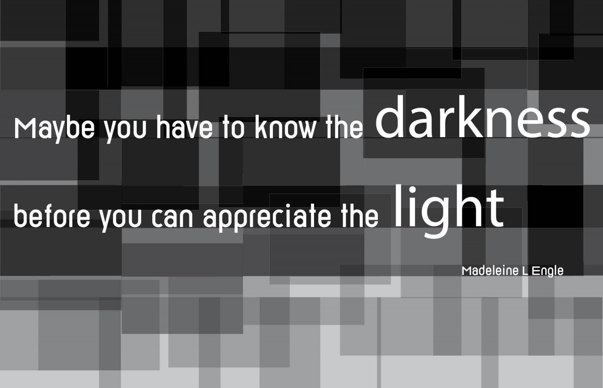
For the first design I decided that I wanted to create a monochromatic image to represent the quote itself. More specifically I wanted to represent the literal meaning of the word’s darkness and light. I created an abstract image that fades from dark to light. I kept my text in the dark area of the image, so it stands out. I used san serif typefaces such as Reross and Helvetica to make it bold and stand out of the background even more.


