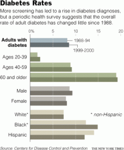
 While searching the New York Times, I stumbled upon an article with this graph. This graph shows the demographics of people with diabetes. The demographics range from people ages 20-39, 40-59, 60+ years, male or female sex, and also by ethnicity. It showcases results dating from 1998. It is important to graph information like this, because it give us a way to forecast the progression or regression of diabetes based off of past statistics and advancements in fighting the disease.
-
Recent Posts
Recent Comments
Archives
Categories
Meta


