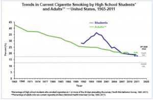
There are many ways that the information from the graph above could be portrayed.For example, a dot graph and a time series graph. A line graph is the most convenient way to portray this type of information because it easily is set up to show the percent of smoking trends amongst teens and adults from 1965-2011. This graph is easily done by plotting the percentage by year for both students and adults for each year. The graph shows that adults have been smoking since 1965 at a high rate and slowly started increasing. Students did not start smoking with a high percentage until 1991 and increased rapidly as well as decreasing after a few years. By 2011, the percentage for adults and students had a 1.1% difference. The graph also shows the pert age expectancy for the year 2020 showing a 4% higher smoking trend amongst students than in adults.
The link to this article is :
http://www.cdc.gov/tobacco/data_statistics/tables/trends/cig_smoking/


