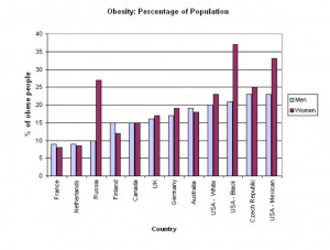
When it comes to data, there are many types of graphs that shows different data and statistics. However, each graph has a different way of showing the data; that’s why when we make a graph it is very important to analyze which one would fit better for our data. For example, this is graph is showing data about the percentage of obesity in males and females from different countries. We can notice that the females from USA (black) has the highest percentage of obesity with approximately 37%. Also, we see that when it comes to men, USA (Mexican) and Czech republic has the higher percentage with approximately 23%. Why did the organization who made the study decided to use a bar graph instead of a pie chart or line graph? Well, as we can notice, the study is for males and women, meaning that there will be two different types of results. So, a pie chart cannot be made if there will be two or more classifications for a result, whereas a bar graph would make this data look more organized, easy to read and professional.


