-
Recent Posts
Recent Comments
Archives
Categories
Meta
Monthly Archives: April 2015
Assignment 2: Bar Graph
Posted in Uncategorized
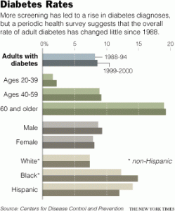
 While searching the New York Times, I stumbled upon an article with this graph. This graph shows the demographics of people with diabetes. The demographics range from people ages 20-39, 40-59, 60+ years, male or female sex, and also by ethnicity. It showcases results dating from 1998. It is important to graph information like this, because it give us a way to forecast the progression or regression of diabetes based off of past statistics and advancements in fighting the disease.
Posted in Uncategorized
MAT 1190 Assignment#2
Largest Population Graph
This is bar graph and it represents the highest populations in the world. As you can see China has been number one for years and still has the crown and the rest seem very small compared to China besides India they are basically right next to each other. This is a very basic bar graph but I just wanted to show that graphs are for everything not just in math, we will see different types of graphs in our life.
Posted in Uncategorized
Graph Assignment
This is a very interesting bar graph, it represents the population structure in New York. The x axis of the the graph represents the population number in thousands and the y axis shows the age rang starting from 0 to 80+. For each age group there is a four year gap in the ages. Both graphs besides each other makes a comparison between the male and female gender and their ages. From studying the graph it is evident that both male and female highest population is around 480 at ages 40-44. Whereas the lowest population is in the age group of 80+. I chose this graph because it is very clear on the information it is representing and also it allows us to make comparison.
Posted in Uncategorized


