Tag Archives: COMD1100
3 pictures of things that I would like to take a color inventory of.
#27
Process color
- Alternatively referred to as full color, process color is used in printers that only have four colors available (commonly cyan, magenta, yellow, and black). With process color, multiple colors can be combined generating what appears to be other colors.(https://www.computerhope.com/jargon/p/proccolo.htm)
- CMYK color, a lot of dot to print out, for example news paper.
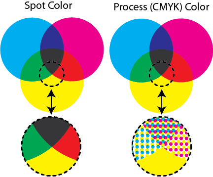
spot color
- Printing technique where each color is printed in layers and the printer prints each layer until each of the required colors have been printed. Spot color printing is commonly performed on print jobs that require a special color that cannot be created using CMYK, for example, a florescent color.
- full color print, for photo or art work.

hex triplets
- Hex Triplet Colors are web colors used for font families and userbox designing.
- color for web, each color with a Code.
#26
That is true that the guy talk about, some time the color you see is not the real color you think, you need a tool like color picker or Color Sampler Tool in adobe (ps, illustrator ,ect.) to get the correct CMYK OR RGB color information.
Example from the Cooper Hewitt collection 2017-5-15
Monochromatic

https://collection.cooperhewitt.org/objects/18708349/
Analogous
![This Soviet film poster for the German 1927 movie "Die Symphonie der Grossstadt" ["Symphony of a Metropolis"], depicts a mechanical man composed of a head with a movie camera for one eye, a watch on his neck, with one arm typing on a typewriter and the other arm in the form of a pen. This figure is placed in front of a flat and tilted skyscraper. The title of the film, in red, runs diagonally along the lower edge while the movie credits in white parallel the diagonal building.](https://images.collection.cooperhewitt.org/127690_9925380dd5d98a29_b.jpg)
https://collection.cooperhewitt.org/objects/18714041/
Complementary

https://collection.cooperhewitt.org/objects/18133471/
Triad

https://collection.cooperhewitt.org/objects/18789723/
Tetrad


https://collection.cooperhewitt.org/objects/18511697/
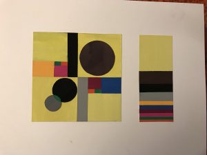
Color interaction exercise
- Change in hue ______Untitled-4
- Change in saturation_____Untitled-2
- Change in value______Untitled-1
- Change in hue, saturation and value______h,s,v
- 2 different colors that look like the same color______Untitled-3
#25
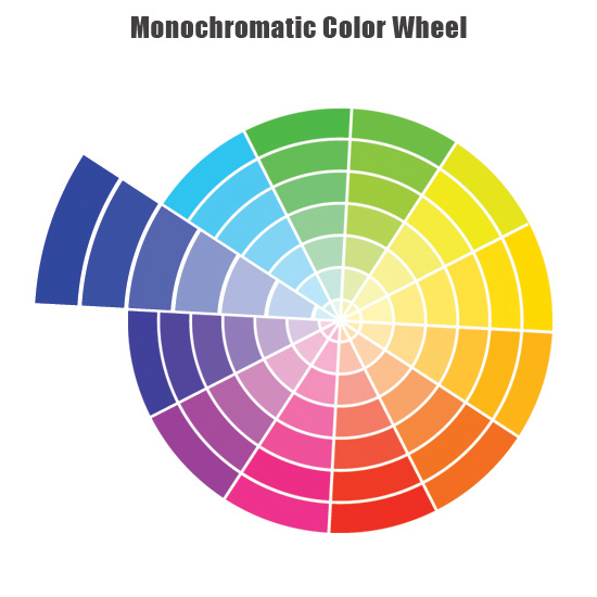
Monochromatic
- A Monochromatic Color Scheme is created by taking any oneof the twelve Hues from the Basic Color Wheel and repeating it in various Tints, Shades and Tones.. (http://color-wheel-artist.com/monochromatic-color.html)
- same color but different intensity. from dark to light.
Analogous complementary
- Choose any color as your main Mother Color. Then select its Complementary color directly across from it. From there choose two or three colors on either side. A total of three instead of four Analogous Hues work best to avoid over-complicating things.(http://color-wheel-artist.com)
- use colors that are next to each other on the color wheel

Triad
- A triadic color scheme uses colors that are evenly spaced around the color wheel.(http://www.tigercolor.com/color-lab/color-theory/color-harmonies.htm)
- Pure Triad Colors combine every fourth color on the Basic Color Wheel.

Tetrad
- The rectangle or tetradic color scheme uses four colors arranged into two complementary pairs.(http://www.tigercolor.com/color-lab/color-theory/color-harmonies.htm)
- combine every fourth color on the Basic Color Wheel.

#24
Prismatic color
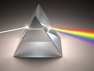
- Prismatic colors are the colors that can be seen when white light goes through a prism. The colors of the visible spectrum produced by passing white light through a prism; red, orange, yellow, green, blue, indigo, and violet
(http://www.yourdictionary.com/prismatic-colors#V9rYvaRF2U7YViEP.99)
- The colors show when the white light pass through the Prismatic.
muted color
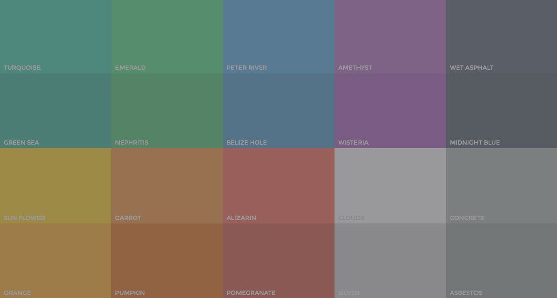
- Muted colors are primary or secondary colors mixed with grey to “tone” them down. (answers.yahoo.com)
- Muted colors are colors that are less intense
Achromatic grays
- Achromatic grays are colors in which the rgb (red, green, and blue) values are exactly equal. ///Since achromatic grays have no hue, the hue code (the h in the hsv values of the color) is indicated with a dash. Achromatic grays are the axis of the color sphere, with white at the north pole and black at the south pole of the color sphere. The various tones of achromatic gray are along the axis of the color sphere from white at the top of the axis to black at the bottom of the axis. (wiki.com)
- black and white

Chromatic Gray
- A chromatic gray is a gray color in which the red, green, and blue codes are not exactly equal, but are close to each other, which is what makes it a shade of gray.(wiki.com)
- dark colors

Additive color
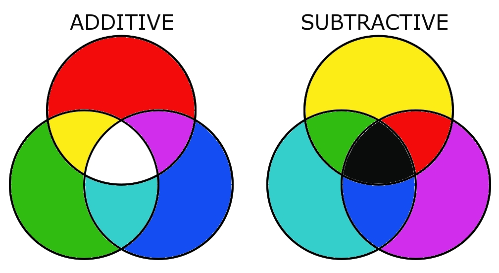
- Is color created by mixing a number of different light colors, with shades of red, green, and blue being the most common primary colors used in additive color system.(wiki.com)
- Describe situations where light is mixed by different colors to become a new color.

subtractive color
- A subtractive color model explains the mixing of a limited set of dyes, inks, paint pigments or natural colorants to create a wider range of colors, each the result of partially or completely subtracting (that is, absorbing) some wavelengths of light and not others.(wiki.com)
- Explain the color of the mixture of paint, dye, ink etc.
Bezold effect
- The Bezold effect is an optical illusion, named after a German professor of meteorology, Wilhelm von Bezold (1837–1907), who discovered that a color may appear different depending on its relation to adjacent colors.(wiki.com)
- color may look differently when compare with Other

color interaction
- Every colour is seen in relationship to another colour. When you see two or more colours together they have a profound effect on one another (http://www.webexhibits.org/colorart/contrast.html)
- Two colors or more side by side, interact with one another affects the colors that we saw.

#23
Josef Albers
(http://www.theartstory.org)
Josef Albers was instrumental in bringing the tenets of European modernism, particularly those associated with the Bauhaus, to America. His legacy as a teacher of artists, as well as his extensive theoretical work proposing that color, rather than form, is the primary medium of pictorial language, profoundly influenced the development of modern art in the United States during the 1950s and 1960s.
- Albers’s 1963 book Interaction of Color provided the most comprehensive analysis of the function and perception of color to date and profoundly influenced art education and artistic practice, especially Color Field painting and Minimalism, in the twentieth century.
Johannes Itten
His development of the preliminary class of the school revolutionized art education. Instead of having students copy works of the Old Masters, he encouraged them to explore their own feelings and to experiment with colors, materials, and forms. This course emphasized three elements: studies of natural forms and colors, the analysis of canonical artworks, and life drawing. He was a pioneer of holistic art teaching and went on to run his own art school, along with serving at senior positions in renowned art academies.
- Itten developed an intricate theory of color, which associated color palettes with types of people and seasons. His work on color contrasts, which characterized seven different types of comparisons, was important for the development of Op Art, but would also influence palettes designed by cosmetic companies in the late 20th century
Albert H. Munsell
(http://munsell.com/)
Albert Henry Munsell was born in Boston Massachusetts on January 6, 1858 and died June 28, 1918. Munsell was an accomplished artist and distinguished professor at what was then known as the Massachusetts Normal Art School in Boston
- Munsell Color continues the legacy of Albert H. Munsell and his dedication to helping people communicate color easily and accurately. Our aim is to provide you with effective color tools, tips, and techniques based on Munsell color theory. We’re your resource for transforming Munsell color theory into action – whether you’re designing palettes, producing products or conducting color-based analysis.

