My Portfolio
Reply
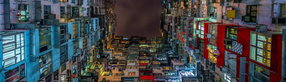
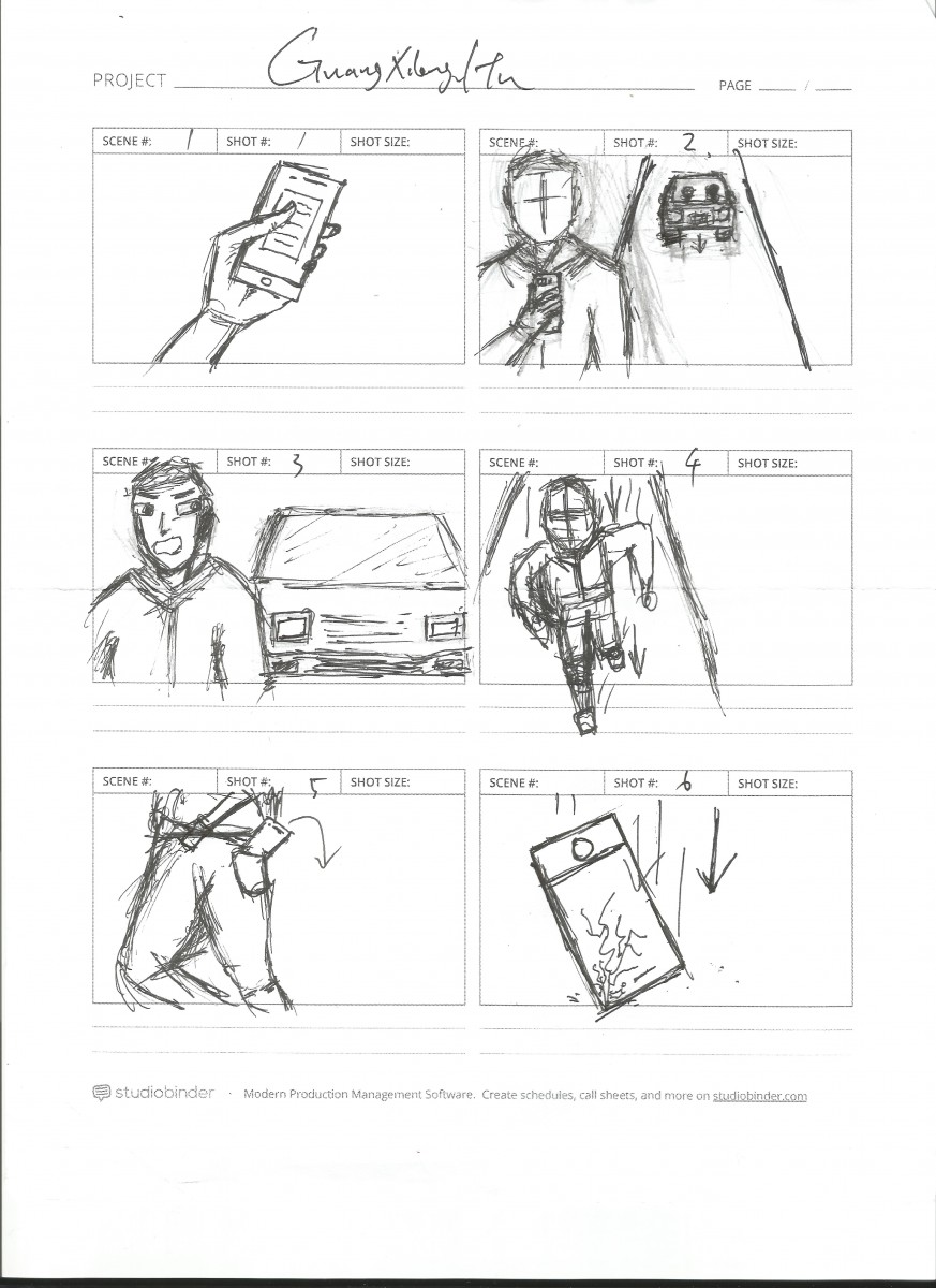

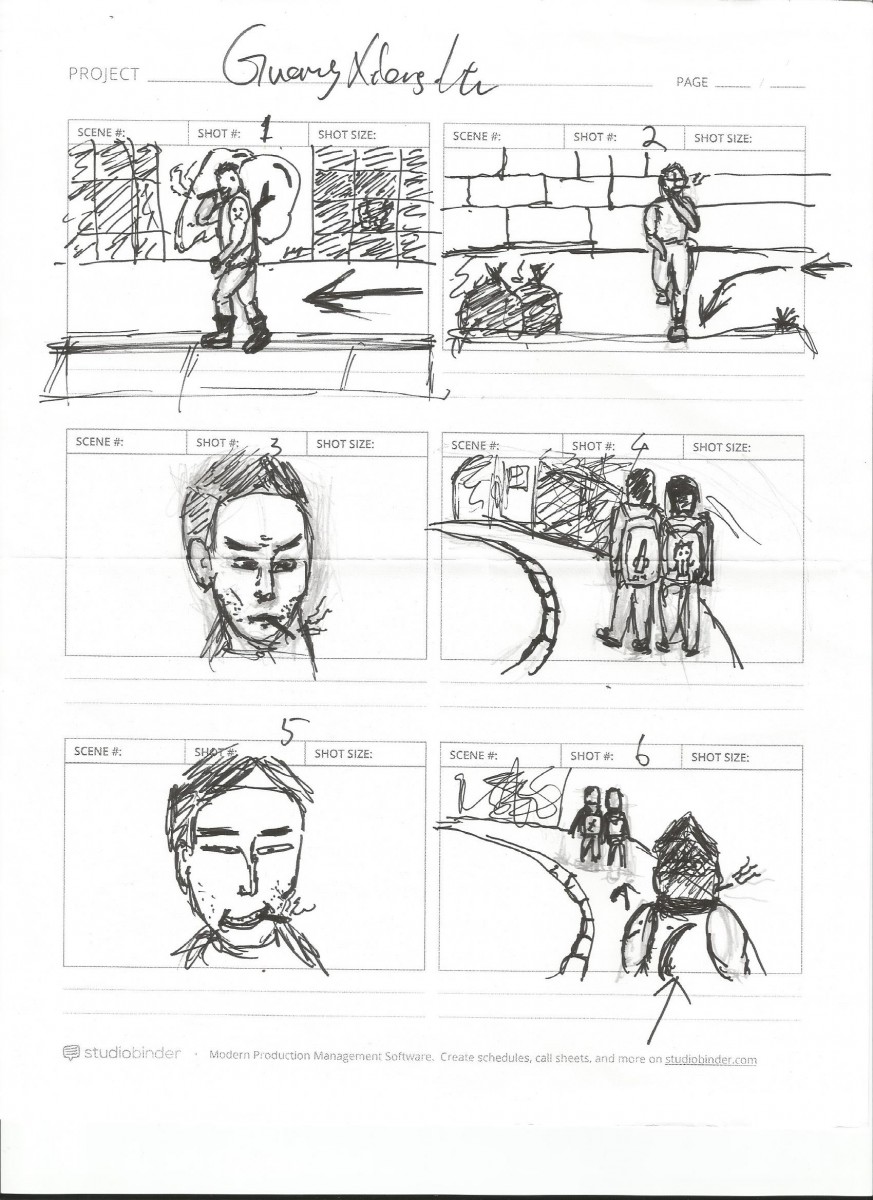

1. Long shot
Walking in the street,
2. Long shot
Stop and smoking against the wall.
3. Medium close up
Camera slowly zoom in, show the detail of the face, smoking and looking at one direction.
4. Wide shot
Two kids walking in the other street
5. Close up
Show bad guy smile, then take a big smoke.
6. Wide shot
Following the two kids from the back
7. Over the shoulder shot
Holding a child with a one hand, the kid shows a scared expression.
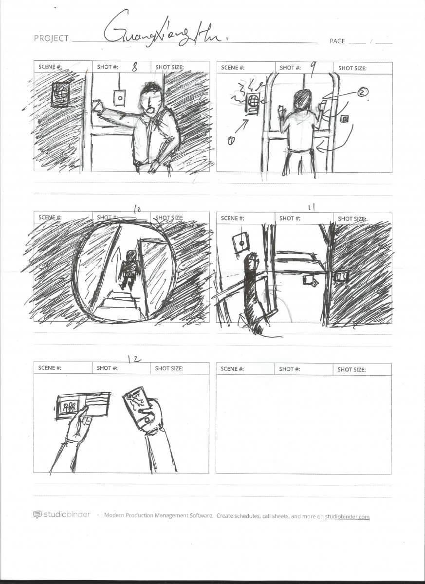
8. low angle close up shot
Focus the hand with money in the front. Two kids Sitting behind crying,
Guangxiong.Hu
CDMG 1111, Section D304
2017-9-12
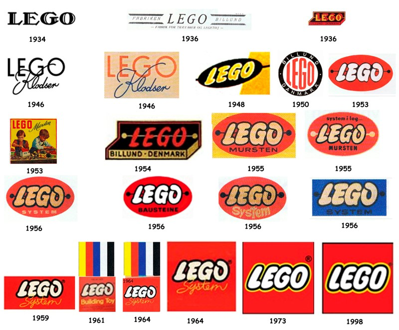
LEGO is many generations of kids and adult’s favorites, it has been a world-famous toy manufacturer, and its sales are among the top 10 toys in the world. Lego has been accompanied by countless children’s growth. The bright red, yellow and white colors of the logo leap out at consumers and can easily catch the eye of a young child.The plastic blocks have convex grains at one end and holes in the other to be inserted into the granule which creates unlimited imagination and the future of creativity. In the continuous improvement of lego products, its logo also changes over time, the iconic LEGO logo is used to mark all LEGO’s products like movie and game are as being associated with the brand and become one of the most recognizable and successful logos of all.
However, the first LEGO’s logo was a rather uninspiring design. Lego founded in Denmark, has a history of 80 years. The first LEGO logo was introduced by Ole Kirk Christiansen in 1934, it came from “leg-godt” in Danish, meaning “to play well”, and later he learned that the name means “Build and pile up” in Latin. therefore, he uses the words LEGO spelled out in an ordinary, black font as LEGO’s logo. The name was registered as a trademark in 1954. Two years later, Ole Kirk Christiansen redesigned the LEGO logo and first used on wooden toys in 1936. He added Fabriken in the left and Billund in the right of LEGO font. Fabriken Billund is a factory which near the birthplace of Ole Kirk Christiansen.Afterwards, there is two different logos in 1946. In 1946, the logo was composed of “LEGO” print and handwriting “Klodser” which meaning blocks. Red began to enter the main color of the LEGO logo. The second logo is inspired by the box used in LEGO products, and the following text “Billund Denmark”
When Ole Kirk Christiansen purchased the first machine for casting plastic, the company began manufacturing plastic toys. The next year, the theme color is yellow with the oval logo. In later 1953, Automatic Binding Bricks are renamed to LEGO Mursten and come out with a new logo which the yellow background, the red font, and the handwritten Mursten font. Under the font, there are two children who playing LEGO. Shortly after, the first one of the oval logos appeared on LEGO Mursten catalog. Although the Lego logo changed many times, the company still has not standardized the brand colors and style. Between 1953 to 1958 the logo didn’t ‘t change much. But in1958, Ole Kirk Christiansen passed away, his son Godtfred officially succeeded and actively pursued his own “System” concept. LEGO building blocks were redesigned, greatly enhanced the versatility and convergence, “System” has become a deputy theme of the logo.
“The first of the rectangular/square logos. This and many variants were used worldwide for the next 13 years.” From logodesignlove website is talking about the first logo that has LEGO himself notable brand colors and style was decided in 1960. Red background, LEGO’s logo text and handwriting “System” as the deputy theme. Later, the first LEGO package released. The new logo on the right side of the color symbol of the new package using the new material of the five colors, Lego blocks since the farewell red and white monochrome color.
Before the last logo was designed, there is a similar logo was designed. “This logo goes in 1973, the same year that LEGO started production and distribution in the US. It intended an attempt to cement a single worldwide logo and remains the mostlectionisable version of LEGO’s brand identity. “this logo was done a great job when LEGO enterprise trying to develop in the US market.
From 1998 to present, the LEGO logo has become one of the most recognizable logos of all, especially for younger audiences and kids. A bright red background, white text with a black stroke color and yellow outline can easily to attract people’s attention and make it easier to remember their brand. Also from each of the evolution of LEGO’s logo, means that the new product of this enterprise appears and changes
(UFT-Print Shop) Trip Report
On Wednesday, November 29. We have a trip with class to the United Federation of Teachers (UFT), Print Shop on Broadway in Manhattan, New York. The purpose of this trip was to took a tour of their faculty and explaining what they do and how the machines they use every day work. Get a close-up look into their print shop, and to learn about the different kinds of machines, paper, ink, etc.
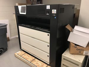
The first machine we were showed was a poster-sized one, that can only print documents with minimum measurements of 11” x 17” in color or black and white. The next was a machine used to print newspaper-type articles with the option of front and back. This machine used oil-based ink and produces a medium-quality picture. The third printing machine we saw was an extremely large one of the ryobi series, used to print large quantities of large-sized documents.
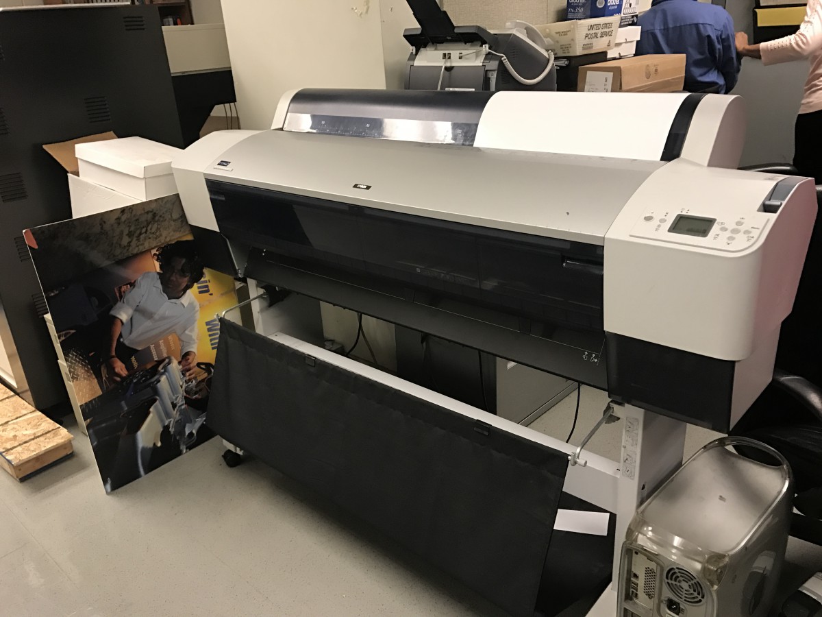
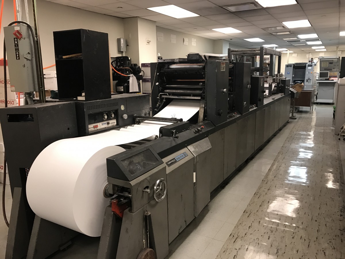
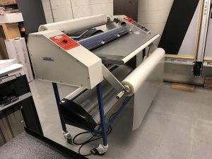
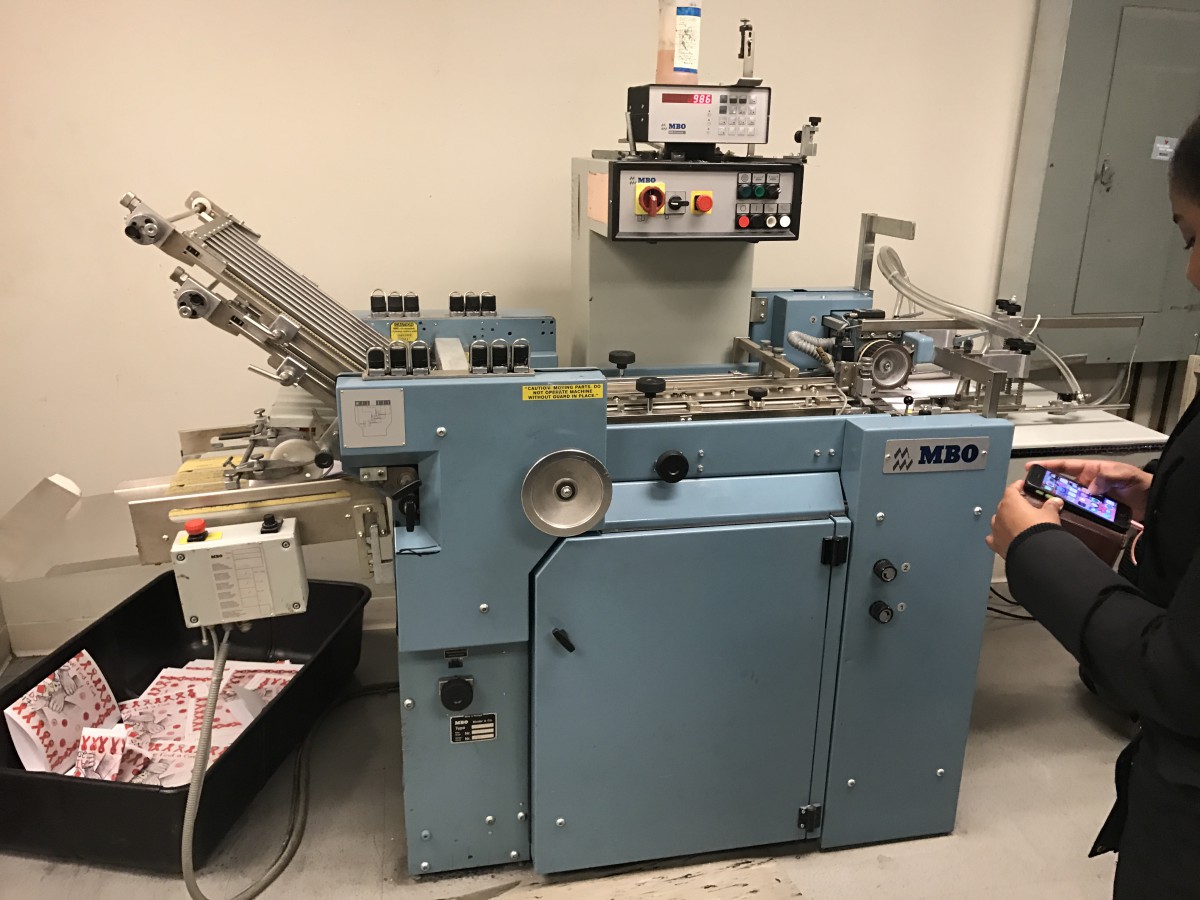
Then we were shown a very large machine that prints off a gigantic paper roll, instead of by individual sheets. This paper would need to be cut after printing, and there is a cutting machine right next to the paper roll machine. This cutting machine can be adjusted so you can cut at any size. the staff showed us how to minimize the time it takes to cut by always cutting from the back. Also, we were shown how mail a piece of paper without using an envelope. the machine also can fold the paper and use a sticker to keep it sealed, and then right on the outside of it as if it were an envelope.
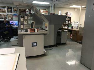
Overall, the print shop was a great experience to seeing how print products on operates because it showed to us how much times and jobs they can save from the machine.
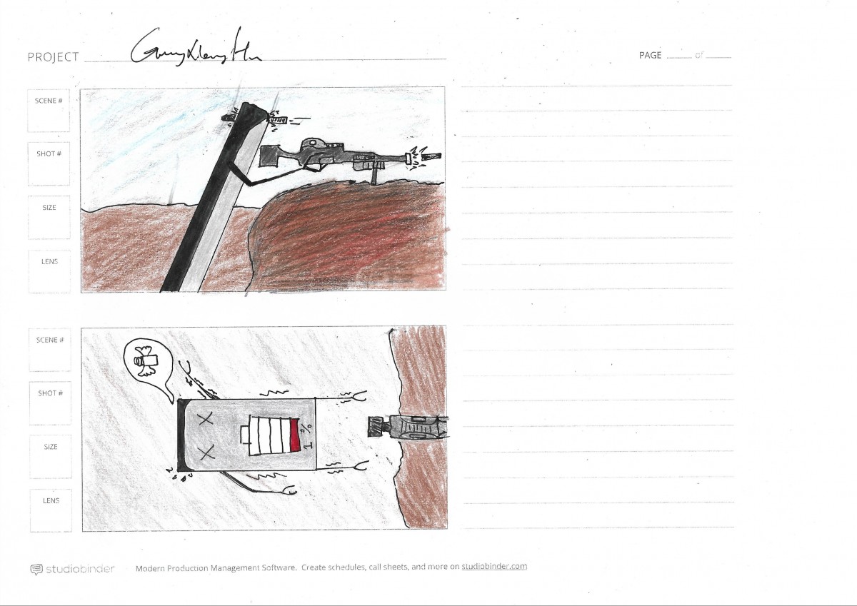
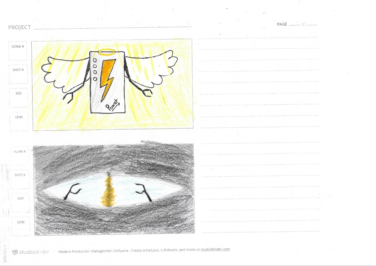
This video is about my Thanksgiving day.I use Gopro and Iphone7 plus shooting the video, The hardest part is I have to ready my phone or Gopro at any time to capture interesting shots. The first part is what I saw on my way to Baltimore, I shot the sunset by using the time-lapse photography which played at normal speed, time appears to be moving faster. The middle part is all about food that i ate at Baltimore. The last part is the way i going back to New York city. This video is up to 5 minutes, but my music is only 3 minutes so i need to use the second song to overlap the first song.
![]()


The OpenLab is an open-source, digital platform designed to support teaching and learning at City Tech (New York City College of Technology), and to promote student and faculty engagement in the intellectual and social life of the college community.

