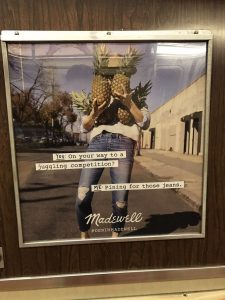
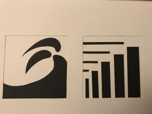
#21
Color (ldoceonline.com)
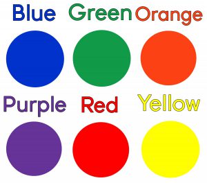
- The quality of an object or substance with respect to light reflected by the object, usually determined visually by measurement of hue, saturation, and brightness of the reflected light; saturation or chroma; hue.
- Is a visual feeling of an object
Hue (dictionary.com)
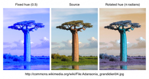
- a gradation or variety of a color; tint
- a colour or type of colour
Saturation (helloartsy.com)
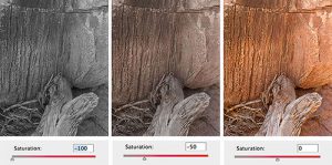
- Saturation describes the purity of a color and along with hue and value it represents one of the three properties of color.
- Show whether the color is colorful or Bleak
intensity (thevirtualinstructor.com)
- Intensity, on the other hand deals with the amount of purity in the hue itself. It can also be referred to as “saturation”. Primary colors are considered to be the most “pure” in intensity.
- brightness or dullness of a hue
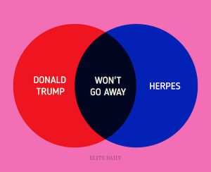
Funny venn diagram
Design Journal entry #16
Tonal progression,
- The purpose of this page on Tonal Progression is to demonstrate some ideas about color mixing.(http://anthonyryder.fineartworld.com/)
- is a color proceeding from dark to light
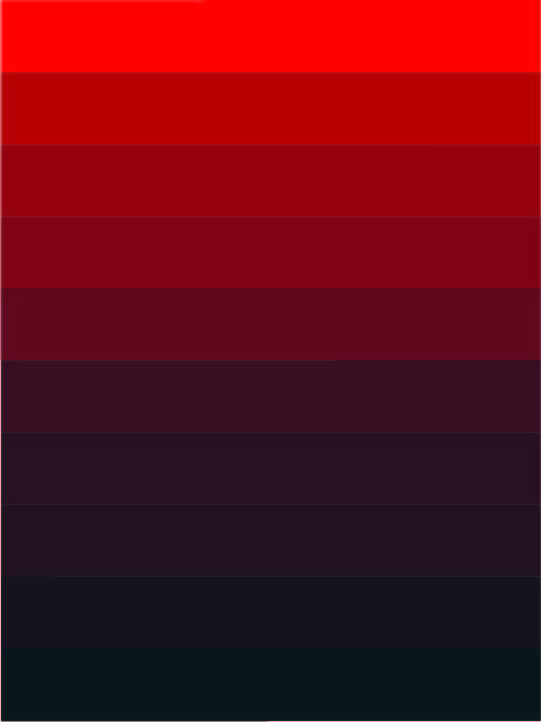
shade,
- the comparative darkness caused by the interception or screening ofrays of light from an object, place, or area.(dictionary.com)
- a color, especially with regard to how light or dark

tint,
- a color diluted with white; a color of less than maximum purity, chromo, or saturation.(dictionary.com)
- a color with more white to less

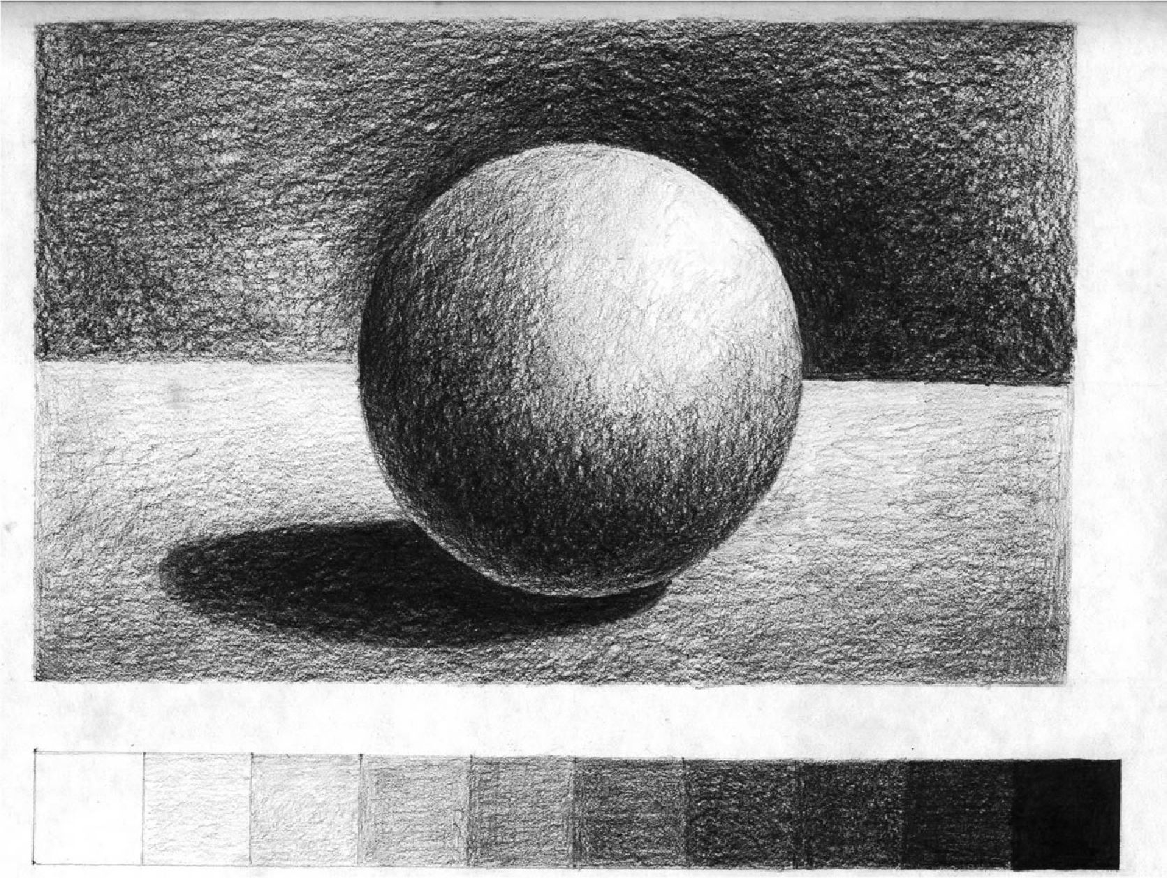
tone
- defines the lightness or darkness of a color. The tonal values of an artwork can be adjusted to alter its expressive character.(artyfactory.com)
- to show a color is darkness or lightness
venn diagram
- a diagram that uses circles to represent sets and their relationships.
- make by 2 or more diagram to show the relationships

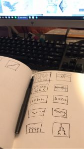
5 thumbnail sketches exploring transparency and layering
Project #2
3 successful examples of rhythm and movement in design
Rhythm
https://collection.cooperhewitt.org/objects/18346351/
https://collection.cooperhewitt.org/objects/18400701/
https://collection.cooperhewitt.org/objects/18689071/
Those examples are success for me because they all rhythm which followed have their own regularity to develop.
Movement
https://collection.cooperhewitt.org/objects/18499327/
https://collection.cooperhewitt.org/objects/18344419/
https://collection.cooperhewitt.org/objects/18799765/
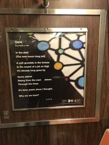
3 Strong visual hierarchy from subway
3 Successful examples of the design principle contrast #9
https://collection.cooperhewitt.org/objects/18264713/
https://collection.cooperhewitt.org/objects/18253031/
https://collection.cooperhewitt.org/objects/18519629/
these examples are good examples to showing contrast from Compared both side.

