Monthly Archives: March 2017
Design Journal entry #16
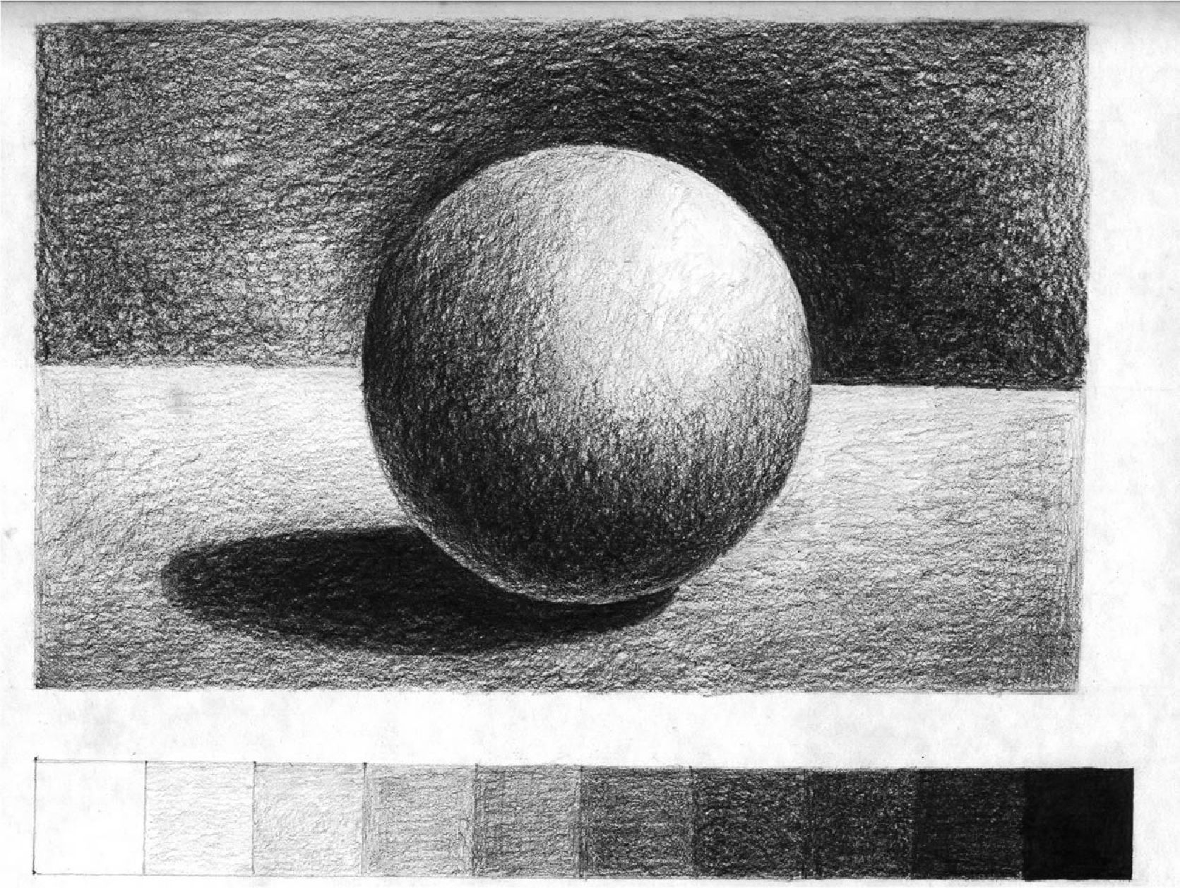
Tonal progression,
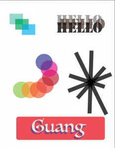
- The purpose of this page on Tonal Progression is to demonstrate some ideas about color mixing.(http://anthonyryder.fineartworld.com/)
- is a color proceeding from dark to light
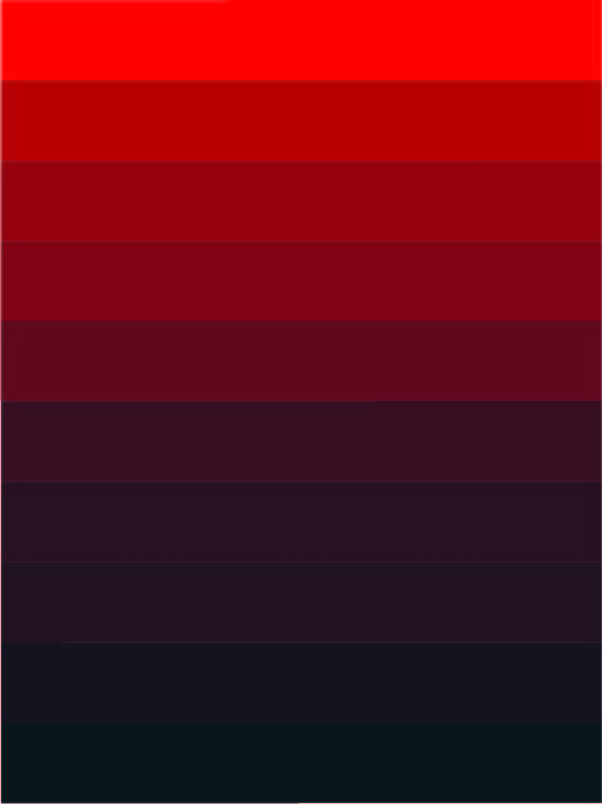
shade,
- the comparative darkness caused by the interception or screening ofrays of light from an object, place, or area.(dictionary.com)
- a color, especially with regard to how light or dark

tint,
- a color diluted with white; a color of less than maximum purity, chromo, or saturation.(dictionary.com)
- a color with more white to less

tone
- defines the lightness or darkness of a color. The tonal values of an artwork can be adjusted to alter its expressive character.(artyfactory.com)
- to show a color is darkness or lightness
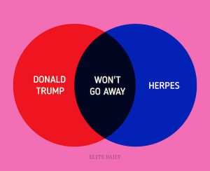
venn diagram
- a diagram that uses circles to represent sets and their relationships.
- make by 2 or more diagram to show the relationships

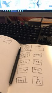
5 thumbnail sketches exploring transparency and layering
Project #2
3 successful examples of rhythm and movement in design
Rhythm
https://collection.cooperhewitt.org/objects/18346351/
https://collection.cooperhewitt.org/objects/18400701/
https://collection.cooperhewitt.org/objects/18689071/
Those examples are success for me because they all rhythm which followed have their own regularity to develop.
Movement
https://collection.cooperhewitt.org/objects/18499327/
https://collection.cooperhewitt.org/objects/18344419/
https://collection.cooperhewitt.org/objects/18799765/
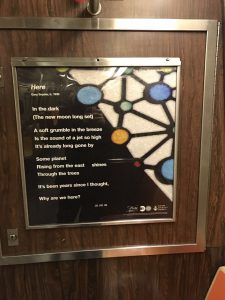
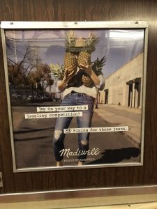
3 Strong visual hierarchy from subway
3 Successful examples of the design principle contrast #9
https://collection.cooperhewitt.org/objects/18264713/
https://collection.cooperhewitt.org/objects/18253031/
https://collection.cooperhewitt.org/objects/18519629/
these examples are good examples to showing contrast from Compared both side.

