-
Recent Posts
Recent Comments
Categories
LL4
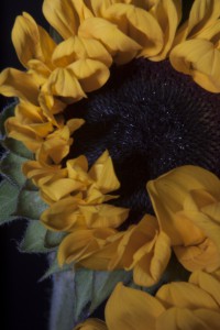
This is the picture i chose to right about from the group of pictures that i took. the background isn’t illuminated in this picture but the seeds in the front are so you can tell that i had no backlight. For this picture I was using a front light but it wasn’t relatively strong seeing how the petals aren’t super bright but still cast shadows upon one another. The lighting gives the flower a feeling of life but doesn’t give off any signs of joy its not a flower thats happy to live but a flower thats just living its life.
Posted in LL4-Lighting Direction
Leave a comment
LL2
While at the Brooklyn Historical Society we learnt about the past forms of photography such as the Daguerreotype . There are a lot of differences between Daguerreotype and the type of photography cameras we use such as dslr. With modern day cameras we can instantly take multiply shoots and see them instantly to see if it was a bad shot or a great one. They both still use the same theory of capturing light and reflecting it to capture an image. We can now gather a bunch of photos on a memory card and travel with it and put it on display easier then we can in the past. Though modern day cameras are use for portraits that is not the only style of photography that it is mainly used for. Back then there used to be only one type of daguerreotype but now there are different model and various versions depending on your personal preference. One of the flaws of the Dauerreotype is that you can’t angle it as much and isnt as compact as a modern day camera. It was also a much longer process seeing how now all it take is a click of a button and two seconds later you have your image.
DOF
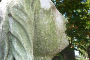
In my opinion shallow depth of field, allows the viewer to focus on the main image while the background is not in focus. To achieve the shallow depth of field, I had to put on the “macro effect” on my camera (it looks like a flower). At first it was a bit difficult, I could not achieve the “blurry” out of focus effect in the background. This photograph shows the texture and fine details in he statue. Although it may appear ugly, it the chips, and stains in this statue show its natural beauty. In the background the texture of the leaves is also noticeable. The use of the shallow depth of field creates a pleasing photographic composition.
Posted in LL3-DOF, Uncategorized
Leave a comment
Portrait shots
In class we did a portrait photoshoot. We did the photo shoot using; a background light, broad light and fill light. While shooting broad light, we took one light and placed it directly onto our subject, this lighting was direct. The fill light was achieved through holding a circular or square like reflector. This added highlights to the subjects facial features, it was quite fun to manipulate the lighting. The background light was achieved through placing a light directly on the backdrop which created a “glow” around the subject
Posted in LL5-PortraitBasics
Leave a comment
LL8
Over the course of this semester I have learned many interesting and various things. I have learned about; shallow depth of field, lighting, aperture and ISO among many others. Photography has allowed me to be in contact with nature, and also taught me that Iphone cameras are not the best. While visiting Green Wood Cemetery and the Botanical Garden I was allowed to take the best photos, I took many however they were my favorites. I also learned about different angles such as; oblique and worms eye view. I enjoyed classroom photo shoots, it taught me that an individuals body language or facial expression when photographed at the right time can speak volumes. As known a picture can speak a thousand words. I also learned about particular photographic styles such as; high key and low key.
Posted in LL8-Final Evaluation
Leave a comment
Gallery Report Re-post
Upon entering the “On Assignment” gallery by Irving Penn, I was mislead. The first images that I saw were hands shot in lack and white. His photographs were shot in high contrast. While continuing my tour it became versatile, there were fashion photographs, magazine spreads also images of women draped in cloths and still objects. My favorite image was his famous fashion photograph that was featured in Vogue. The symmetry in the models pose creates an interesting composition, along with the balance between black and white.
Nick Brandt’s photographs were among my favorites, he photographed very personal images within wild life. From his photographs I felt that he was very daring and bold to interact so closely with wild life. The lighting in some of his photographs have a very soft appearance. My favorite image was of the lion (he has a side profile, and his mane is blowing in the breeze). I believe that Brandt slowed down the shutter speed on his camera to give the lion’s mane a very soft appearance. Also this image has shallow depth of field.
The Mary Boone Gallery was my favorite of all. I loved the theme of Versailles, I felt that Robert Polidori executed the concept well. The gallery had open spacing, which allowed the viewer to focus on a photograph and analyze the composition. My favorite images were the fabric prints, and wall embedment(s) the patterns in the images created rhythm. The details were very neat and precise.
Susan Danziger’s photographs were quite interesting, while analyzing the photographs they automatically reminded me of stained glass. The hues were very mellow and created a peaceful theme. The silhouettes of her images worked well and were placed well in her composition. They were mainly centered in a circle around the center of her images. The most intricate detailing was in the water droplets, some were very subtle and created a definition between the foreground and background. I feel that her best image was “Starfirld Bridge”, it appears that the sky and water are both the foreground and background.
I did not enjoy Olivo Barbieri’s photographs, the images were edited through Photoshop and created into vector images. This was not appealing to my eye. I felt that the white walls had too much contrast (which hurt my eyes). The images appeared brighter than usual. The white walls made it appear as if it was snowing inside, in my opinion.
Lastly Philip Lorca DiCorsia’s gallery was the most intimate and personal in my opinion. He photographed “hustlers” and their daily struggles with personal life such as; food money and work. I feel that his photograph named “Marilyn” was powerful. Considering that the female ironically looks like the complete opposite of Marilyn, and is somewhat imitating her iconic pose. However she is the focal point in the image. The use of shallow depth of field and lighting adds great emphasis to her.
Posted in Gallery Report
Leave a comment
Final Evaluation
This Digital photography class was really a wonderful experience, and it was definetly my favorite class of semester although my work wasn’t as great as I had liked it to be. I learned so many things about photography, and I can say I learned more than just the basics. Also without the professor the class wouldn’t have had the same wonderful experience so I guess that was another reason why for the great experience I had. I know how to work my way around a camera better than I’ve ever did before, learning all the meanings of the different options and how they can affect the look of a photograph. The field trips were a lot of fun and I was disappointed I missed the first one because I think were very helpful in learning how to take great shots. I loved the pace of the class because I was able to learn at a beginners level because I was for sure a beginner in field of photography. Overall I can honestly say I have no complaints at all about this class, everything was done the way it should be and now I can take my new found knowledge of photography and apply it to my future work.
Posted in LL8-Final Evaluation
Leave a comment
painting with Light
The painting with light assignment had to be my favorite in class assignment of the semester. As a kid I always wondered how in photography were people able to create pictures or images with light but I never really went deep into that mystery of mine. When it was finally explained to me in class it all made sense even though I had a pretty good idea because of the prior knowledge of our other class and in class assignments. The slower the shutter speed, the more detail you were able to add to your picture you were painting with light. This was a really awesome experience and I was glad to finally learn how to actually do it.
Posted in LL7-Painting with Light
Leave a comment
Final Evaluation
Before taking this photography class, I only had some experience in dark room photography.However, throughout this class, I learned many things to look out for when taking pictures, like lighting and different compositions. Different lighting causes different moods in the photograph aside from the expressions given by the model. Examples like side lights can give a more serious moods when there’s dark shadows or using wide angle lens can give playful distorted looks. I’ve also learned many photographic terms like depth of field and shallow depth of field that I learned to incorporate into my photographs. The terms that I had learned and effective ways of photographing subject helped improve my skills in taking pictures and my sense in looking out for subject focus and lighting of the images.
Posted in LL8-Final Evaluation
Leave a comment


