Michael Kenna
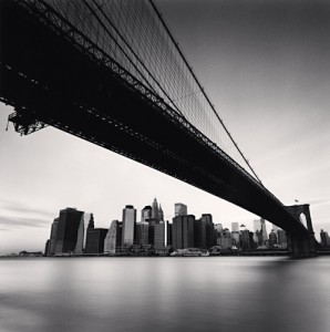
Brooklyn Bridge, Study 1, New York City, USA, 2006
http://www.michaelkenna.net/gallery.php?id=14
The photo that I have chosen is of the Brooklyn Bridge. It was shot from an angle, it shows the water under the bridge and the buildings in Manhattan if I’m not mistaken. I would say that it has a calm and peaceful felling because of the resting waters and how the buildings appear in the image, doesn’t feel too busy to me like New York usually is. The contrast from the top of the image to the body of water also helps create that peaceful sensation. Especially with the bright sky on the side.
There is a strong diagonal line, which is the bridge, I think that it makes you stop and stare at the bridge for a second before looking at everything else. There are also lines on the structures holding the bridge creating interesting shapes. The buildings in the back also create more lines that are straight, as well as the piece where the bridge begins or ends that combines with the buildings lines really well. For framing, I don’t that there is much of that but I can see how someone can argue that the bridge itself is a frame, showcasing the sky and the water with the buildings. I don’t think I would agree though. However for patterns there are plenty, the patterns on the building that allow you to differentiate the buildings from each other as well as the pattern of the windows. The interesting pattern of the reflection on the surface of the water. Also, the most noticeable pattern that’s on the bridge, not only of the supporting wires but also of the entire structure, the repeating boards and rods that create the bridge itself. When I first looked at the image it seems as though there is no depth of field but the more I look at it, I start to think that the photographer wanted the viewer to focus on the left side of the image, because some detail is lost near the right of the bridge but I am not entirely sure. The contrast is something that you notice right away because the image is in black and white. As I’ve said before the focus of the image is primarily on the bridge and part of the reason is because of the high contrast between black and white. Or if you’re more drawn to lighter colors you might look at the water first. Either way contrast plays a big part into what you decide to focus on first. For the last part the vantage point or angle of view is my favorite part of the image. It almost feels as though you’re flying or walking on the water creating that blissful felling. It reminds me of dreams that I’ve had. I think that the angle is brilliant, it’s at a perfect height, capturing the mood together so well!

