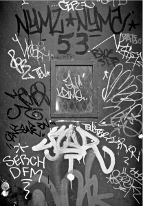
For the first homework I decided to pick and discuss Thomas Holton’s photo from the lams of ludlow street. In his photos i feel that he humanizes people and has a good understanding of what the mood he wants to set. The photo i chose was one of the first pictures that just took me by surprise when i saw it. I love urban or graffiti style photos be cause they are usually very artistic in their nature. Although this photo is of a door with graffiti styled calligraphy it is still visually engaging. The focus on the whole door rather that what surounds it really allows for you to focus and appreciate something that is often ignored.
The mood of the photo stays fluent all around and i’m not distracted by color. The black and white picture allows there to be a nice contrast between the different paints as well as the words to the door. Overall i get a feeling of a serious, grungy, underground feel to the photo which is exactly the way the photo was suposed to feel. If there was color the focus might have been on the lightest color and alter the mood making it a bit more cheerful and take away from the general feel to the picture. The composition was great as well. I fell that the way Holton cropped the photo allowed for your main focus to be the door. If he included what surrounded the photo it would have taken away from the impact of it.


We talked about this hw and you said it i could still post it
The framing is so important here. The tight cropping on the door making it symmetrical is offset by the chaos of graffiti. I totally agree with you that if Holton had shown us more of the surrounding this wouldn’t be so effective.