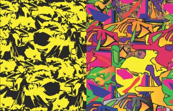
This is my port as recently of the midterm. The name reflects the concept of hand drawing vs Computer drawings.
Within the portfolio I demonstrate my work done in Arch 1191 and Arch 1110.
« The Beginning Of the Journey Inspirations of Architecture »
Hey there! Thanks for dropping by CROSSBLOGS! Take a look around and grab the RSS feed to stay updated. See you around!
This is my port as recently of the midterm. The name reflects the concept of hand drawing vs Computer drawings.
Within the portfolio I demonstrate my work done in Arch 1191 and Arch 1110.
« The Beginning Of the Journey Inspirations of Architecture »
Our goal is to make the OpenLab accessible for all users.
Our goal is to make the OpenLab accessible for all users.


Jean-Pierre Demerieux Gomez-
1. The image on your introduction should expand to page 3.
2. On page 1, there is too much space between the description and the photo, try expanding the image.
3. Image on page 6-7 needs a description
4. The images on pages 16-20 need descriptions!
I like your book!
Some of your pictures of your clay models are cut off (pg.2-5). The black background is a good idea. However, I don’t think you should have most of your background black. For example, on page 14-15, you don’t need a black background (in my opinion). I see how you were comparing your work from drawing to computing. It’s a good idea and try to maintain that idea towards the finals. On page 12, try to center your photo and put the description on the bottom. On page 18-19, can you scale the image a little bit smaller? Over all it’s a very good book. I see you put a lot of work into your portfolio