Author Archives: faiza hussain

#09 My Thoughts on this Internship

My Thoughts on this Internship

image: https://unsplash.com/photos/5fNmWej4tAA

How would I rate my work with my internship? Well in the beginning it seems pretty slow. I spent a lot of time on logo design. It was the longest time I spend on designing. It was interesting since I usually try to be quick and with logo you really have to catch the brand with a simple design. In the end I did find that my final design for the instagram logo to be my favorite design out of all of them. Things started to speed up after that since I had been quick to design the way the brand was met to be like. I felt like I connected with my supervisor who was able to be with me through a lot of my designing. I am glad that I was able to work with a new brand since it is a different experience then to work with a brand is already there. Overall I would have love it if I was able to do more work than what I had done. I plan to stay and finish up this brand project since I feel like it would mean that I was learning more.

#08 Work to finish the facebook banner

Work to finish the facebook banner

image: https://unsplash.com/photos/DfMMzzi3rmg

I have never made a Facebook banner so this was interesting. While I have the design details for what my supervisor wants I had to try make it my own design. I had the images I would use so I went on canva and started to make the size of the website banner for Facebook. I worked with canva before but not to do a complete design since I mostly worked with adobe. It was interesting playing around with the elements that they have. I made a collage format and then used two image as if the image was a photo and I used tape element to make it simple like it was taped on. I did several designs and I hope that my supervisor like the design. After doing different design I also did one cover design like the one from the website that she shown me.

#07 Podcast Cover to Meeting Other Interns

Podcast Cover to Meeting Other Interns

Podcast Cover design by Faiza Hussain for ToBeHonestTho…

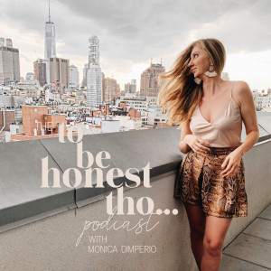
For this week I got to design the Podcast cover with Monica. It for her ToBeHonesttho… podcast. She showed me a bit of a mockup to the design and I made sure to follow the direction what she wanted. It was enjoyable doing that since I had to make sure that everything was in the right order. I used the font give to me along with Capri font family and made it the color light salmon. It was the first time ever that I created a podcast cover and I would definitely love to do it again in the future.

On Monday I finally got to meet the other interns for Monica. It was through google meet. We each spoke about what we did for Monica. I found that I would be working for the rest of the project with the editing intern, Jillian. We exchanged emails so that she could show me some of the images she worked with. This is so that I could work on it in lightroom.

Finally for the week Monica wanted me to design her Facebook banner. The design she wanted was collage like and with a photo over it like like someone mood board. I am excited to get that working and done.

#06 Faiza Hussain’s works to get that subscription!

Subscription

Subscription image made by Faiza Hussain for ToBeHonestTho…

For this week I worked on several designs. The supervisor wanted to see a new color with her logo. The new color was light Salmon which I thought fit the brand very well. After that I worked to create the brand logo into a favicon which would give different sizes for the different devices. After that my supervisor wanted me to design a new subscription design. She wanted it to be with a new image she sent to me. So I made it as close in design to the old one as possible and with new copy text to get people involved. It wasn’t hard at all for me since I was able to find similar fonts for free.

#05 Faiza Hussain’s massive logo designs

Logo redesign

Logo design by Faiza for tobehonest…

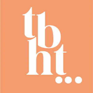
For this week I had been reassigned to redesign the logo. My Supervisor felt like the logo need some fixing to match with the design. While she wanted the design to be the Capri San she wanted the logo to jump out to bring more attention. After she show me a similar style and told me to get it to be like that I did several version. I made a bit of mix up since I thought she wanted the comma in the rounded new logo but she wanted it in the old logo instead to see how it would fix. I fixed it up and did the instagram with a style with three periods like she asked and then she wanted a design with the letters over each other. In the end we had the instagram logo with the letter over each other and the website logo with tho around the last letter of honest with the periods after the t.

#04 My first design with a Startup

My First Design with a Startup


Image: https://unsplash.com/photos/v9FQR4tbIq8


After getting my internship from my supervisor, I was give a google doc with my assignment for the internship. My supervisor made a meeting on Wednesday with me and we discuss what was expected from me during this internship. I was told about what she wanted in color for the logo and given an example of the text. She wanted in white, black, and a peach color. For the Instagram logo she wanted it to tbh… instead.  I also worked on the icon for the mail and remade to make sure that it was in the color peach.
I work a lot on the typography and tried to find similar fonts to Capri San and in the end the supervisor decided to buy the font since it would work the most on the logo.