When I was going through websites I stumbled across a quote saying “keep your face to the sunshine and you cannot see a shadow” by Helen Keller. My interpretation of the quote is saying to always stay positive.
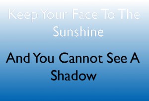
For my first concept, I wanted to keep the  concept simple. For the background I use a gradient effect where it gradually fades into white to blue. In the chose of font its a sanserif called Gill Sans. “Keep you face to the sunshine” is white while “And you cannot see a shadow” is black. I chose black and white because it symbolizes positive and negative. Quotation concept 1
When I thought of the first part “Keep your face to the sunshine” I imagined the sky. I used a cursive writing called Lucida Handwriting. When I thought of the other half of the quote “And you cannot see a  shadow” is I took the word ‘shadow’ and making it seem like it is casting a shadow and hiding the word ‘cannot’ which the words speaks for itself. It is not to the point where the shadow is hiding the word ‘cannot’ completely but it is still readable. The typeface is a bold serif called Goudy Stout.
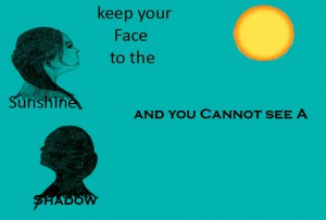
In both concepts I made so far I used a light blue. I wanted the third concept to be in the blue range category and making the background a teal color. I drew both t
he figures and used my youngest sister as a model where I sketched out one side of her face quickly. I also wanted the figure to face the sun which kind of suggest in the quote. The typeface is a sans serif called Calibri. I took the word ‘shadow’ again just like my second concept and shaded the figure black. Taking the word ‘shadow’ to make it seem like its creating a shadow like a figure of one side of the face which it is facing the opposite side of the sun. The typeface is a serif called Copperplate Gothic Bold.


