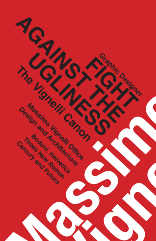
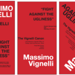
Typography poster inspired by Massimo Vignelli’s colors and grid method. This poster was printed and placed outside on display of City Tech’s library. In our class assignment, we had to pick a quote from our favorite designer and create posters using the grid technique. Originally I was trying to place things to fill the space but still align, at the end of the class I figured that I could tilt the text and still keep it aligned. The interesting shape created by the quote looked similar to a skyline which made it more meaningful and dynamic since Massimo Vignelli moved to New York later to work.
Please check out my process book below.
COMD1200_fa19_process_booklet_Ng_Evelyn
- Poster
- Sketches
- Sketches2


