As we were strolling through the parks, plazas, and Squares, one as a designer is able to recognize the differences between these three public spaces. I noticed that the materials used on the ground surfaces of these spaces gave a feeling about what the space was meant to be for. A plaza usually had tile or more smoother materials, park used grass or pebbled ground, and square had a little of both. Also, it is comforting that the streets are being narrowed down, making more of a pedestrian like setting instead of a vehicular one.
Reflection
New York City have different places that pedestrians can enjoy. The bowling green is a square surrounded by big buildings which make the place like a close open place. Also, there are other places by the city where there are parks and plaza with more open spaces which are not enclosed like bowling green. Every place has its function to the community.
The use of different materials in bowling green make people feel like they are moving from one place to another even though they are in the same square. While, the use of the same material make people feel like they are in the same place
5 principles
Cristian Morales, Cristian Aguilar, Stevenson Fenelon
ARCH 4710
5 principles
Hierarchy– areas standing out
Identity– knowing where everything is.
Community-creating areas for people to gather.
Growth– increase in both construction and population.
Link– connect the redirected areas to create better circulation.
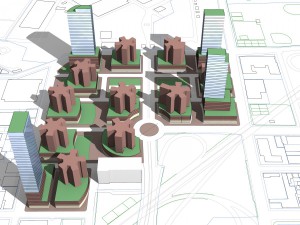
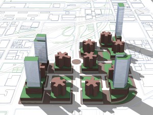
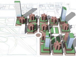
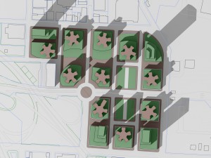
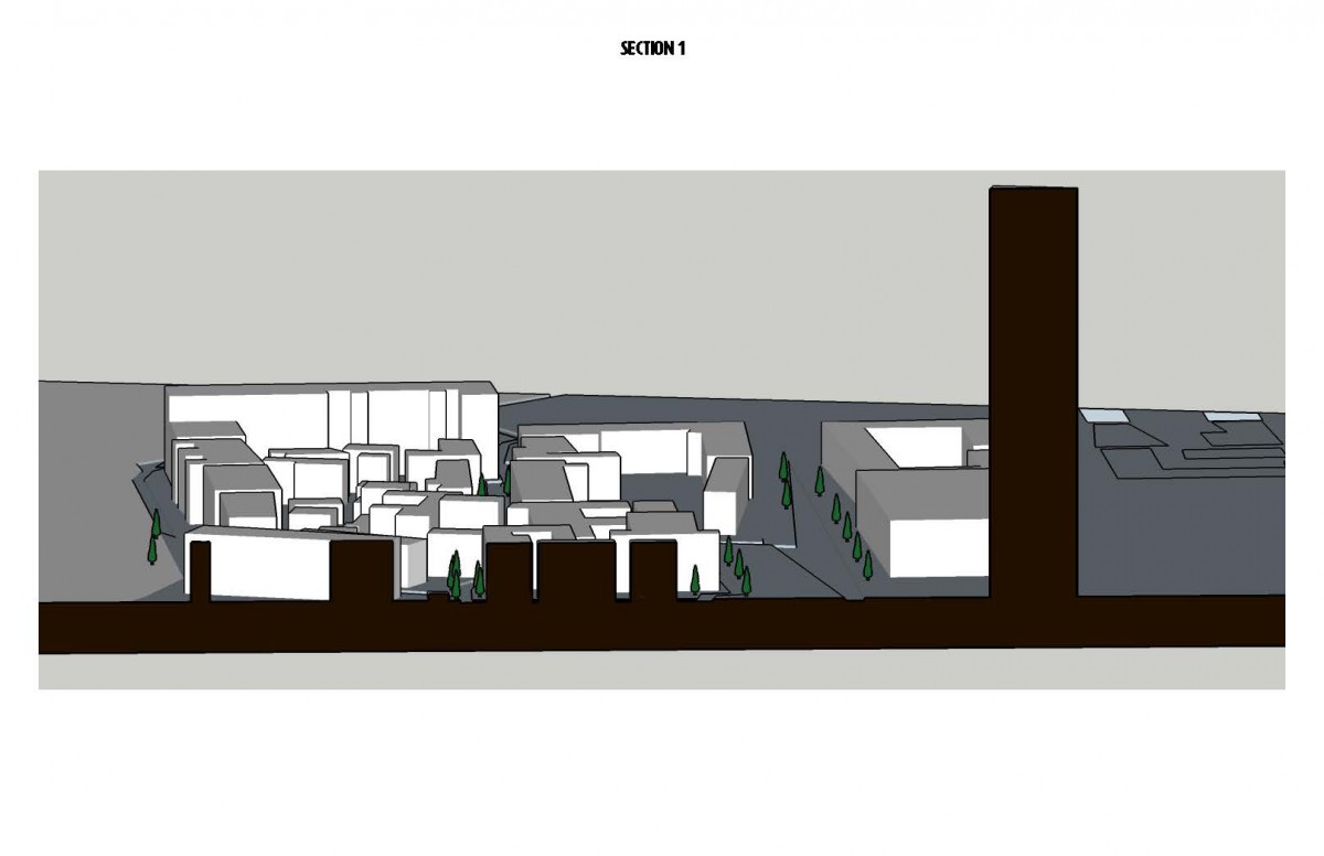
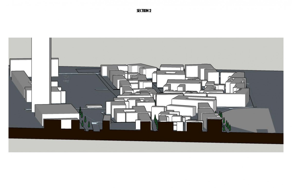
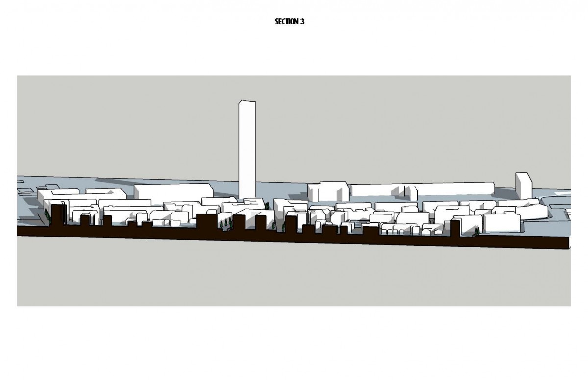
Faragut Houses 3D Renderings
The above redevelopment of the Farragut Houses focuses on the following Principles:
– Fluidity into and out of the ascribed territories of the Farragut Houses
– Mobility within the space
– Safety
– Activity
– Community
– Sustainability
These objectives will be facilitated and ameliorated nominally through design by performing the following objectives:
1. Linking the surrounding automotive infrastructure so as to divide the super-blocks and segregate the buildings from one another. This Allows a sense of community to no longer be extended to a large group of buildings, but rather the buildings themselves. Increased activity in the vernacular landscape, as well as private outdoor space for the buildings add to the effect of reinforcing a sense of community for the occupants.
2. Increasing the population density within the territory with medium and high income residential towers so as to materialize diversity as a means of integrating the territory demographically.
3. Increase mixed use space by extending the boundaries of each building to the limits of the newly created blocks for the first five floors. Of which the first two floors will be dedicated to commercial use and the three top floors can service residential, office and/or commercial purposes. The Commercial Spaces will be divided into Mall and store front so as to accommodate a diverse scale of commercial capacity (Mall accommodating large scale businesses/ Store Fronts accommodating small and medium scale businesses). The effect is destined to increase job opportunity for the vernacular, satisfy the vernacular population and increase day traffic as a sustaining factor to the resilience of the micro-economy of the region.
4. Landscaping the Ground Level so as to invite pedestrians to a more hospitable setting via Parks, lawns, public seating, tree canopy, child recreational infrastructure and water features. (Interactive interfaces on history and impact of the region: Lost Heritage and impact of Mosean/Corbusier Public Housing and Highway development).
Please feel free to comment, critique or provide advise.
New Castle, Delaware – Case Study
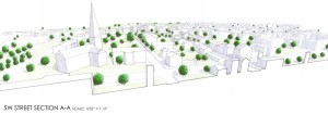
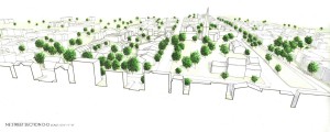
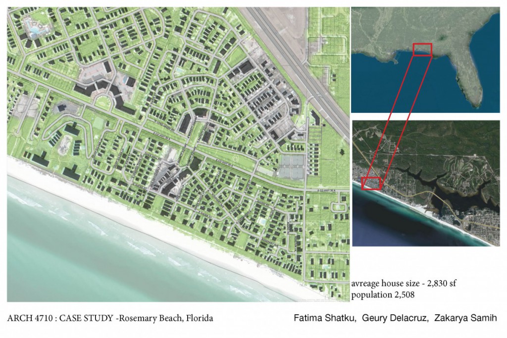
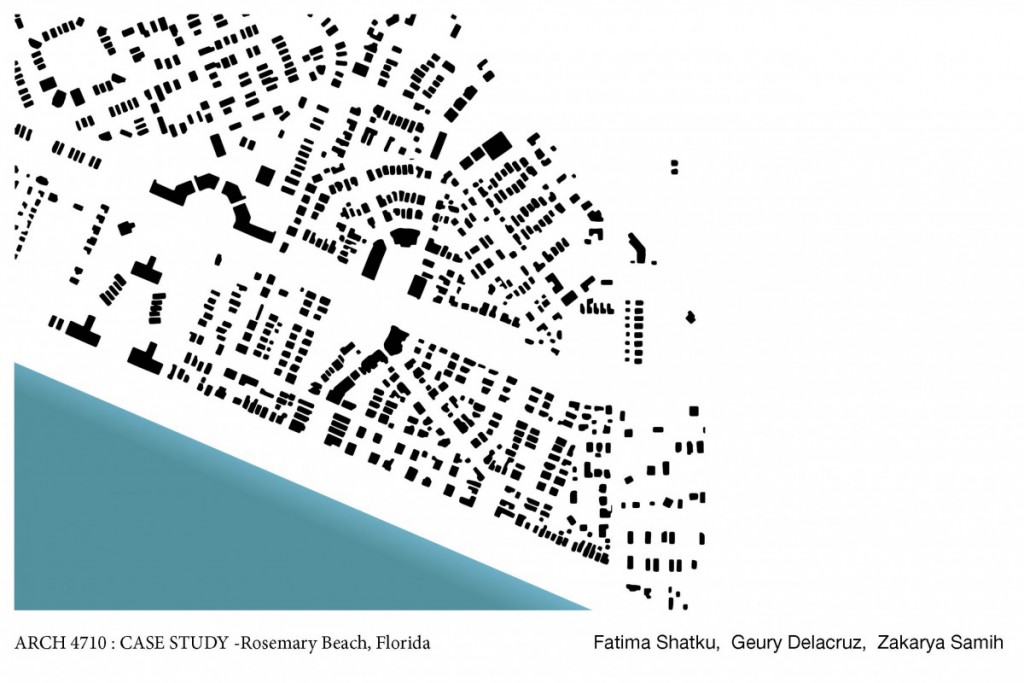
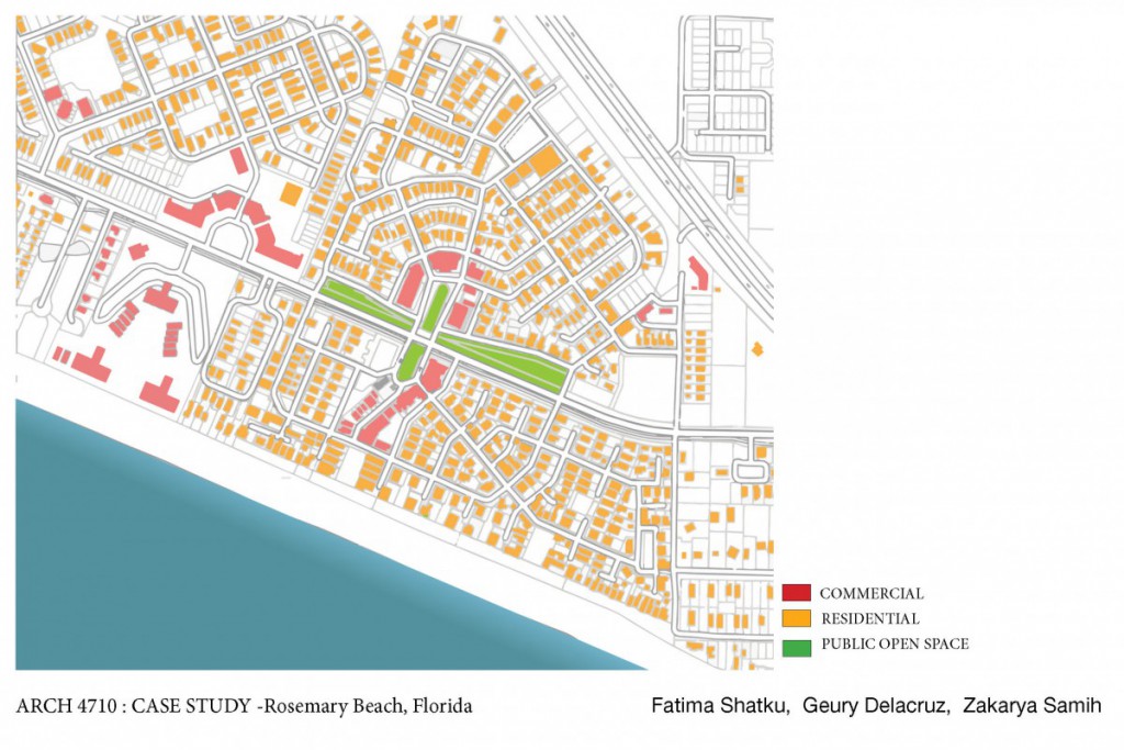
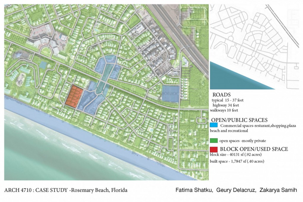
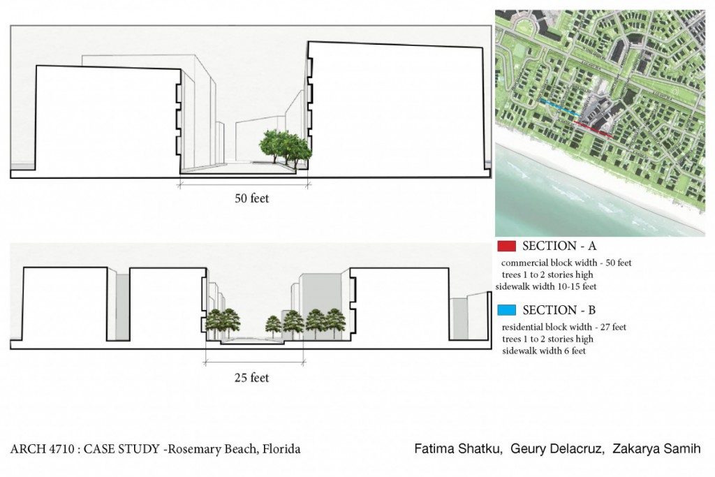
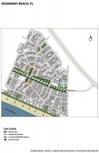
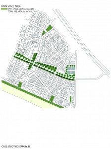
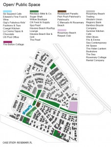
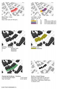
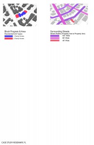
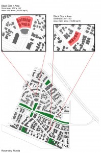
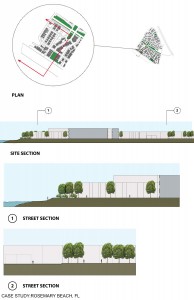
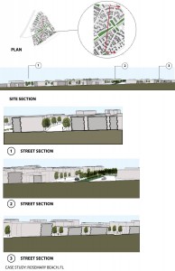
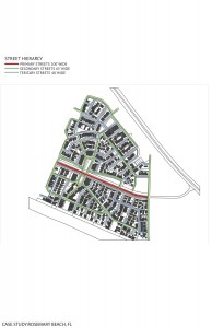
Case Study – Rosemary Beach, Florida
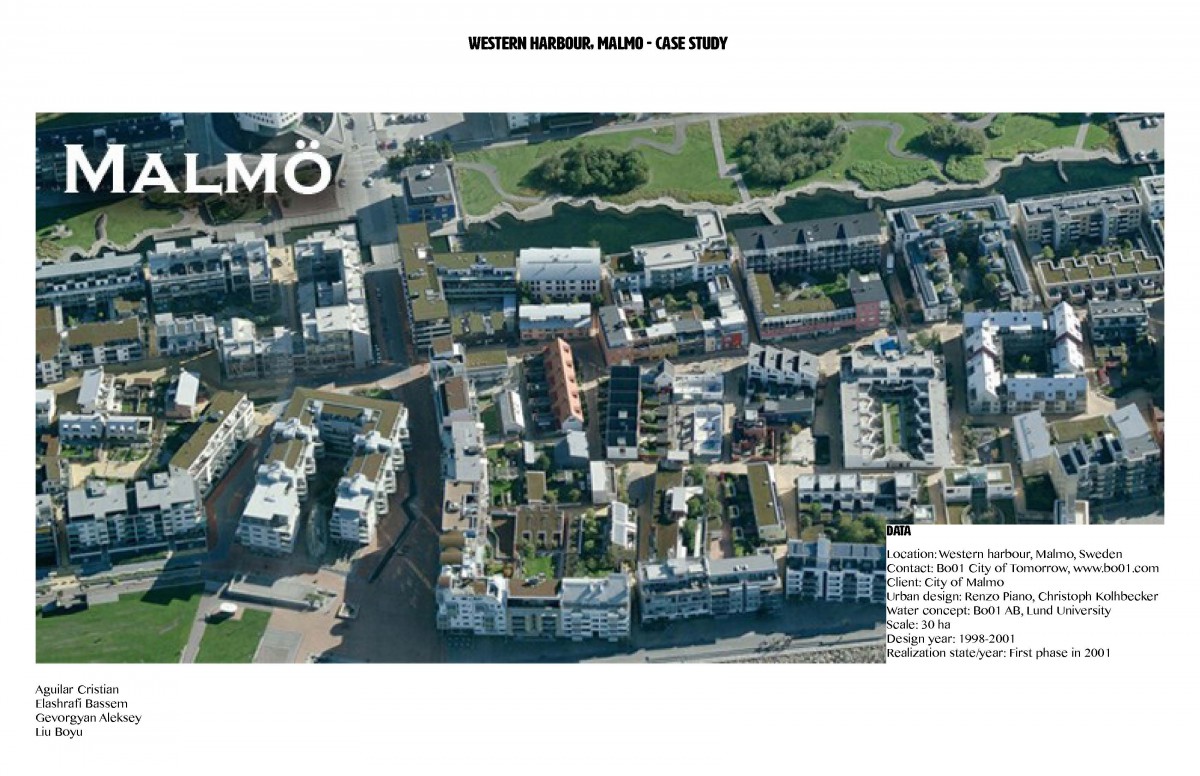
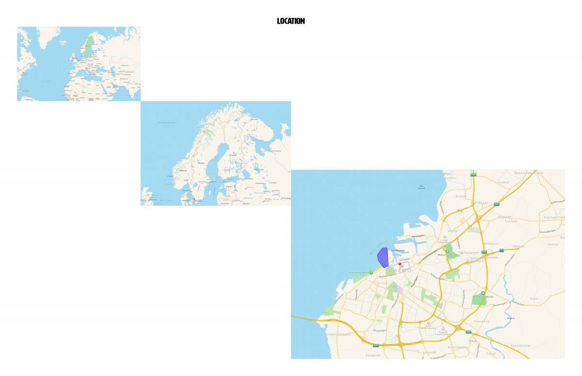
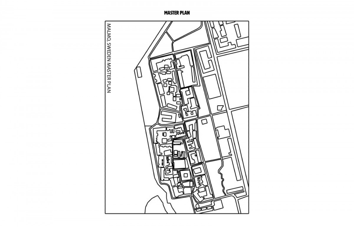
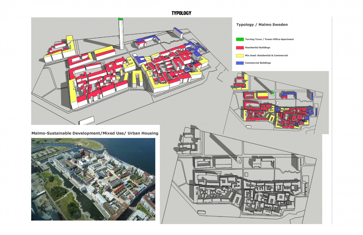
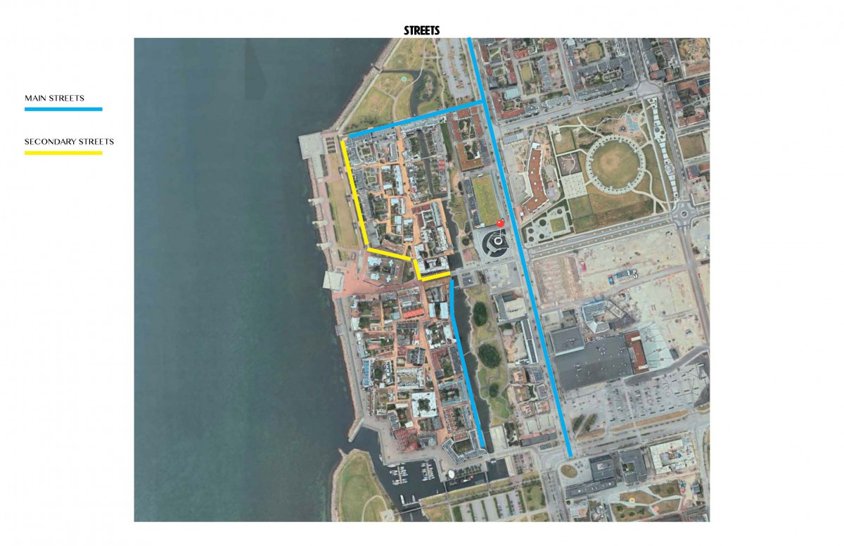
Case Study – Malmo – Western Harbour
Case Study:Rosemary Beach, FL
Urban Design Principles
When creating a master plan, I believe the most important principles would be,
1) The use of open spaces
2-Private/ Public areas
3-The arrangement of the blocks
4-Placement of open spaces & plazas
Principles of Urban Design
The integral principles in designing resilient and sustainable masterplan must allow:
1. A commodification of space that is efficient and respective of their functions relative to the users (to allow social and economic resilience of the host population via local service or office jobs)
2. Fluidity of movement in, out and around the site. (avoid viscosity of automotive or pedestrian traffic)
3. A pseudo Cultural representation of the vernacular so as to endow the site the ability to visit a more hospitable impression on its residents and visitors
4. Architecture that seeks to promote “good” Behavior by means of organizing the public, private and semi-private areas relative to their respective functions so as to control traffic density, noise, and other conditions within the space that would either label the anthropogenic habitat hostile or hospitable to its residents and visitors.
5. Organization of space which allows communal activity and avoids the segregation of people (both visitor and residents of the site)
6. Public infrastructure which promotes walk-ability and cycling over other modes of transportation, as well as sports facilities so as to increase the physical activity of the people within the boundaries and within the vernacular setting as a collective means of promoting better physical health
7. Public Landscaping which allows the invasion of fauna, flora and water as a means of promoting psychological health by expunging monotony.
8. Organization of spaces that is relatively organic in order to embellish and enrich the experience of the visitor or resident within the space.

